Want to become an animation expert? Learning the 12 principles of animation is the way to go! They’re the key to making super cool and pro-looking animations. This guide will show you each principle with fun tips and tricks, so your characters and creations move and feel alive, just like in the movies made at an animation studio! Are you ready to become an animation superstar? Let’s get started!

Need Animation Services?
Visit our Animation Service page to see how we can help bring your ideas to life!
What Are the 12 Principles of Animation?
The 12 principles of animation, created by Disney legends Ollie Johnston and Frank Thomas, are the core of professional animation. These rules work for all types of animation: 2D, 3D, stop-motion, and motion graphics. They make motion look natural, characters feel real, and stories connect with people. Using these principles improves the quality and impact of any animation project, from a simple bouncing ball to a full movie. Let’s look at each one to see why they are still so important.
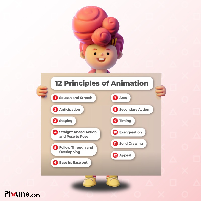
1. Squash and Stretch
Squash and stretch gives weight and flexibility to animated objects. A bouncing ball flattens when it hits the ground and stretches as it moves through the air. A character’s face also squashes during speech to look more real. Without this rule, motion looks stiff. It also helps show if something is hard, soft, heavy, or stretchy. In 3D animation, animators use small changes in scale to get this effect. You have to use squash and stretch in the right amount. Too much looks fake, and too little looks robotic. When done correctly, it turns stiff movement into dynamic life.
2. Anticipation
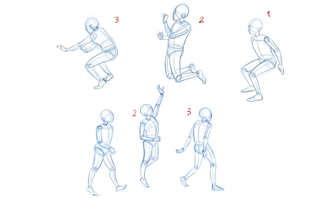
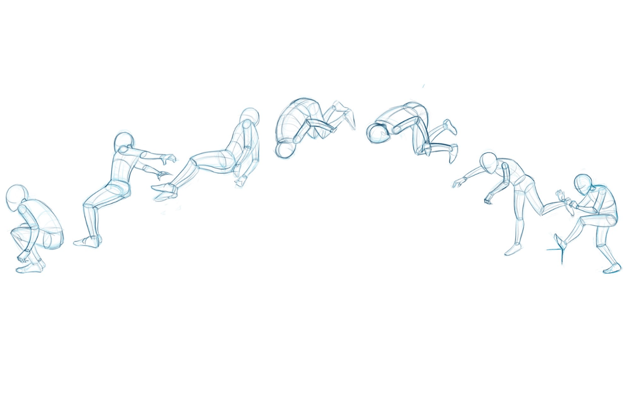
Anticipation gets the audience ready for an action. For example, before a character jumps, they crouch down. These small actions show what is about to happen, which makes things clear and creates tension. Without anticipation, movements can seem sudden or confusing. In comedy, it builds suspense before a joke lands. In drama, it makes emotion stronger by delaying an action. In 3D animation pipeline, you can use things like shifting weight to show anticipation. This principle is the setup that makes the action satisfying.
There Are Only Three Things in Animation: Anticipation, Action, and Reaction
BILL TYTLA
More Clarity with Video Example: When you want to hit with a hammer, first you raise the hammer to save the required energy and then hit. When you want to animate this action, you need to use Anticipation to make it clear and palpable for the viewer.
3. Staging
Staging is about making things clear for the viewer. It helps the audience instantly understand a scene’s idea, emotion, or action. Animators use things like composition, lighting, and posing to guide the eye. A good pose should explain the action even without words. Staging also involves camera angles, as the right view makes the story better. Bad staging can confuse people, but strong staging makes scenes memorable. In Pixar and Disney films, a single frame can tell the whole story. Good staging turns animation into pure visual storytelling.

4. Straight Ahead and Pose to Pose
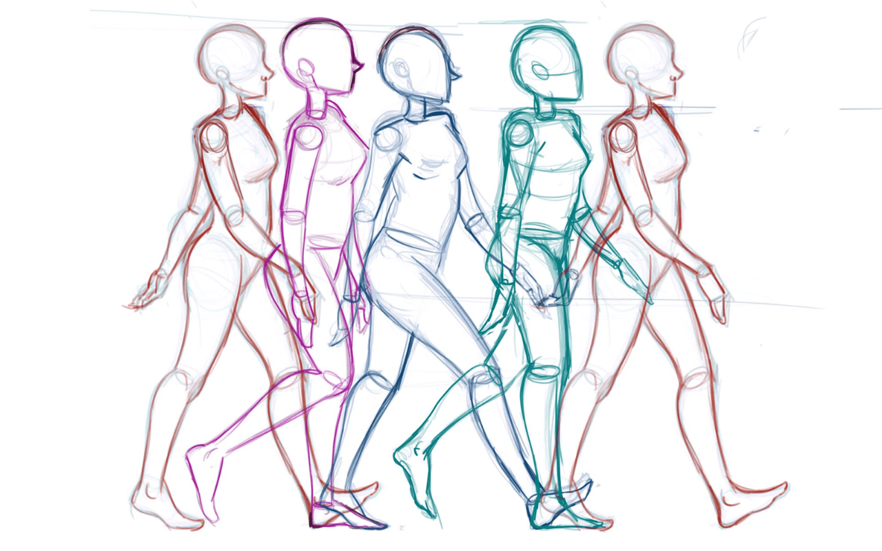
These are two different ways to animate. Straight ahead means you animate frame by frame. This makes motion feel fluid and spontaneous. Pose to pose means you plan the main poses first, then fill in the frames between them. Straight ahead is good for things like fire or water. Pose to pose is better for complex acting or dialogue scenes. Most animators mix both methods. They use pose to pose for clear timing and then use straight ahead to add detail. Knowing when to use each method gives animators control over both spontaneity and precision.
5. Follow-Through and Overlapping Action
These two principles keep animation from looking stiff. Follow-through is when a body part or object keeps moving after the main action has stopped, like hair swinging after a turn. Overlapping action shows how different parts of the body move at different speeds, like arms moving after the body. Together, they create natural physics. Without them, animation looks robotic. Things like clothes, tails, and props use these principles for realism. They add depth to motion, showing that characters follow physical laws
6. Slow In and Slow Out
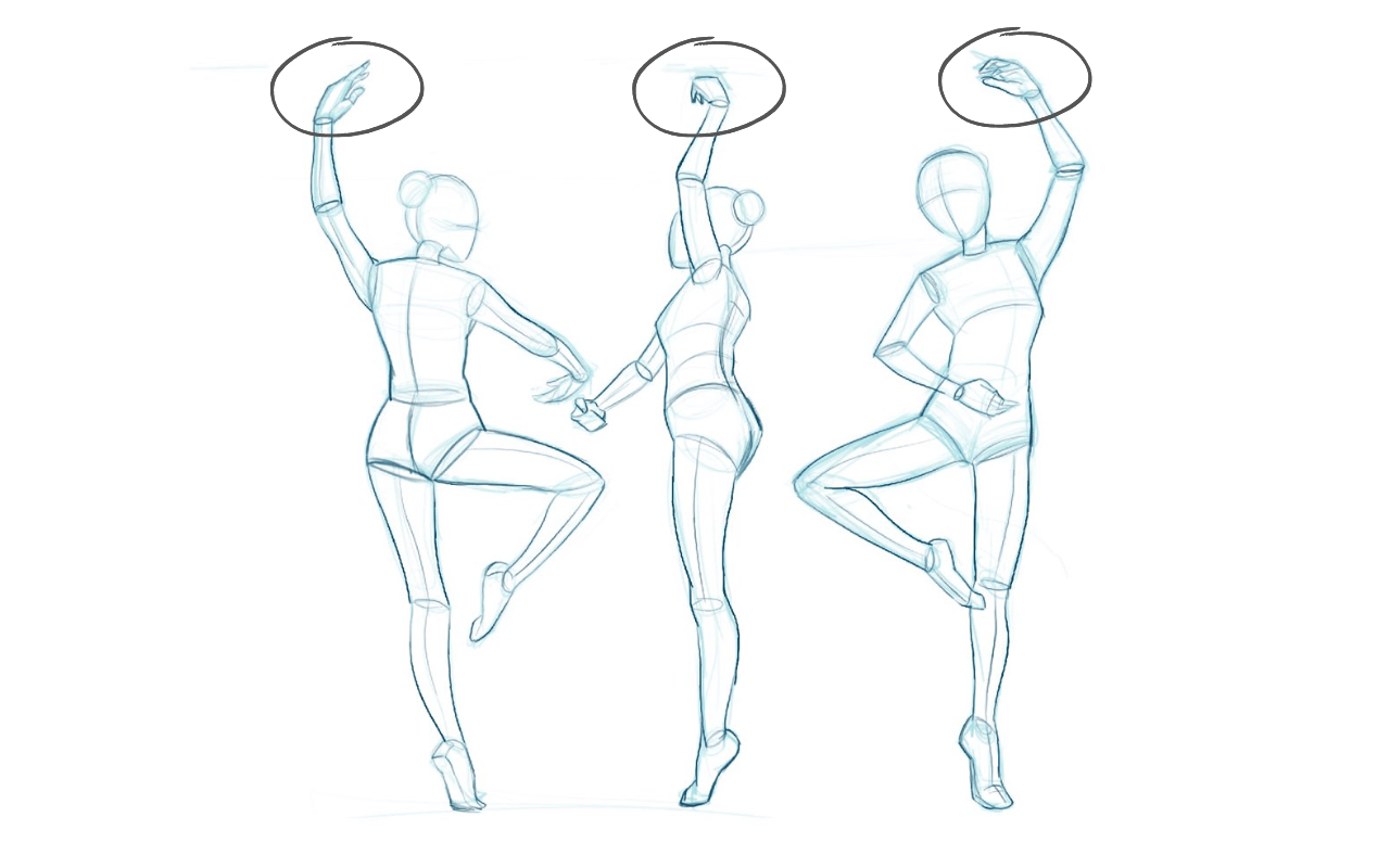
In the real world, nothing moves at one speed. Slow in and slow out is about speeding up at the start of a motion and slowing down at the end. A hand reaching for a cup starts slow, speeds up in the middle, and then slows down as it gets to the cup. Without this, movement seems robotic. In digital programs, this is controlled with easing curves. Mastering this principle adds rhythm and realism. It helps show weight, emotion, and purpose, so characters do not move at the same speed.
7. Arcs
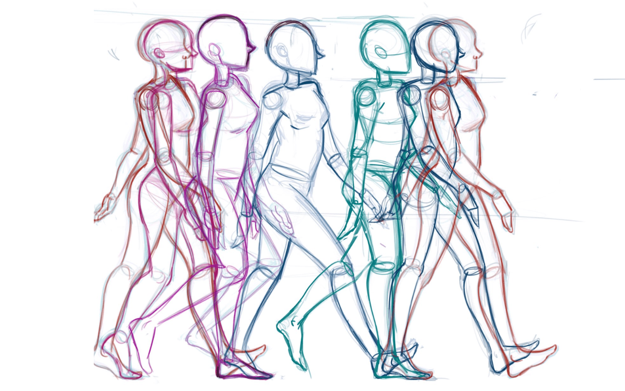
Most natural movements follow a curved path, not a straight one. A waving hand or a running step all follow arcs. If you ignore arcs, movement looks linear and robotic. Animators use guides or onion-skinning to make sure motion is smooth and believable. Even small arcs in eye or head movements make characters feel alive. In 3D, animators often have to manually fix rig controls to make them follow a curve. Using arcs is a small detail that makes animation look much more natural.
8. Secondary Action
Secondary action makes the main action better without taking attention away from it. When a character runs, their hair might bounce or their arms swing. These details add realism and emotion. Secondary actions can also show a character’s personality, like a nervous person fiddling with their hands. The key is to keep a balance: the extra action should help, not hurt, the main one. Animators who use this well create deep performances that make characters feel like real people.
In our work, we don't merely try to entertain people, we try to bring joy and happiness.
Walt Disney
9. Timing
Timing is often called the soul of animation. It controls how heavy something feels, and what emotion and speed it has. A heavy object falls fast, but a balloon floats slowly. Fast motion shows excitement or panic. Slow motion shows drama or sadness. Mastering timing ensures actions have the right impact. In 3D animation, 3D animators change the space between keyframes to get the right timing. Without this, even good characters seem flat. Strong timing makes movement believable and emotionally powerful.
10. Exaggeration
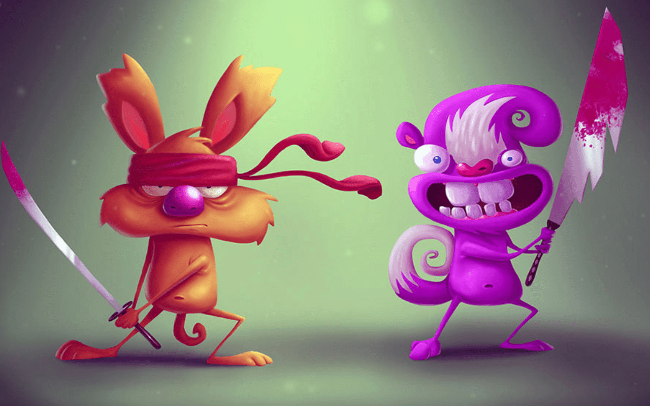
Exaggeration makes reality bigger to increase impact. Instead of showing real physics, animators make motions and expressions bigger to communicate more clearly. A character might jump higher or smile wider to show their feelings. Exaggeration is not about breaking the rules; it is about making them more powerful. Pixar and Disney use exaggeration to connect with people’s emotions. In games, it helps you quickly understand what is happening. Without exaggeration, animation can be too subtle to notice.
11. Solid Drawing
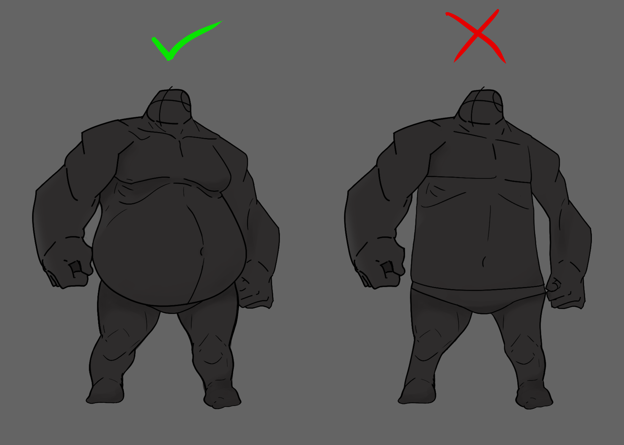
Solid drawing is about form, volume, and being consistent. In 2D animation, characters need to look 3D with believable shape and weight. In 3D, this means making poses with clear shapes and balance. Solid drawing makes sure characters do not look flat or lose their shape over time. It also focuses on things like perspective and anatomy. Animators practice by drawing from different angles. Without solid drawing, even smooth animation can look empty. With it, characters move with presence and are believable.
12. Appeal
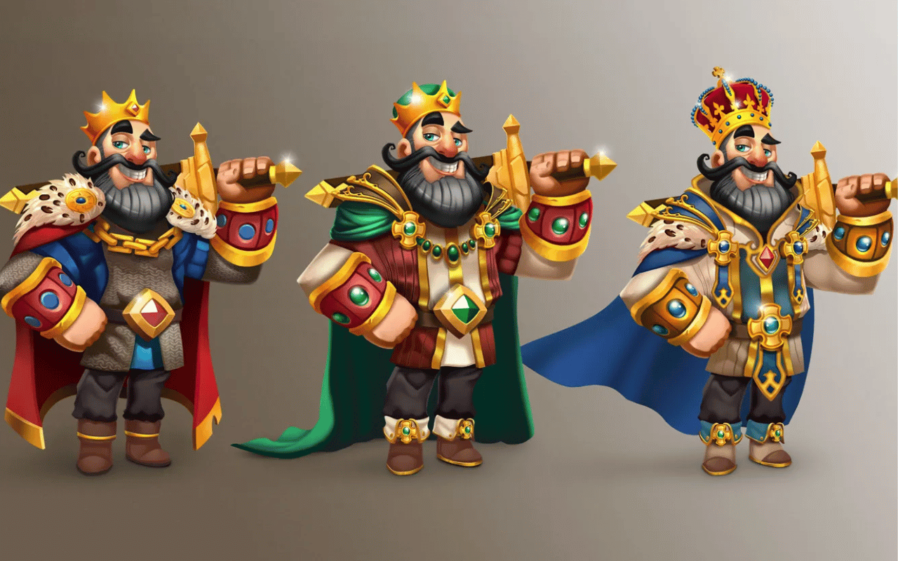
Appeal makes characters interesting and memorable. This does not mean they have to be cute. It means they have a clear design, personality, and charm. Appeal comes from strong shapes, expressive features, and relatable traits. Even bad guys can have appeal if their design is strong. Animators use this to make sure people want to watch and feel connected to the character. Appeal is what makes a character a timeless icon. It is the principle that keeps viewers interested in your work.
Why Are the 12 Principles of Animation Important?
The 12 principles are the basis of every good animation project. They ensure clarity, realism, and emotional connection. Without them, characters move like machines and stories lose their effect. By using these principles, animators connect with the audience, turning movement into meaning. In movies, games, or ads, these rules make sure animation is both technically good and emotionally powerful.
What is the Most Important Principle of Animation?
While all the principles work together, timing is often seen as the most important. It controls emotion, weight, and impact. It decides if a joke works, a fight seems powerful, or a sad moment lasts long enough. Without timing, the other principles are not as effective. However, real skill comes from using all of them together, not just one.
Our characters made you laugh and they made you cry. They were flesh-and-blood people.
Walt Disney
Do the 12 Principles Apply to 3D Animation?
Yes, they do. These principles work for all animation types. In 3D, squash and stretch may use rig deformation, arcs need graph changes, and secondary action adds to realistic rigs. Companies like Pixar, DreamWorks, and game studios show that these rules work for every style. Technology changes the tools, but the principles do not
How Do I Learn the Principles of Animation?
Start with small projects. Practice bouncing balls and walk cycles to learn each principle. Use books like The Illusion of Life and Richard Williams’ Animator’s Survival Kit. Software like Blender, Maya, or Toon Boom gives you ways to test ideas. Online tutorials and feedback help you learn faster. The secret is to do it many times until it becomes easy.
Case Study
Pixar’s “Luxo Jr.” is a perfect example. The lamp uses squash and stretch, anticipation, arcs, and appeal without speaking. This short film showed that these principles alone can create emotion and storytelling. Years later, movies like Toy Story and Frozen use the same rules, which proves they are timeless.
Conclusion
The 12 principles of animation work together seamlessly; squash and stretch bring appeal, appeal enhances follow-through, and strong poses enable exaggeration. Whether animating by hand or computer, bouncing balls, or beloved characters, the foundations remain the same. Generations have grown up knowing characters who stretch, squish, hurtle, meander, and stomp with the charm and appeal of classic animation.
We tried to cover all 12 principles with examples in this blog post. Try to implement them, and you’ll be sure to create stunning animation. Remember that these rules are not the only important ones but they are great launching points. Understanding the 12 principles allows anyone to instill such magic in their own animated creations.
FAQs
Which principle is most essential for beginners?
“Squash and stretch” and “timing” form the foundation for learning motion dynamics and rhythm.
Can these principles be applied in modern animation?
Absolutely. They remain vital in 3D, games, motion graphics, and UI design.
Are these rules set in stone or open to creative tweaks?
They’re guides. Once mastered, breaking them intentionally can create unique and memorable styles.
How long does it take to learn them?
You can grasp the basics in months, but mastering them takes years of practice.
What's the difference between pose-to-pose and straight-ahead?
Pose-to-pose relies on key poses and then fills in between; straight-ahead animates frame by frame in sequence.
Which principle adds realism to movement?
“Follow-through and overlapping action” simulates inertia. For example, hair or clothing trailing motion.
