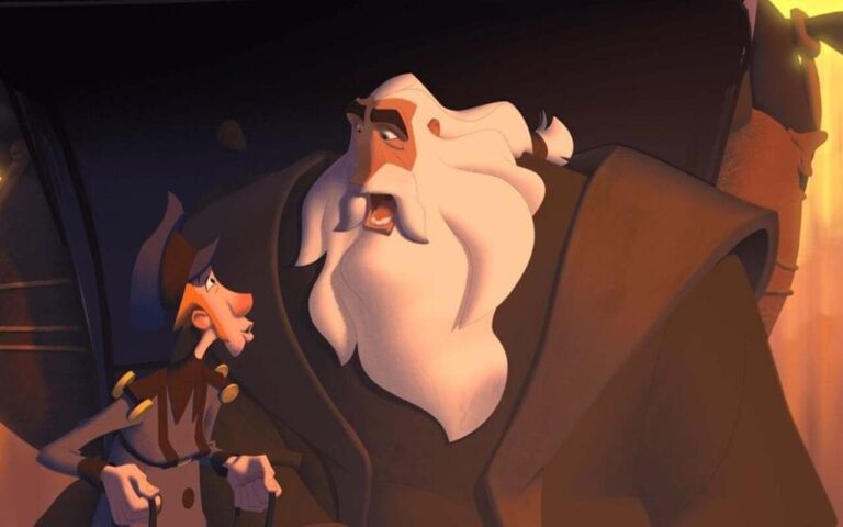
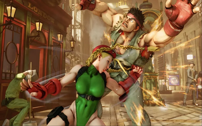
Composition, in general, is how you visually tell a story or try to implement a certain vibe and mood with the usage of light and placing assets in one scene; one single shot can be seen in many different ways as we explore this theory with many visual examples in this article.
Our main focus will be 3D animation, but composition vise examples will be 2D drawings of shots and unwrapping the reasoning for each shot and the usage of that sort of scene layout and lens usage.
Need 3D Animation Services?
Visit our 3D Animation Service page to see how we can help bring your ideas to life!
Things to Consider While Creating Composition
Let’s not forget that when we are talking about visual storytelling, the image is the vehicle and not the end in itself. We can not afford to get the audience stuck on a particular frame just because the drawing or the scene looks great without a specific purpose within the story.
Obviously, we aim to produce high-quality art, but we should prioritize the following:
- What are we trying to say in our narration as a whole?
- What mood do we want our audience to be in throughout at any given time?
- What is the function of this moment within the story?
- How are we going to take out the audience there?
- What can we leave out without changing what we are trying to imply?
While trying to create the composition of a scene itself, we are first of all doing an exercise in storytelling, as opposed to creating pieces of art for a show composition as a soul aspect should not make the audience conscious of the fact that they are simply setting their eyes on a shot filled with great 3D characters and some scene props, the composition should make the audience feel like living an experience.
Although aspects of a scene, like your scene’s character development and art style, are important and the composition itself should move beyond that.
Welcoming the Viewer to Your World
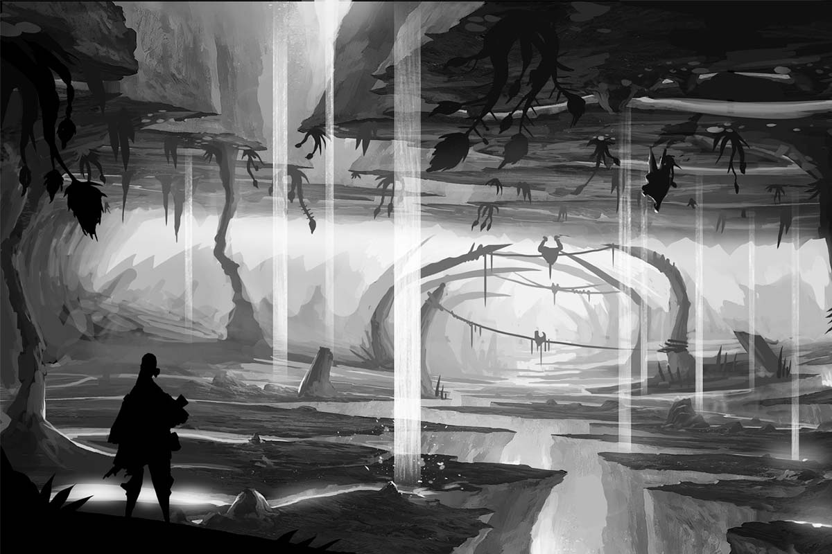
Your main goal should be translating “reality” into “your reality”, capturing a mood, then delivering it to your audience through good environmental storytelling in your scene.
The reality around us is always triggering moods and feelings in our brains, generating somewhat of an emotional response from us, whether it’s a beautiful and evocative landscape or, rather, a menacing one.
As artists, we need to be especially perceptive of this surrounding energy because it is our work to translate it into something physical, more tangible, like a drawing or the narration of a story that will successfully convey and deliver all of it effectively to the audience.
The General Tone of the Story/Consistency
Consistency in our vision from the first to the last frame is essential the moment we decide to grab pen and paper or set any prop or model in the scene, even that small light you think does not matter.
Making every element coherent with the rest as part of a solid chain that is the world we are creating. That’s why our choice of first shots will establish our sense of drama, comedy, or action for the whole narration.
One of the main things you should consider as an artist is not telling the audience things but rather making them feel things.
Sometimes it comes down to using insinuation to drive action, foreshadowing things rather than telegraphing them on both artistic and narrative levels. This will allow our audience to participate more in the adventure. The idea behind this is that no matter how hard we try, we will never represent reality as it is simply because we each have our own unique vision of reality in our minds.
Drawing and Composing a Single Image
We have to first go over the basics in order to move forward with composing connected shots with narratives.
We should study reality as it appears in front of us. To put it in another way, how would we perceive the things we see around us if we had just arrived at Earth from another different planet or dimension and we didn’t know what a “person” looked like, what an ocean is, or what makes a tree different from another one?
We would just have to go by impression without being able to rationalize any of the elements around, and that impression would depend not only on the physical element but also on the conditions of the moment.
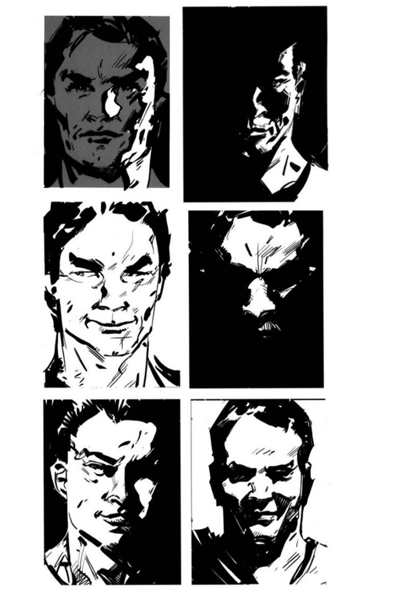
Let’s go now to a simple example, a human head. We all know what it looks like and what features and sense of volume it appears to have. The question is, what happens the moment we start changing the circumstances around it?
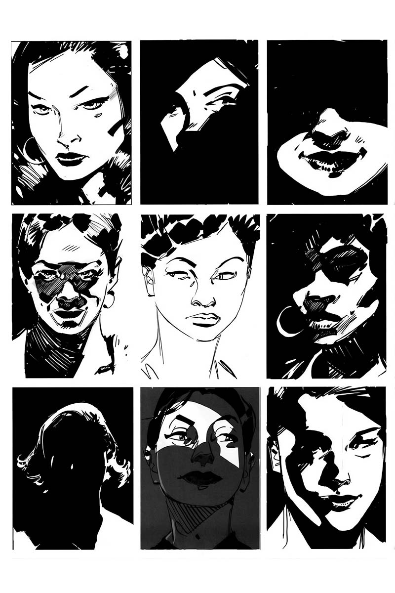
The variety is great. Some will tell a more relaxed, upfront story, while some might go to the realm of nightmares and then. Worlds in between. One of the main steps will be to decide how much of the subject we want to show, how clear or how confusing the image will be,
How We See Things and How We Don’t
When we see anything in our life, we compare it to what’s familiar to us in terms of what we are used to seeing. When we start deviating from it, we will create scenes that feel unusual, which can be special or just weird and unpleasant. We need to decide what we need each moment.
Normally we go about life focusing on what is relevant to us at every given moment. If we are walking down the street, we basically pay attention to the traffic in order to remain safe or to the shops in the street to make sure we don’t miss out.
The point is if our eyes are seeing many things at once, we do prioritize them based on our needs at the moment, making specific things stand out above the rest. This is how we will select and highlight certain elements in our compositions as part of the visual message we want to deliver.
Let’s look at various styles of scene layouts and shot angles in the following lines. Notice that these rules are sometimes meant to be broken! We will always try to find a creative and innovative way to do and say things, as long as it makes sense!
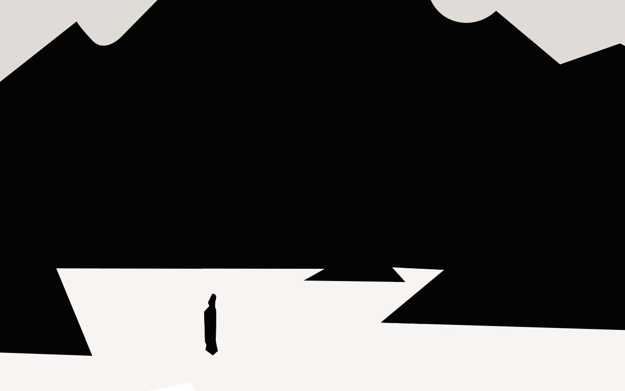
Long or wide shot:
This type of shot helps establish a general sense of the scene. It allows us to show the character within his or her context or surroundings and circumstances, answering questions like, where are we? Where is the action taking place? What type of elements will we have to interact with?
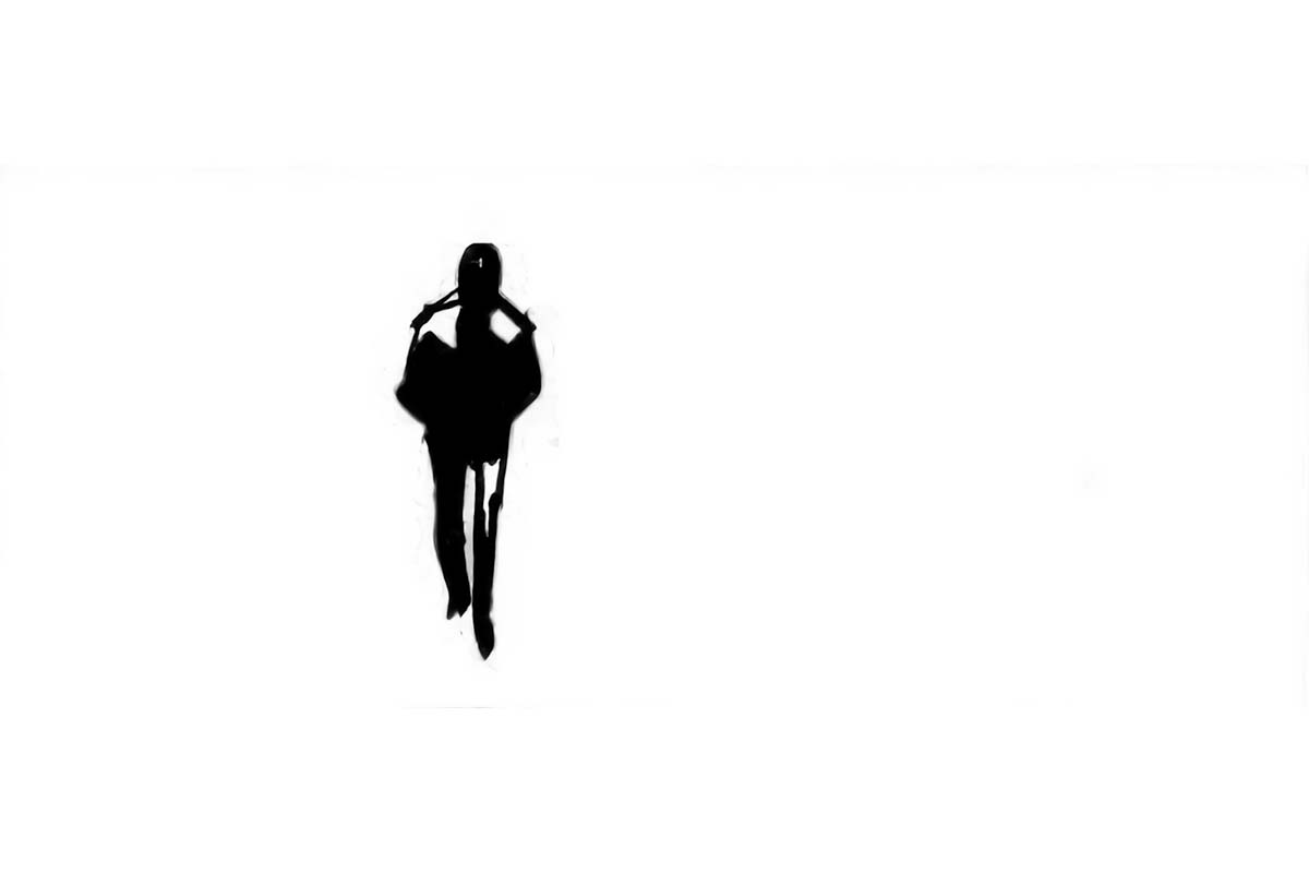
Medium shot:
This still offers a wide view, but elements that otherwise would interfere with the message of the shot are cropped out.
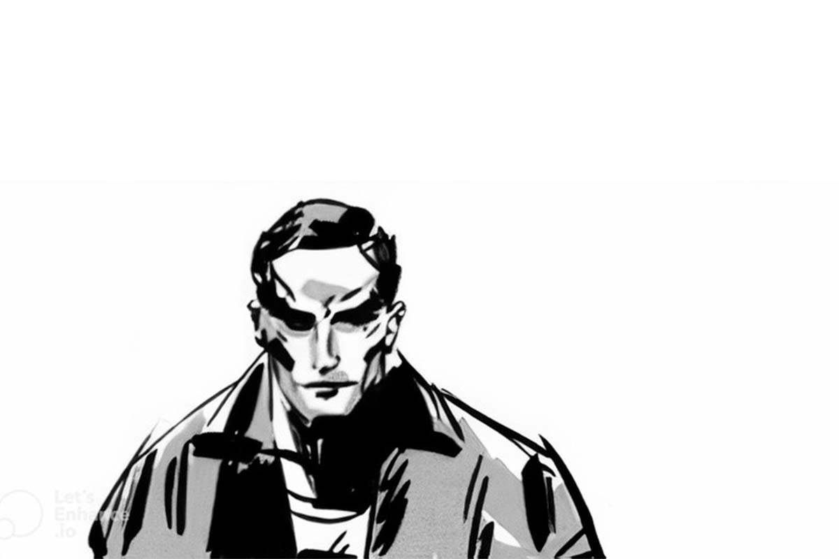
Close-up:
This provides a better feel for the features and the reaction of a character to a situation. At this point, the reaction will be more important to an audience than whatever caused it.
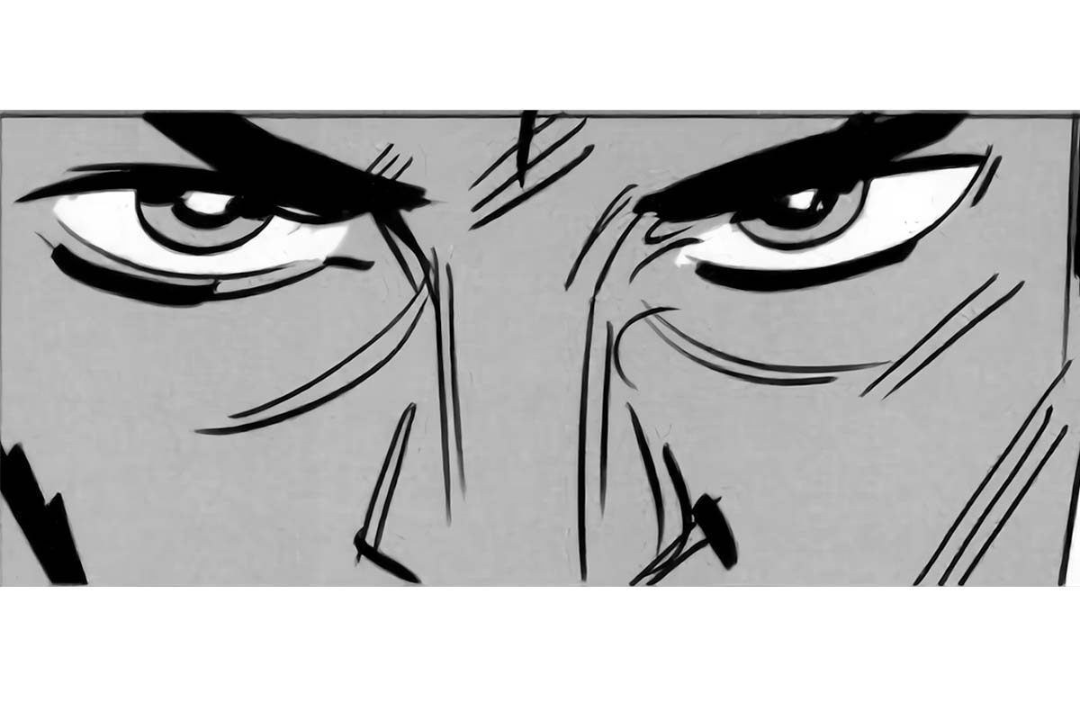
Extreme close-up:
Here, the audience will become one with the person on screen. Extreme close-ups are not the only way you can achieve this effect, as we always have other options, such as the use of a point-of-view camera.
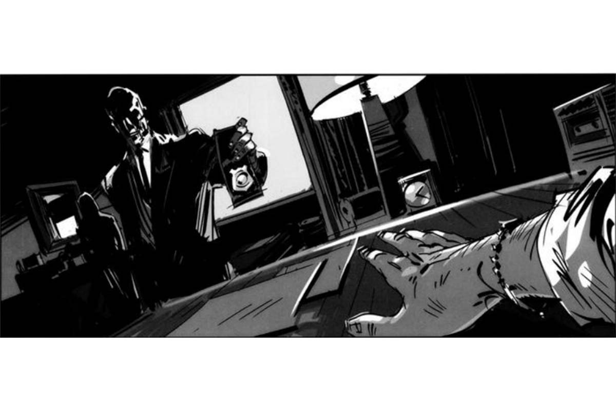
Cutting in:
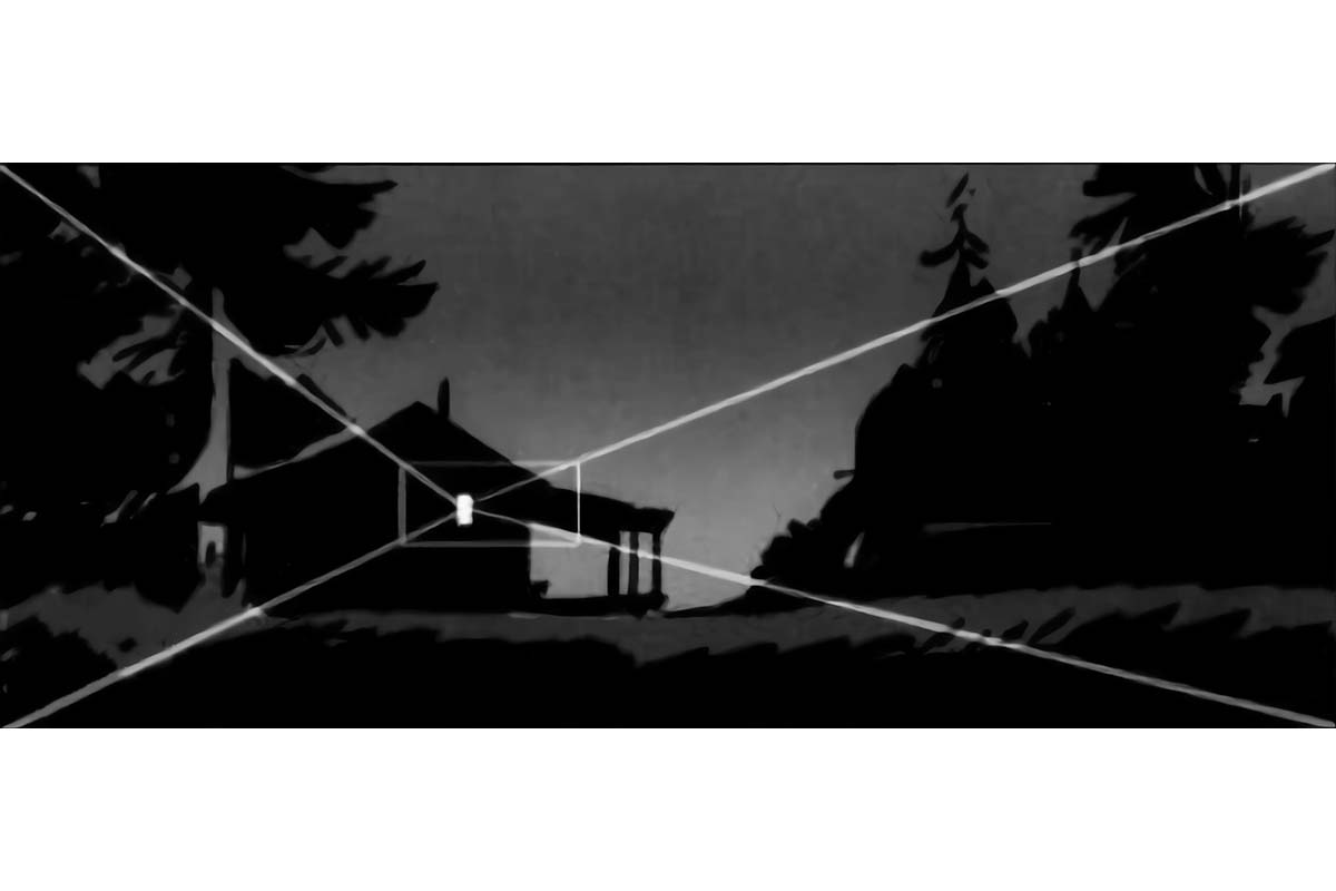
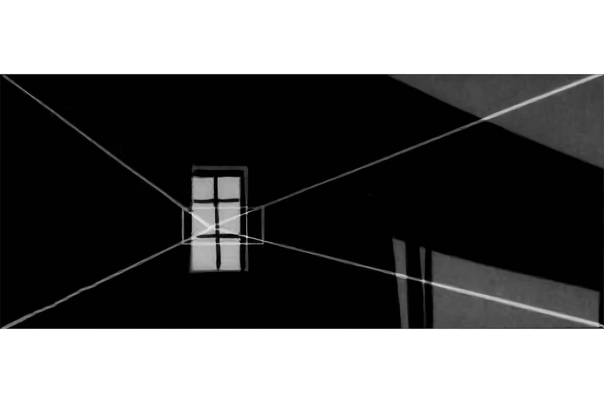
Sometimes, the moment will require us to jump close to a certain detail in the scene we are in. to better appreciate the expression of a character’s eyes or the subtlety of an object that will shortly become relevant in the development of the facts. In this case, we always make sure that the subject stays in the same position in both starting and ending frames proportionally within the measurements of the screen.
A Quick Word on Lenses
One last thing before we get into the analysis of specific compositions based on the elements we have seen before. Sometimes how we see things on the screen is heavily influenced by the lens you decide you use, even if the camera is in the same exact place and direction.
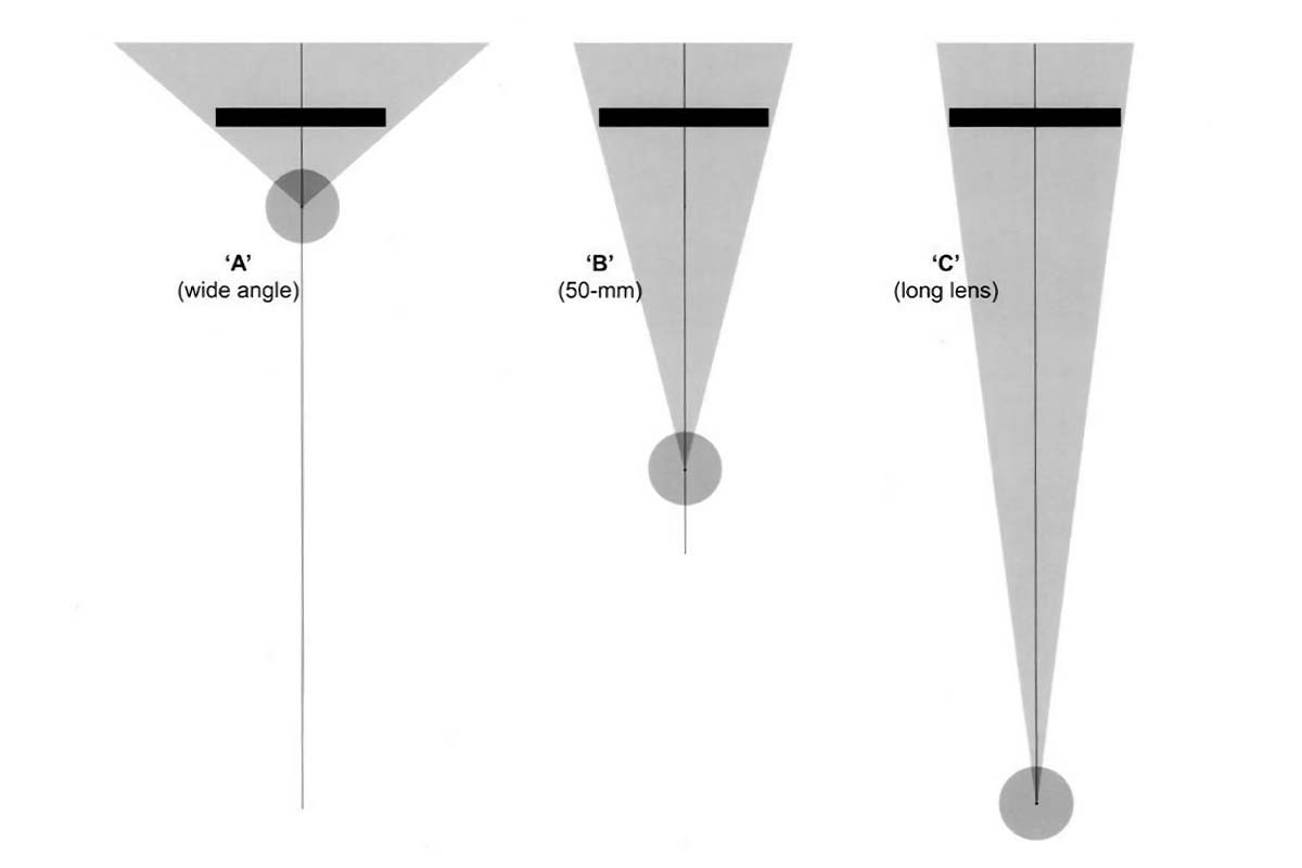
To simplify, we will mention the two extremes in a broad way, the wide-angle lens (A) and the long lens (C). right between them, the 50-mm lens (B).
Both wide and long lenses will give us distorted views of the objects in front of us in comparison with what we would normally see with our naked eye, each in a very different and distinctive way that will influence the effect and type of visual message we imprint on a particular bit of our narration.
The wide-angle lens literally includes a wider view of the subject it points at, from left to right and top to bottom. The long lens focuses on a much narrower portion of it. Therefore, in order to get the same section of landscape in both cases, The distance between the lens and the landscape will have to vary a lot from one to the other.
If we were to shoot a simple blank rectangular wall both with wide and long lenses, we would already see the difference because of the texture and the distortion on the sides of it, but it is the moment we position different elements at different distances from the lens, and from each other, then the example becomes most clear.
Here is how the same exact shot would look in three different cases:
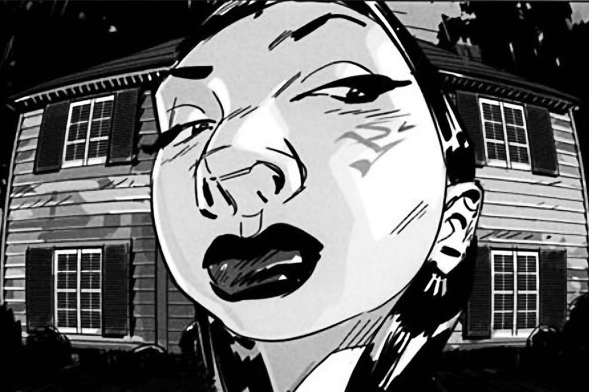
Here we used the wide angle lens and did include the whole house as an element in the scene. Let’s see what happens if we try to have the whole house in the scene using a long lens:
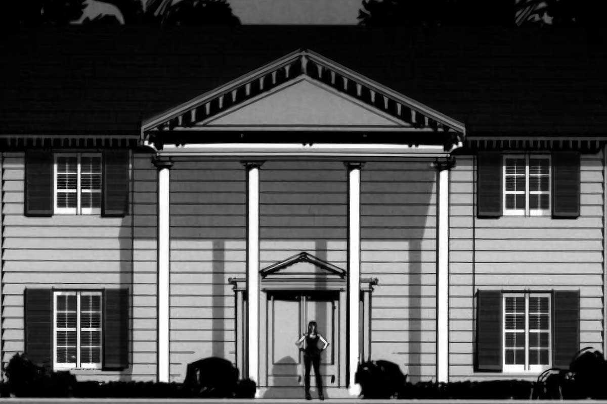
As you can see here, we tried to include the whole width of the house in the frame. The character and the house would appear to be in realistic proportion to each other since the distance between the two of them wouldn’t be relevant at all.
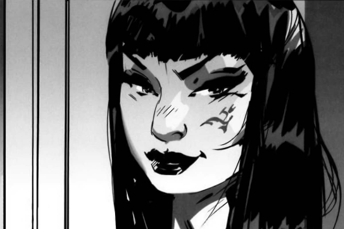
If the intention were to get the face within the frame as we did in the first shot, but from a far distance and with the long lens, we would still keep the realistic proportion between the girl and the background, barely seeing a little portion of the house.
Here we can conclude that if you want to create the composition of a scene in 3D animation pipeline, you have to have a clear idea of different lenses and how you can use these variations to your benefit and based on your needs.
Composing shots with a purpose
In this section, we will look at various examples and unwrap the details and techniques that have been used in that particular scene. Implementing things we have learned by now and learning new things you can do while creating the composition of a scene.
Looking to outperform your competitors with engaging, quick, and high-quality 3D animations? Well, look no further because that’s our specialty! Contact us to help you benefit your business with stunning 3D animation services.
Example I:
Let’s say we are trying to create an oppressive environment. We will try to create a composition that will visually strangle our character. in order to do that, we will come up with a basic distribution of the light and dark masses, as seen below.
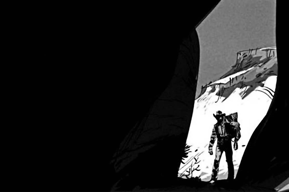
In a similar example but a different situation, we can have:
In the first example, we had our character entering a cave, all the lines lead to him, and the main and only focus is his arrival at a cave. That’s how we implemented a harsh and closed situation, While in the second example, we have the same composition but the reasoning for our oppressive environment is an opponent rather than the environment itself.
Example II:
Let’s see how we can compose effectively with the proper use of lighting, staging, framing, and other elements while directing the audience’s eyes toward our subjects of the scene.
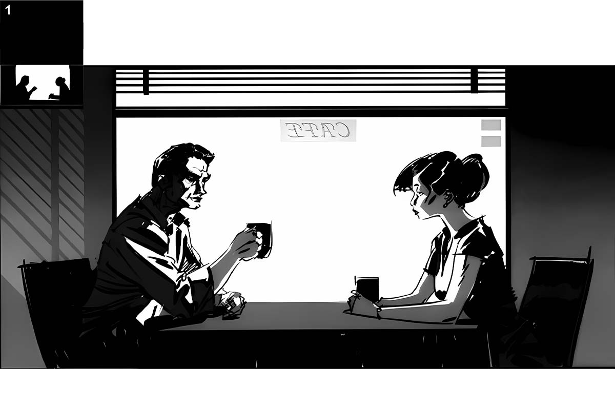
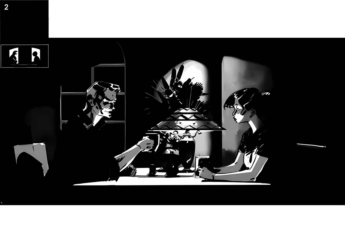
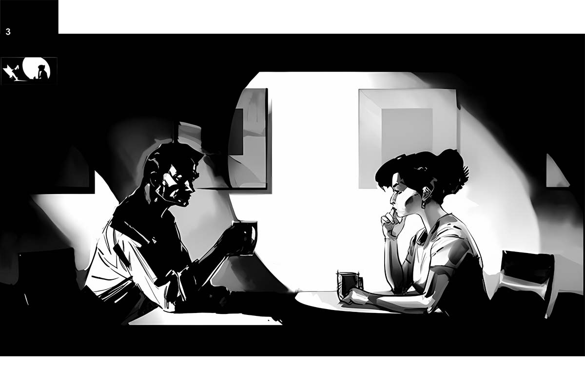
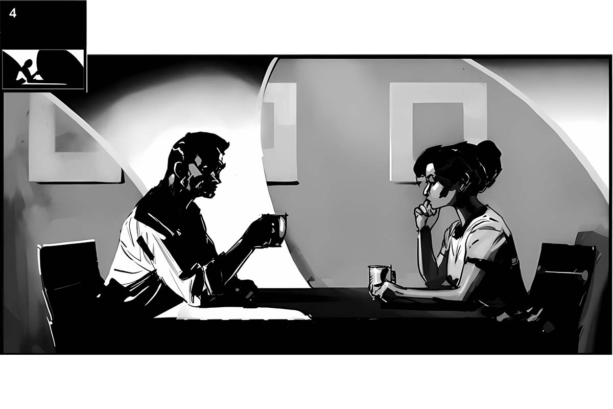
While composing, we have to consider that the scene should get a message across even without any dialogue involved. Let’s see what story each shot tells us:
1- If the space between them is clear of obstacles, the impression will be their communication is fluent and positive.
2- On the contrary, if we position visually heavy elements between the two characters, the visual dialogue between them will be somehow broken. The feeling will be accentuated the moment their respective backgrounds are different.
3- If one of them is lit while the other remains in the shadows, the lit person might have more positive intentions than the one who is not.
4- When one character is lit in a way that offers a bigger tonal contrast than the other one, our eyes will go straight to that person (in this case, the male character), giving him a bigger visual relevance.
Taking Your Compositions to The Next Level
There might be a certain action embedded in your scene that you have to convey and amplify, in order to capture your viewer’s attention and give them an experience rather than a visually stunning artwork to look at, as said before.
Up until now, we looked at different basic shot angles and discussed various situations, But here we will see some high-level examples of composition which will go beyond the basics.
Anticipation and action:
This particular situation can be different depending on the action itself. Maybe we are breaching into a house, or, like the example below, we are running away from some people and many different scenarios.
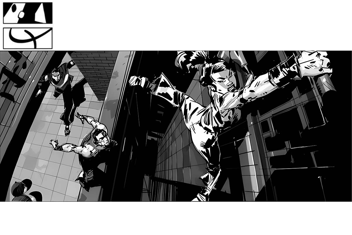
Here we can see that the three characters involved in this street chase are simultaneously taking the position that the character ahead of them was holding barely the second before. Also, if we drew a line going across their three heads, we would see it follows a U-shape direction.
As you can see, this is not the typical composition we see on basic levels, like said before. Rules are meant to be broken!
Using The Negative Space:
Negative space is, in fact, the surface that is supposed to be the least relevant in a scene, that is, the space outside and between the elements that are considered to be the main focus and subject of the composition. But negative space can often be used as a very active part of the message. Here are a few examples:
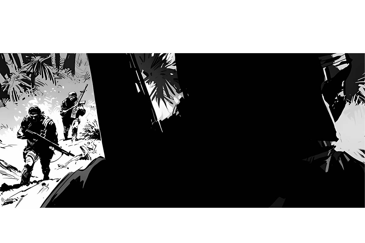
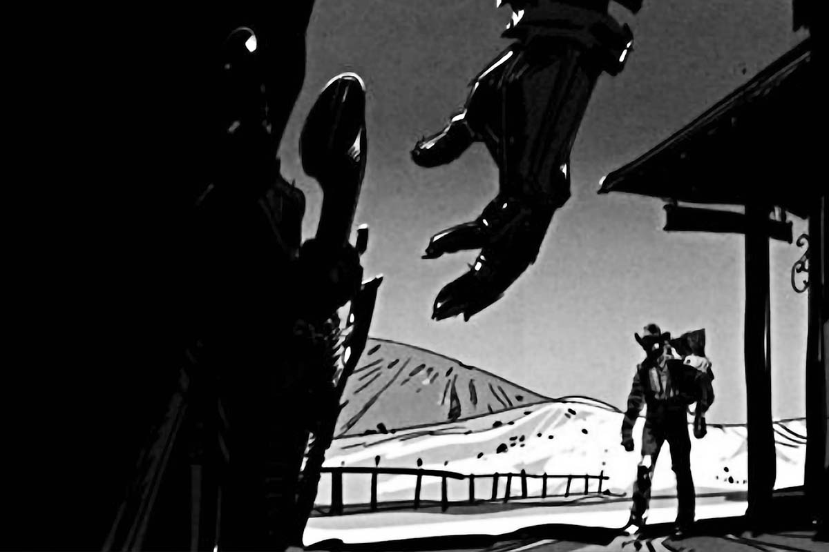
While the soldier in the foreground is the most prominent figure, we also use him as a device to frame the other two who follow. The extreme size difference in the frame between these two groups adds drama and tension by contrast.
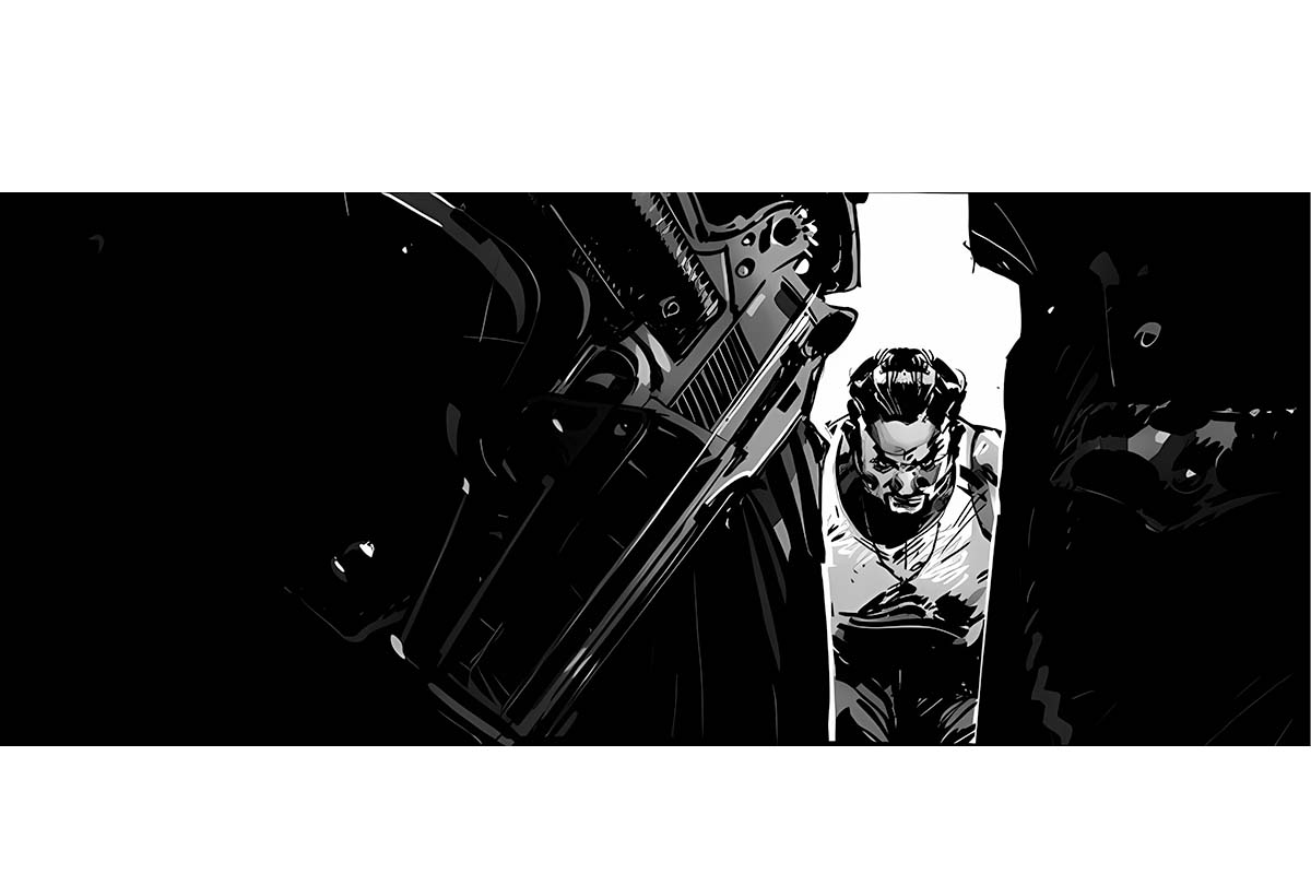
Here, an oppressive atmosphere is achieved by positioning these “armed man” in an extremely tight frame created by the backlit bodies of the cops in the foreground. The man becomes even more vulnerable the moment we make him only exposed to the light. And, of course, the gun adds even more tension to the scene.
While we discussed only two examples of different types of shots, there are many other ways to create a scene.
For example, we have complex and simple compositions, order and chaotic compositions, and angular vs. curved compositions, which you can make by using the right lens, as we discussed before. You should surf around the internet or try to find the shots within published animation by Pixune 3D animation studio or other animation publishers out there.
Conclusion
In conclusion, composition is crucial in 3D animation, serving as a visual symphony that tells a story and evokes specific moods and emotions. While it is important to create high-quality art, the primary focus should be on conveying a clear narrative and eliciting the desired audience response. Consistency throughout the animation is key, as it establishes the tone and sets the stage for the storytelling experience.
By understanding how we perceive the world and utilizing different shot angles, framing, and lenses, animators can effectively manipulate the audience’s perspective and create compelling compositions. Whether through wide shots to establish a scene, close-ups to convey character reactions, or extreme close-ups to immerse the audience in the experience, each composition choice should serve a purpose within the story.
