The notion of minimalist game art in the realm of game development has left its mark as a substantial design philosophy emphasizing simplicity, clarity, and the importance of the most basic elements. And indeed Minimalist game art does all those things, favoring straight lines, shapes, and a limited palette, the big advantage of which is providing visually appealing and highly stylized gaming experiences.
In an age where video games are all about the best graphics and realistic appearances, the minimalist style has served as a calming, laid-back answer to it all. Games such as Monument Valley, GRIS, and Superhot have won worldwide acclaim for their minimalist design.
So what makes minimalist game art, and how can developers and artists harness its principles to deliver great and immersible gaming experiences, In this Ultimate Guide, we’ll demystify the principles of Material Design and show you how you can use them in your projects.

Need Game Art Services?
Visit our Game Art Service page to see how we can help bring your ideas to life!
Simplicity through Geometric Shapes
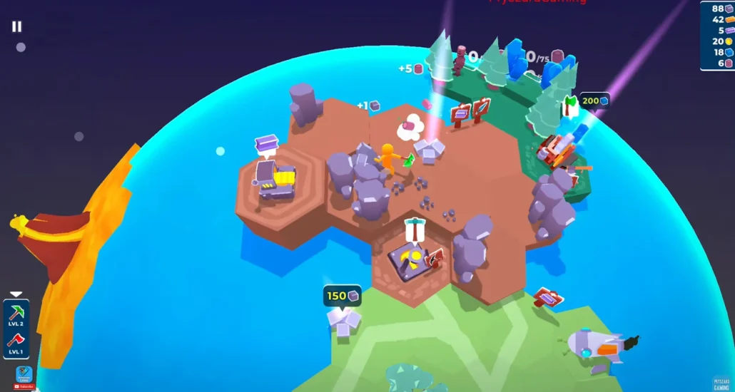
The heart of minimalistic game art is balance based on the utilization of basic geometric shapes to compose environments characters, and objects. Circles, squares, triangles, and other such low poly shapes become a language artists use to express the most complex ideas and the most grandiose structures in an extremely simple and elegant way.
Minimalistic artist uses fascination with geometric shapes to help create order and balance in their designs. Basic blocks and soft edges provide clear visual feedback that aids players in perceivably understanding and navigating the game world.
Fan-favourite Monument Valley is arguably the most high-profile example of this, with a puzzle game that persuades players to move through a world composed entirely of impossible geometric shapes. Its beautiful minimalism allows for the puzzles to be a little bit surreal, and contain a spark of magic that only this powerful style allows.
Restrained Color Palettes
This often means using less than 15 colors in the entire game (for example, 3 shadows, 3 medium tones, 3 lights, 3 accent colors, and 3 shades of white) Not only does this emphasize the unpolluted simplicity of minimalist design, but it also permits artists to be surgical with color – to set a mood, an environment and to draw the player’s gaze.
Artists can achieve a visual sense of harmony and oneness in the game world by restricting the color palates. Contrasting bright colors can make key elements of your game pop out and attract your player’s attention, while muted or desaturated colors may have the opposite effect, making the game more moody or subdued.
In other words, the nearly monochromatic vibrancy of GRIS and Limbo creates a unique visual style that is both emotionally engaging and deeply memorable. In GRIS we see a ship where the color palette changes as the protagonist progresses on her emotional journey while in the case of Limbo, the monochromatic look of it causes an eerie and palpable sensation.
Negative Space and Minimalism
One of the most important aspects of minimalistic game art that makes games visually more calming and those are the areas, negative space, around objects. Artists can use negative space to highlight what is the most important to focus on in the world while filling gaps for the mind and helping create a believable space dimensionally.
Robbie and I believe in good use of white space; as key ways to utilize white space is to give your space a minimalist vibe and make it seem extra constray, which are both important beliefs in mid-century design. Blank negative space can also be used to suggest breathing room and let the player mentally fill in the rest.
The indie smash Limbo is an industry-defining example of the efficient use of negative space in minimalist game art. Its minimalist line-art graphics, with a clean black-and-white palette, make it a spooky, haunting place and it leaves the rest to your imagination.
Employing Flat Design and Stylized Aesthetics
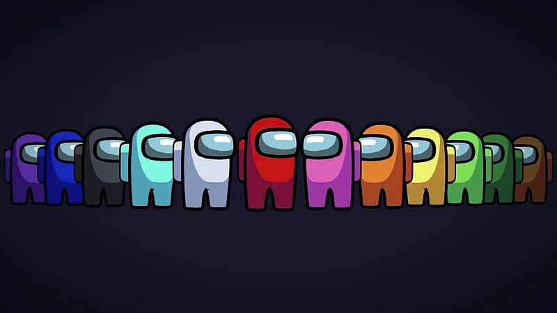
Game art that takes a minimalist approach usually looks like this: flat design, and no realistic textures, but more stylized and simplified. Taking visual cues from mid-century modern art and design movements, the flat design style builds a striking and unique aesthetic that separates minimalist games from the over-the-top stylizations frequently found in photo-real games.
Through flat design, artists can make the game world look more visually cohesive and unified, but flat design also adds a sense of timelessness to the game while still looking new and contemporary. With none of the clutter from complex textures or lighting effects, players are left to concentrate on the core gameplay mechanics with less visual noise.
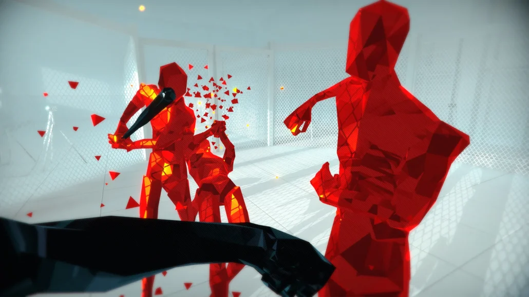
Superhot and Thomas Was Alone are great examples of flat design and stylized aesthetics that translate to unique and memorable gaming experiences. The dichotomy of the game’s minimalist visual design and unique time manipulation mechanic makes it one of the most striking and visually stimulating games to play.
Focus on Functionality and Visual Hierarchy
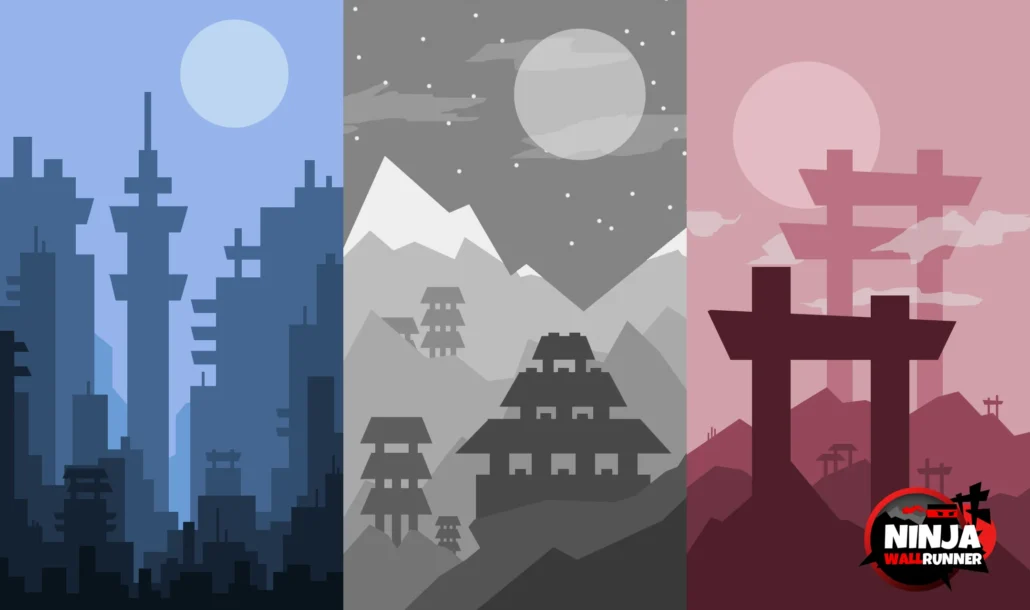
In minimalist game art, every element of the graphic simplification is designed to enhance the functionality of the game, and each contributes in its own way to provide you with an excellent gameplay experience. This focus on the utility of design also means that artists must take special care in the visual hierarchy of the game making sure that key information and cues are communicated to the player.
Visual Hierarchy comes through contrasting Shapes, Sizes, Colors, and arrangement in the game Environment. A minimalist approach allows artists to present important information that their players will notice first and that will help them orient themselves within the game.
Baba Is You, the puzzle game, shows how functional design and visual hierarchy work effectively in minimalist game art. The game features stripped-back block-based visuals and a substantial amount of visual feedback to make sure players grasp the rules and mechanics quickly and get on with the core challenging puzzle experience.
Storytelling through Symbolism and Abstraction
Minimalist game art can look superficially plain and sparse but often is quite symbolic and abstract if you investigate the narrative and thematic depths. By distilling art to its bare essentials and concentrating on iconic forms and shapes, minimalistic images can convey rich metaphors and symbolism, which reach out to the players on an emotional and intellectual level.
This approach to storytelling through symbolism and abstraction permits minimalist games to inherently consider difficult subjects and thoughts while avoiding to some extent the use of common narrative structure and overly expositional game design. This in-game visualization is supposed to provoke player to see the game in a bit more interpretational and subjective way and find their own ideas and conclusions in the games’ abstract visuals and symbols.
For hardcore gamers out there, Journey and GRIS are two clear case examples of how minimalistic game art can be used to tell moving stories and evoke powerful emotional responses through symbolism and abstraction. In Journey, the player embarks on a metaphorical journey, facing abstract landscapes as an allegory for the challenges one faces in life, or to find some higher purpose.
Case Study: Monument Valley
Monument Valley is a genuine treasure of elegant minimalist game art. This successful masterpiece essentially delivers optical illusions, impossible architecture, and unique minimalist artwork, thus distilling the essence of this design concept through the creation of Ustwo Games.
Monument Valley, by comparison, is about geometric shapes, at its heart, those blocks being rearranged to create landscapes out of cubes, cylinders, and other simple shapes. This additional restraint in the color palette, heavy on muted pastels and warm neutrals helps the EarthBound-inspired title truly take on a serene and harmonious harmony.
Negative space speaks to the psychology of a game player – it focuses on their vision while simplifying the experience. The essential puzzle elements, on the other hand, sprawl wide with caverns of negative space, creating a sense of visual clarity in a way, but a more mysterious and oniric atmosphere.
Characters and objects are flat silhouettes laid atop geometric landscapes rendered in the game’s flat, two-dimensional style, which only underscores the minimalism at play here. The flat design of Snowprint also plays nicely with the optical illusions that make up the bulk of Monument Valley’s puzzles.
Symbolism and abstraction are used throughout the game to tell the story and the themes. These levels and environments are visual metaphors, and represent ideas like perseverance, perspective, and enlightenment, prompting the player to read more into them on a personal level.
Most notably, Monument Valley demonstrates the basics of good design and visual hierarchy. Each serves a distinct purpose, either as visual cues or paths for players, as well as an image of which solutions to attempt for puzzles This simple trick of using opposing colors, shapes, and areas strategically forces the players gonna look in a certain direction which in turn relies on some crucial info to communicate effectively.
A master class in minimalism, Monument Valley is a case in point that sometimes less is more and that stripping away the need for flashy visuals and convoluted dynamic gameplay can in turn make the more essential elements inherently more engaging to prospective players.
Conclusion: Minimalist Game Art is a Powerful Tool
Game art minimalist in nature is an incredibly potent design philosophy, one that provides developers and artists with a polished system to produce powerful and visually impactful worlds that mesmerize players and engage emotion. Through simplicity, geometry, minimal color schemes, negative spaces, flat design, and symbolic reduction, minimalist artists can design games that emphasize clarity, attention, and emotive power.
These basic principles of minimalist game art can explore new creative avenues – from approaches to game design to visual storytelling, anyone can learn from the seasoned developer to the aspiring artist.
If you need help with your game project’s art, minimalist or otherwise, we’re here to help. Pixune offers a wide range of game art outsourcing services, from concept art to 3d modeling and beyond.

