Skip to content

Captivating 2D Game Art: An In-Depth Look at Styles

Captivating 2D Game Art: An In-Depth Look at Styles

TABLE OF CONTENTS

A 2D art style refers to visual artwork that is created in two dimensions, focusing on height and width without depth. From charming pixel art to dazzling vector graphics, the art style brings a 2D world to life. But with so many 2D game art styles, each with its own charm, how do you choose? What techniques elevate each style from good to great? This deep dive explores popular 2D game art styles along with tips to make your game visuals truly captivating.

While art styles between 2D and 3D share similar characteristics, this article talks about 2D styles:

  • Pixel Art
  • Vector Art
  • Hand-drawn Art
  • Isometric Art
  • Cel-Shaded Art
  • Monochromatic Art

Pixel Art: Capturing Retro Charm

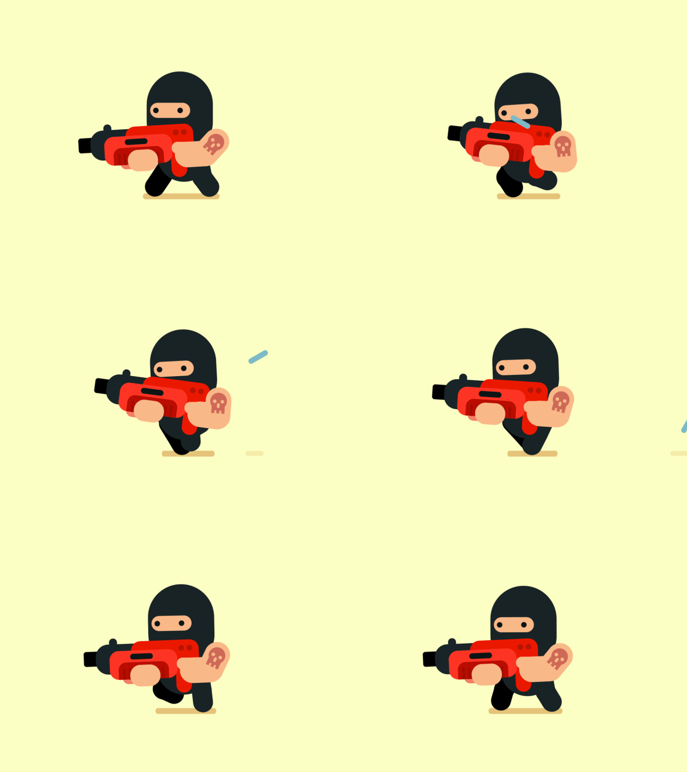
Pixel Art

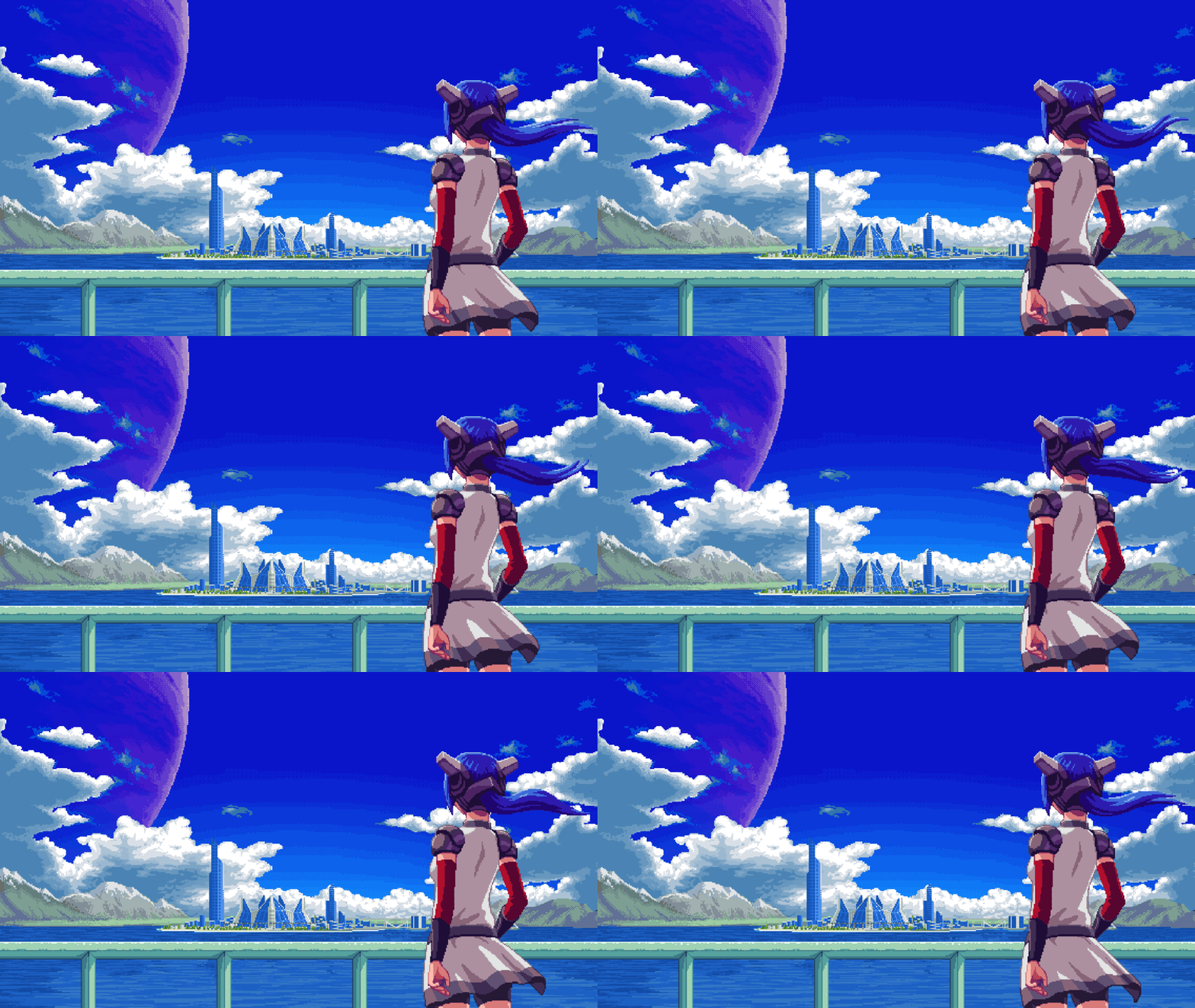
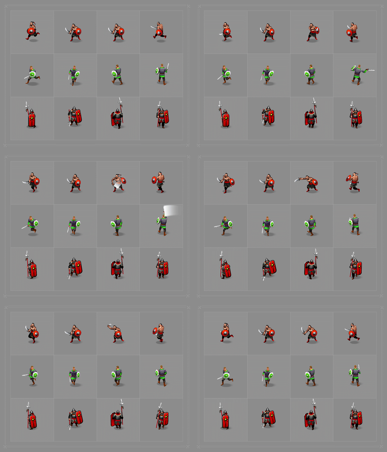
No discussion of 2D art services is complete without pixel art. Once merely an artifact of hardware limitations, visible pixels now create intentional retro charm.

What defines this iconic style? Large, chunky pixels immediately evoke classic games. Sharp edges and blocky shapes make elements feel tangible even when stylized. Colors often draw from rich, saturated retro palettes for vibrance within constraints. Clean dithering mimics shading and textures. Imperfections like bleeds become part of the aesthetic rather than issues to avoid.

Composition focuses on simplicity for legibility with limited resolution. Less detail directs attention and imagination to the action. Animation prioritizes expression over slavish realism. Overall, pixel art design services elegantly convey ideas and style through simplicity.
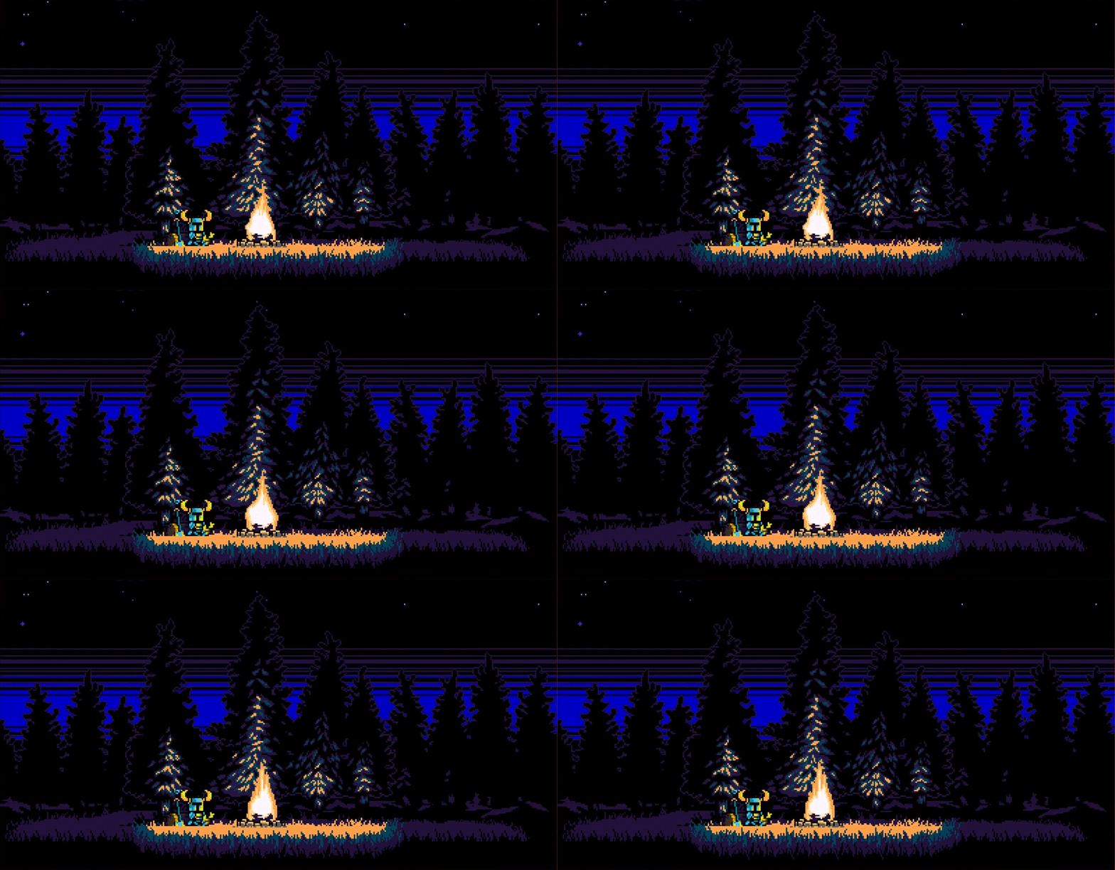
Modern pixel art strikes a balance between intentional roughness and current polish. While recalling early game nostalgia, masterful pixel art disguises meticulous work behind its retro facade. Hints of depth, lighting, and bounce bring environments to life. Careful animations allow retro characters to emote distinctly despite blocky limits. Beautiful skies and parallax layers add subtle movement. Vibrant post-processing makes elements pop off the screen.

Pixel art squeezes massive visual impact from seemingly simple elements. It’s a style with retro charm, and modern polish, kind of like low poly game art for 3D styles.

Tips for creating truly stellar pixel art:

  • Design major elements large enough for clarity when zoomed. Favor defined silhouettes.
  • Use color contrasts between elements for separation. Vivid but limited palettes.
  • Animate with intention, not perfection. Focus on lively expressions over realism.
  • Stylize shading subtly with dithering and bright highlights.
  • Imply depth through background layers and perspective tricks.

Great Pixel Art Games:

  • Shovel Knight (2013) – A love letter to 8-bit platformers with colorfully chunky retro graphics.
  • Hyper Light Drifter (2016) – Evokes SNES classics with its vividly pixelated sci-fi world.
  • CrossCode (2018) – 16-bit RPG glory focused on expressive characters within chunky constraints.
  • Celeste (2018) – Standout pixel art in a brutal but charming platformer.
  • Dead Cells (2018) – Impressively fluid combat animation despite intentional retro pixel limits.

Vector Art: Super-Smooth and Scalable

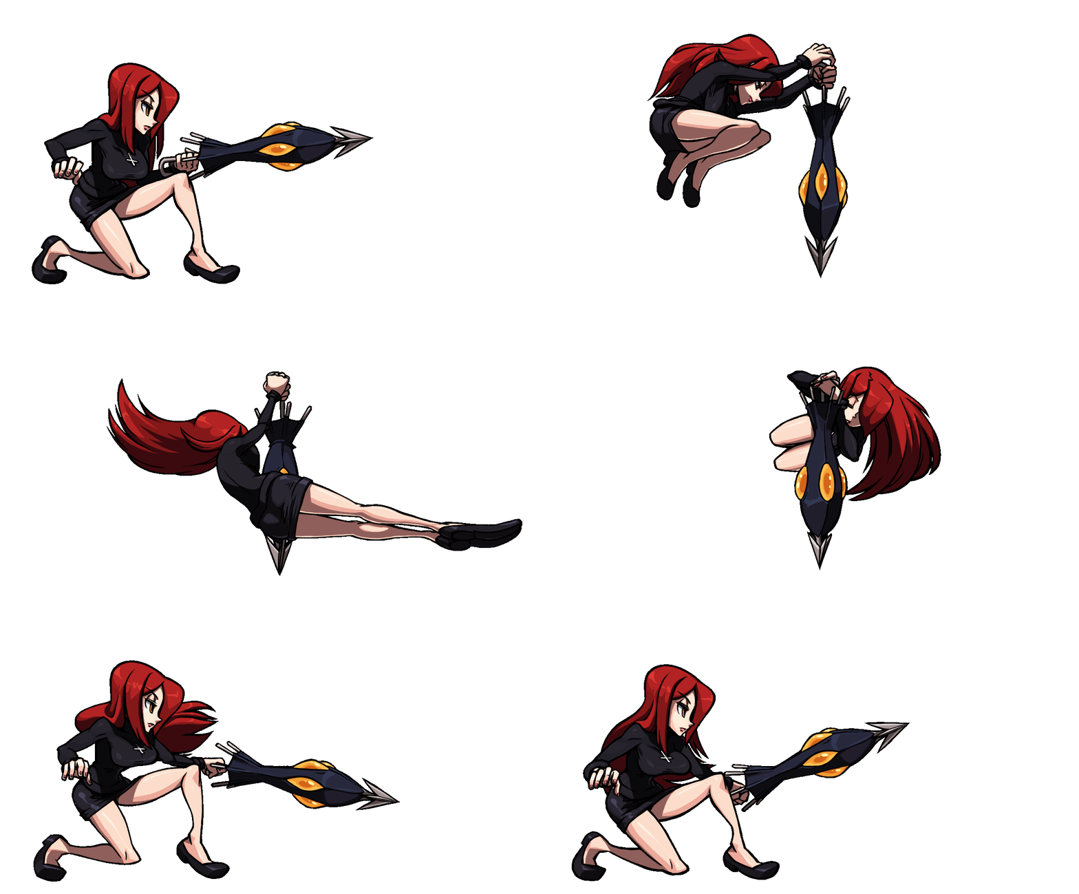
On the opposite end of pixel art’s rugged pixels lies the impeccable smoothness of vector art. Instead of fixed bitmaps, vectors allow 2D assets created from mathematical lines and curves. But what are the benefits of using such a crisp game art?

First, vectors remain editable and infinitely scalable without losing quality. Game elements gracefully resize for any platform or resolution. Vectors also enable ultra-fluid animations unrestricted by jagged edges. File sizes stay compact yet allow extensive editing. Combined with sophisticated shaders, vectors imitate countless styles in illustration services.

Vector art projects clean elegance prized in games like Cuphead. Precisely defined shapes, typography, and lines construct polished aesthetics. Vectors excel at geometric structures but also handle flowing elements like hair or smoke. Layers keep assets modular for animation. Post-processing adds flair, like paper or canvas textures. In masterful hands, vector art achieves refined game visuals impossible with other mediums.

Tips for creating stellar vector art:

  • Economize lines and shapes. Rely on suggestion over realism.
  • Use layers for consistency, swapping mouth or eye shapes, for example.
  • Animate on “ones” for liquid smooth movements and transformations.
  • Apply decorative post-processing like ink splotches or noise.

Great Vector Art Games:

  • Skullgirls (2012) – Gorgeous vector-based fighter with lush illustrations.
  • Castle Crashers (2008) – Comically drawn fantasy characters in a vibrant vector world.
  • Transistor (2014) – Futuristic vector environments and characters ooze style.
  • Bastion (2011) – painterly vector visuals create a distinctive fantasy world.

Hand-drawn Art: Personal Style Through Imperfection

On the reverse side of vector art’s precision lives the beautiful imperfections of hand-drawn art. Rough strokes, irregular lines, varying pressures – these organic touches communicate personal style.

Traditional media like pen, pencil, and paint create natural textures, impossible to imitate digitally. Animating frame-by-frame adds life through minor inconsistencies. Familiar tools like colored pencils also tap into childhood nostalgia. Objects draw in imaginative shapes and proportions over realism. Richly personalized, hand-drawn art brims with heart.

Hand-drawn game art rewards devotion with heaps of intimate personality.

Yet maintaining consistency across a game poses challenges.

Some tips for killer hand-drawn art:

  • Establish style guides early for main characters and elements.
  • Use layers to touch up scanned sketches and refine pieces.
  • Animate carefully to avoid continuity errors that break immersion.
  • Consider working digitally from the start for more flexibility.
  • Add charm through small imperfections – nothing’s 100% perfect!

Great Hand-drawn Games:

  • Gris (2018) – Watercolor dreamscapes bursting with fluid personality.
  • Genesis Noir (2021) – Whimsical black and white worlds full of heart.
  • Little Acre (2016) -The Little Acre is a hand-drawn adventure game from the creator of Broken Sword

Isometric Art: Faux 3D from 2D Assets

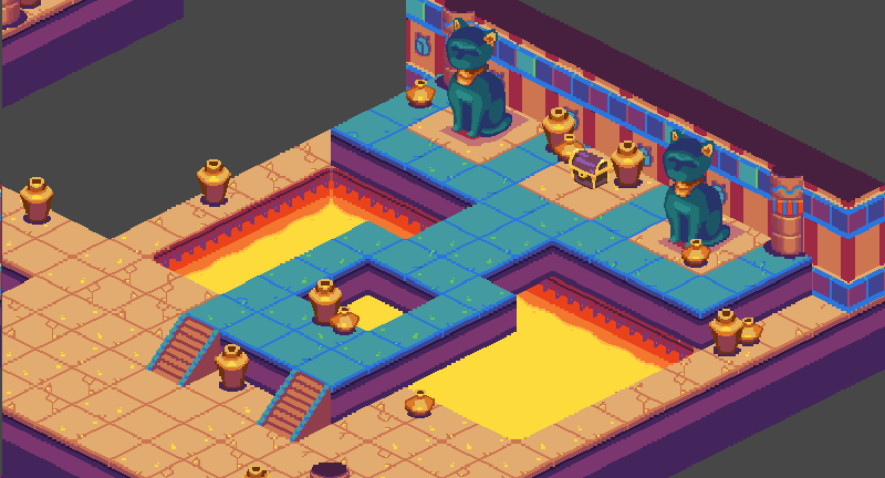
Isometric art leverages a specific viewpoint to conjure pseudo-3D depth from 2D game art. By adhering to a consistent 30-60 degree angle, isometric art implies three-dimensional space while remaining truly 2D.

This angled viewpoint provides the illusion of depth. Assets shrink proportionally towards the background, further suggesting distance. Overlaying assets at different scales enhances depth. Dual-side rendering completes the effect for objects and environments to feel tangible from all directions.

However, isometric art poses animation challenges. Walk cycles must show forward, backward, and side motion without revealing unfinished sides. Layers help, separating characters from backgrounds. Movements often burst in short loops to minimize duplicating frames. With care, isometric art conjures pseudo-3D appeal completely from 2D art.

Tips for creating stellar isometric art:

  • Use grid guides religiously to nail the perfect 30-60 degree angle.
  • Render backgrounds and assets as separate layers for maximum flexibility.
  • Reuse assets when possible – chairs often reuse a table’s wood texture, for example.
  • Animate in short, efficient loops to avoid excessive frame duplication.

Great 2D Isometric Games:

  • Hotline Miami (2012) – Brutal top-down action on isometric blood-soaked floors.
  • Fallout (1997) – Set the standard for isometric post-apocalyptic atmosphere.
  • SimCity (1989) – The classic city builder viewed from an isometric perspective.
  • Diablo (1996) – Isometric action-RPG with a brooding gothic aesthetic.
  • Civilization II (1996) – Sprawling empire management via isometric god view.

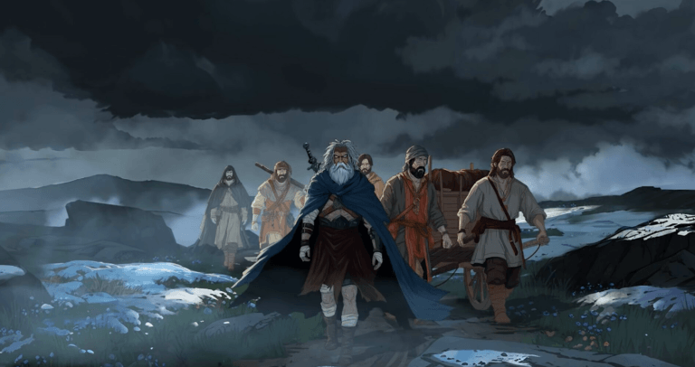
Cel-Shaded Art: 3D Style With 2D Charm

Cel-Shaded Art

While technically 3D, cel-shading renders models to emulate 2D hand-drawn animation. Dark outlines exaggerate forms. Shading uses discrete regions of flat color rather than gradients. The result feels stylistically 2D.

Cel-shading imparts comic book or cartoon appeal. Clean colors contrast with bold contours to define shape and depth. Stylized models and textures simplify details. Animations can exaggerate physics comically. The medium merges 3D technology with 2D aesthetics.

Great for games desiring 3D fluidity but 2D personality. It Can feel excessively flat without lighting variations and textures. Difficult to convey gritty realism, but excels at imaginative style.

Tips for creating stellar cel-shaded art:

  • Use bold outlines that cleanly divide color regions.
  • Employ flat shading with limited gradations for a clean style.
  • Design stylized models removing noise and fine details.
  • Take advantage of texture filtering for art style cohesion.
  • Animate with exaggerated motions befitting the medium.

Great Cel-Shaded Games:

  • Dragon Quest XI (2017) – Akira Toriyama’s charming creature designs cel-shaded.
  • Jet Set Radio (2000) – Cel-shading brought cartoon graffiti to life.
  • The Legend of Zelda: Wind Waker (2003) – Nintendo’s cel-shaded Zelda leaped off comic pages.
  • Ni No Kuni (2010) – Vivid character animations resemble hand-drawn favorites.
  • Gravity Rush (2012) – Manga-inspired characters soar through cel worlds.

Monochromatic Art: Minimalist Style

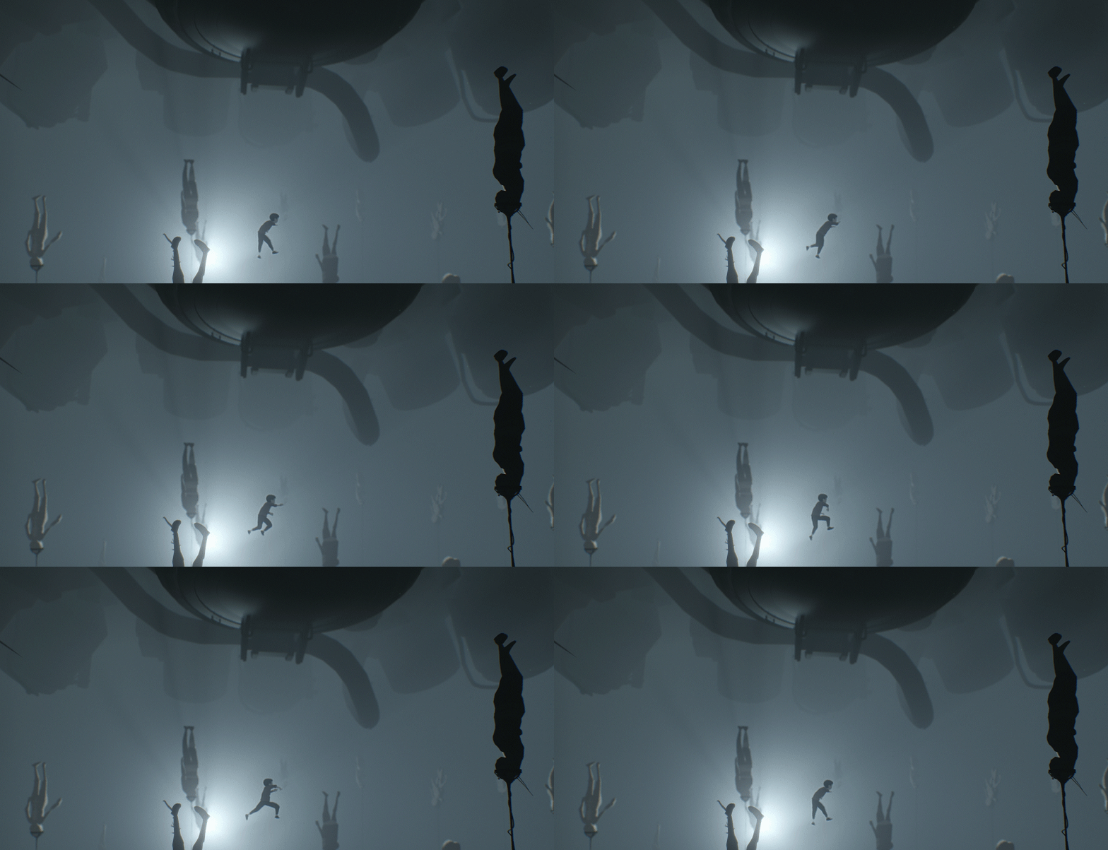
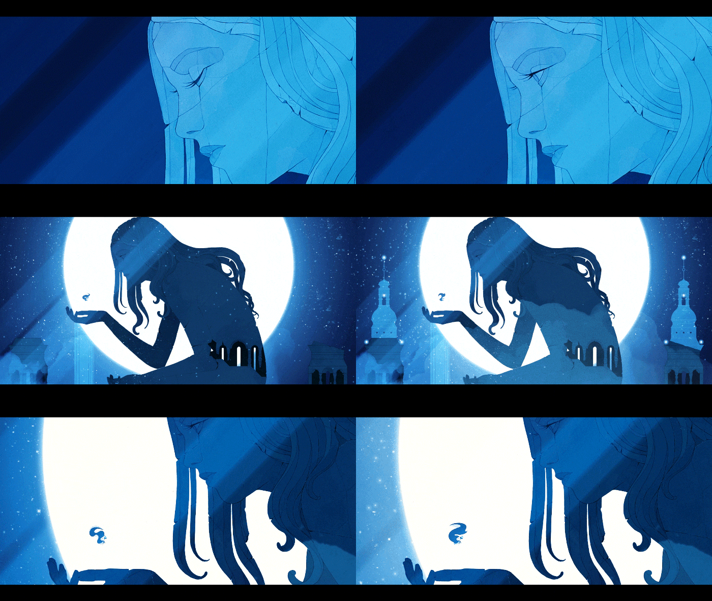
Monochromatic art employs only one dominant color and its shades for bold, minimalist style. Without the distraction of hue variation, focus zeroes in on form, light, and shadows.

High contrast lighting sculpts shapes and adds depth. Details emerge in tones and textures instead of colors. Negative space amplifies the solitary color’s impact. Composition and silhouette hold power over vibrance to direct the eye.

Monochromatic art exudes a brooding mood when darker. But it also pops brightly for playful aesthetics. Clean and bold, it conveys visual impact through precision.

Tips for creating stellar monochromatic art:

  • Use high contrast lighting and rich blacks to accentuate form.
  • Rely on subtle value and texture variations instead of hue to define details.
  • Leverage negative space around subjects to further focus attention.
  • Carefully compose silhouettes and shapes to convey visual impact.
  • Animate layers and overlays to add depth and parallax motion.

Great Monochromatic Games:

  • Inside (2016) – Silhouetted grayscale environments drenched in atmosphere.
  • Year Walk (2013) – Haunting black and white folklore scenes come to life.
  • Lyne (2014) – Soothing monochromatic puzzles with calming ambient music.
  • Echochrome (2008) – Sleek monochromatic aesthetic for perspective puzzles.
  • Spewer (2018) – Vibrant monochrome worlds full of goopy creatures.

Choosing the Right Art Style: A Quick Guide

With so many captivating art styles to choose from, how do you select the perfect fit for your game? Considering these key factors should help you decide on the right one:

Mood and Emotion: The visuals should complement the experience you want players to have. A cheerful cartoon world won’t match a bleak horror story. Make sure the style evokes the right emotional response.

Inspirations: Think about the games, animation, and art that get your creative juices flowing. Their styles likely resonate with you for a reason.
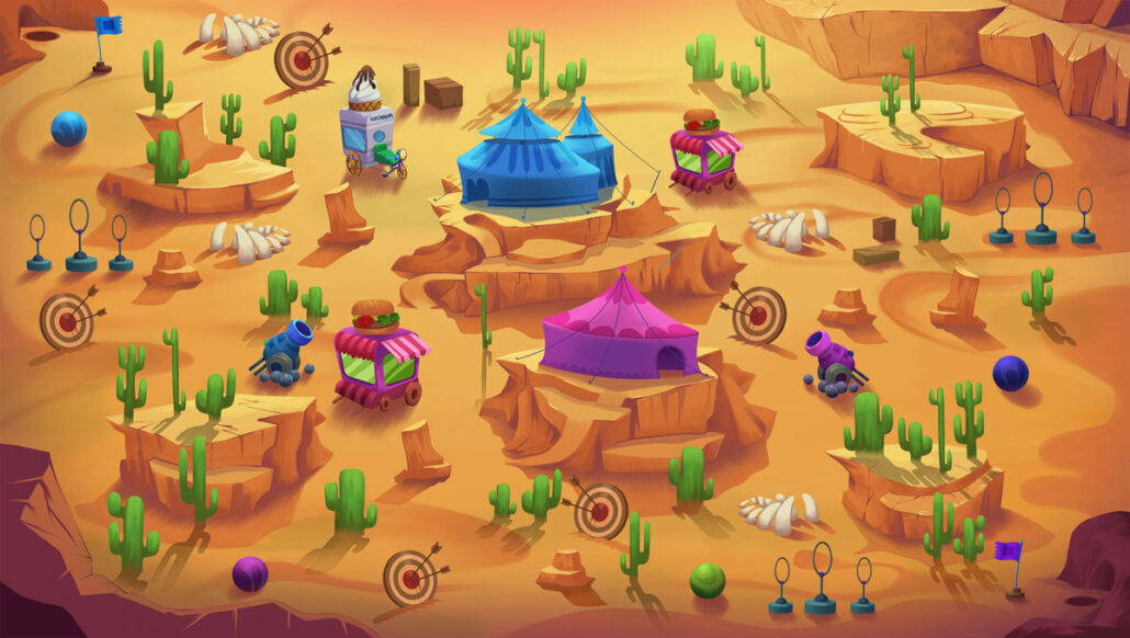
Crazy Clown Desert Map by Pixune

Story and Gameplay: Game art styles should support the narrative and mechanics. Realistic graphics may clash with fantastical stories while cel-shading could jar with gritty gameplay.

Team and Budget: Play to your team’s artistic strengths and pick a style achievable within budget constraints. A small team can better execute a simple retro pixel art game than a big 3D open world.

Timelessness: Some art styles age better than others as technology progresses. Cel-shading’s clean lines hold up better than early 3D graphics. Consider long-term appeal.

Variety: Can the style be adapted to convey diverse environments, characters, and moods? Or does it limit you to one specific look?

Conclusion

We’ve only scratched the surface of the artistry powering stunning 2D games. But hopefully, this overview illuminates creative possibilities and gets your imagination flowing. Making amazing game art takes dedication – but foundations like color theory, shape language, and composition apply across tools and styles. Build those foundations while exploring techniques that excite you the most. Never stop learning, and push limitations to take 2D art where no one has gone before!

What art styles or methods intrigue you most? Any pro tips for aspiring 2D artists? Let’s chat more in the comments below!

Was this article helpful?
Thanks for your feedback!

Author

  • Behnam Mehrafrooz

    Behnam is a game designer, a storyteller, and a pizza lover. He loves diving deep into a pile of text to find the right answers. A diehard Warhammer fan and a tireless eco-warrior.⁣ Beside designing games for the smartphone platform, Behnam has been passionately writing about everything related to the game industry for +5 years.

    View all posts

Let's Start A Project Together!

Let’s start a project together!

Message us and receive a quote in 24 hours