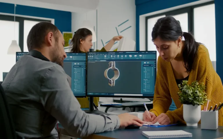
Staging is one of the most important principles among all 12 principles of animation. It refers to the composition and positioning of elements in a scene to direct the viewer’s attention and clearly tell the story. While staging may seem straightforward, it involves thoughtful consideration of many visual elements and techniques. When done effectively, staging creates dynamic scenes that immerse audiences in the animated world. Let’s explore the key aspects of stellar animation staging.

Need Animation Services?
Visit our Animation Service page to see how we can help bring your ideas to life!
What is Staging in Animation?
Staging is a crucial principle in animation that establishes the composition, focus, and flow of a scene. It determines where characters and elements are positioned, how they move, and how the audience’s eye is directed. Effective staging strengthens the clarity and impact of the narrative and action.
Key Principles of Staging in Animation
A variety of fundamental concepts, including composition and framing, silhouette, depth and perspective, as well as posture and gesture, are required for effective animation staging. Let’s look at each of them one by one:
Scene Composition and Character Positioning
A well-staged scene starts with thoughtful composition. The arrangement of scene elements creates visual balance and draws the viewer’s eye where the animator intends. Characters are positioned not just aesthetically but also to convey relationships and power dynamics.
For example, in The Lion King, the towering rock Pride Rock puts the characters who inhabit it, like Mufasa and Simba, in a position of power and importance. This complements the story and emphasizes their roles as lion kings. The low camera angle looking up at them further cements the imbalance.
Movement and Framing
Movement is another fundamental aspect of animation staging. The way characters and elements move through scenes conveys crucial information. Disney’s 12 principles of animation propose “staging” as an important principle regarding the purposefulness of action. For movement to be staged well, it should have easily readable “pose-to-pose” clarity. Additionally, effective staging uses camera movement and framing to pan across scenes, track the action, and reveal information.
A great example is at the beginning of The Incredibles when the camera follows Mr. Incredible on his covert hero missions, panning up from his feet to reveal his identity.
Depth Cues and Visual Hierarchy
Staging also utilizes depth cues and visual hierarchy to create the illusion of three-dimensional space within animation’s 2D drawings. Relative size, overlapping, lighting, shadows, perspective lines, and focus can make some elements pop towards the front while others recede into the background.
This adds a feeling of depth and realism. Visual hierarchy through size, contrast, saturation means certain elements draw the viewer’s eyes before others, guiding their focus throughout the scene. The enormous Titan statues dwarfing the humans in Attack on Titan exemplify powerful staging with depth and contrast.
Basic Shapes and the Rule of Thirds
Studying staging principles from other visual arts is instructive for animation as well. Painting and photography utilize compositional tools like basic shapes and the rule of thirds to stage striking visuals. For example, abstract shapes like triangles bring implied motion and power into a frame, as seen with Maleficent’s dramatic entrance into Sleeping Beauty.
The rule of thirds divides a scene into horizontal and vertical thirds, with compositional points of interest at the intersecting lines. Seasoned animators lean on these tried and true techniques for bold staging.
Leading Lines, Negative Space, and Color
Other compositional elements animators use include leading lines, defined negative space, and strategic color choices. Leading lines draw the viewer’s eyes along the implied path or direction within the scene through alignment of scene elements. The long anchor chain creates a strong leading line in The Little Mermaid as Ariel yearns for the surface world.
Negative space is area around and between subject matter. Defining and balancing negative space creates breathing room and visual balance. Monochromatic backgrounds allow brighter character colors to stand out, like Tinkerbell’s glowing fairy against dark space.
Rhythm, Pacing, and Dynamics
Just as thoughtful timing gives movement meaning in animation, staging space over time adds crucial dynamism. Effective staging employs balanced scene rhythm, strategic pacing of information reveals, and dynamic camera motion to match the action.
For example, the thrilling clocktower finale of The Hunchback of Notre Dame alternates wide establishing shots with extreme closeups on details to build tension. The scene dynamics accelerate into chaotic intensity in perfect sync with the story climax.
Different Staging Types and Purposes
Staging in character animation services changes dramatically based on the tone and purpose of a given scene. Wide shots can reveal a sweeping setting, closeups convey emotional intimacy, and medium shots focus on character animation. Bird’s eye views literalize power imbalance, worm’s eye view lend childlike wonder, and straight-on angles feel neutral. Steady tripod shots offer stability while handheld camerawork adds dynamism. Staging also sets viewer expectations – tight framing on a doorknob signals an impending reveal, for instance. Master animators analyze staging choices to perfectly match scene goals.
Core Staging Principles
Impactful animation staging uses principles like:
- Thoughtful scene composition for visual balance
- Strategic character positioning to convey relationships
- Clear pose-to-pose movement that conveys action and progress
- Dynamic camera moves that add visual interest and match the action
- Depth cues, visual contrast, and hierarchies to guide focus
- Basic shapes and compositional techniques for bold designs
- Leading lines defined negative space, and color for impact
- Rhythmic editing, strategic pacing, and energetic dynamics
- Diverse camera angles and shot types tailored to the desired effect
Staging in Animation Examples
Analyzing significant moments from well-known motion pictures or tv programs that display excellent animation staging can offer valuable info about how the key principles of animation staging might be put into action.
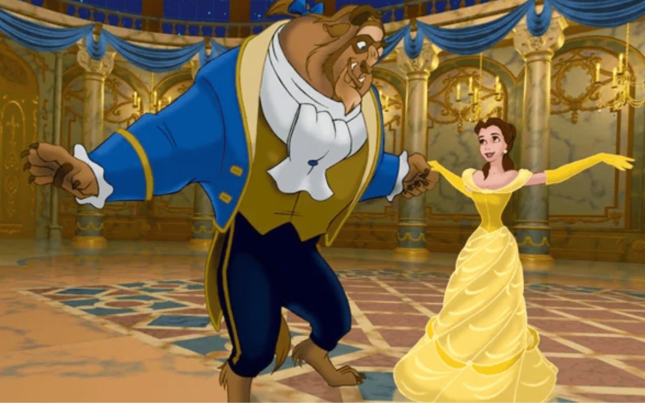
Disney’s Beauty and the Beast
The ballroom dance scene from the Disney (one of the best animation studios) movie Beauty and the Beast provides a sample of effective animation staging. The scene combines composition and framing to generate engaging and dynamic visuals, as the camera pans and zooms to highlight various scene features.
The poses and gestures of the characters are also skillfully designed to portray their personalities and feelings, and the line of action of their movements gives the scenario a sense of fluidity and movement. As the large ballroom and its chandeliers serve as an exquisite background for the dance, depth and perspective also generate a feeling of space and mood.
Pixar’s Up
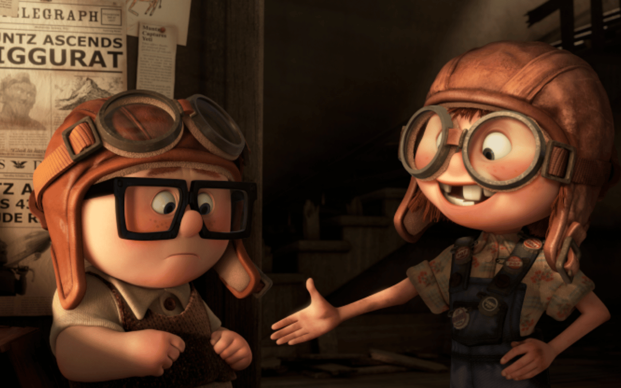
The opening sequence of the movie Up, which includes a montage that narrates the story of the protagonist’s life, is one example of great animation staging. In addition to posing and gestures to communicate emotion and character, the scene also uses depth and perspective to provide the impression of space and mood.
For instance, the main character’s body’s line of action is skillfully manipulated to convey fluidity and movement, while his facial expressions modify to portray his changing emotions throughout the montage.
Pixar’s Wall-E
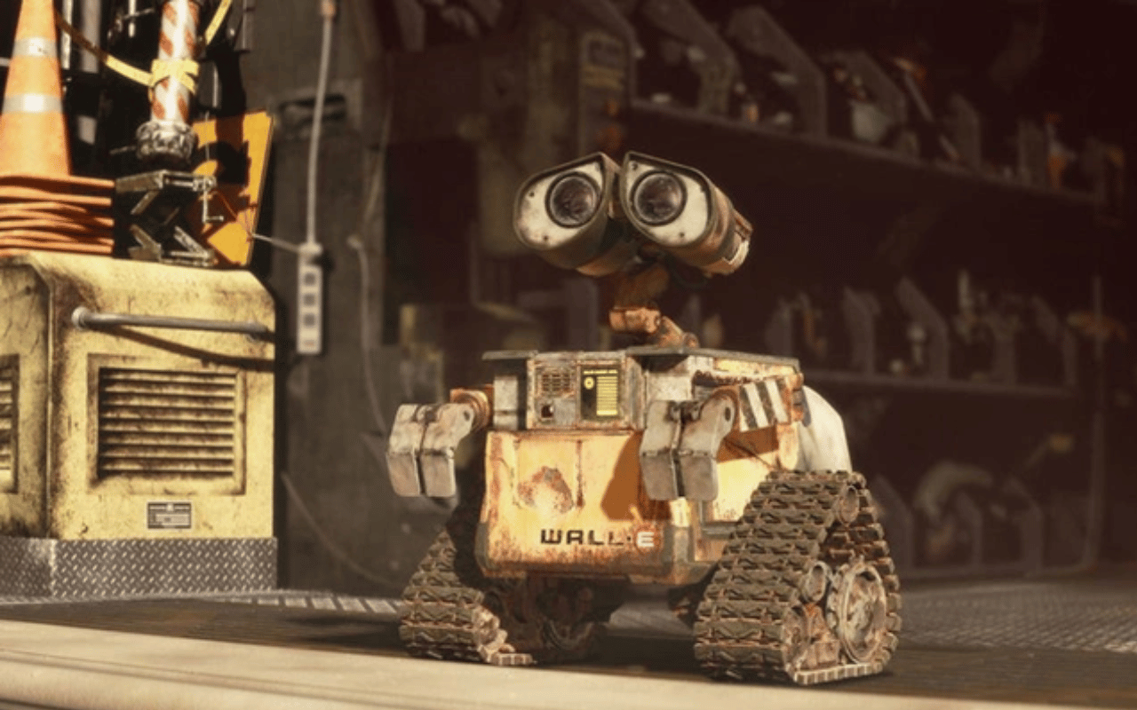
The opening scene of the Pixar movie Wall-E stands as another good illustration of superb animation staging. The camera progressively zooms out from Wall-E as he works in the lonely wastes of Earth, using depth and perspective to create a feeling of space and mood.
Due to Wall-E’s design and movements, the usage of silhouette also creates a memorable and unique visual picture. Posing and gestures are also used to portray Wall-E’s personality as he interacts with his environment and goes about his daily routines.
A Case Study of Pixune’s Dragon Shield
Dragon Shield 3D Animated Commercial by Pixune 3D animation studio shows a smart usage of several visual design components. Every scene is carefully composed and framed, with consideration given to the positioning of the characters and objects as well as the camera angle and movement. The animation is made more interesting and varied by the combination of close-ups and broad vistas, while the framing highlights the key components of each scene.
The animation also makes excellent use of silhouettes to produce visually striking and unforgettable pictures. In the viewer’s imagination, the image of the dragon’s silhouette against a fiery background stands out because it is dramatic and unforgettable.
Effective use of depth and perspective provides the scenes with a sense of three-dimensional space. To successfully convey a sense of depth and space, the animation makes use of a range of techniques, including camera movement, shading, and lighting. For instance, perspective is used in the views of the dragon flying over the city to give the impression that it is enormous and imposing.
Posing and gesture are important aspects of animation as well, with the movements and interactions of the characters expressing feelings and intentions through their body language. For example, the dragon’s fighting gestures and snarls clearly convey its frightening character and terrifying presence.
Tips to Unlock the Power of Animation Staging
- Practice drawing and composition skills
- Learn from other animators and study their work:
- Pay attention to cinematography in live-action movies and animations
- Experiment with different techniques and approaches to staging
Conclusion
In conclusion, composition and framing, silhouette, depth and perspective, as well as posture and motion, are some of the crucial elements of animation staging. We can examine how these ideas are put into reality by dissecting major scenes from popular media.
Creating a visual language that conveys a narrative and captures the mood and emotion of a scene is ultimately what animation staging is all about. It’s crucial for animators to keep improving their skills and try out new techniques in order to create engaging animations.
FAQs
How do you use silhouettes to improve staging?
Make poses readable in silhouette. Outlines alone show action & emotion, avoid visual overlap that masks intent.
What role do camera angles & framing play in staging?
They impact emotion, clarity & hierarchy: close-ups, wide shots, high/low angles guide focus & mood.
How does composition guide the viewer’s eye?
Use visual rules (rule of thirds, leading lines, balance) to place key elements where viewer naturally looks first.
What is visual hierarchy in staging?
Prioritizing what the viewer sees first (characters, props, light) by using size, contrast & placement.
How should lighting & contrast be used to stage a scene?
Highlight main elements, darken or mute distractions; use lighting to shape mood, focus & depth.
How many characters or elements should be in a single shot?
Only what’s needed. Too many distract. Group or reduce secondary elements so focus stays on main action.
How do timing & pacing affect staging?
They let viewer absorb action & emotion. Hold key poses long enough; pace beats to match mood.
How is staging different in 2D vs 3D animation?
In 3D you can leverage depth & real camera movement; staging principles like silhouette, framing still apply.
What are common staging mistakes to avoid?
Cluttered backgrounds, confusing camera angles, masking important action, weak poses, unclear focus.
How early should you plan staging in production?
From the storyboard/layout phase. Before detailed animation, you decide composition, camera & key action.
How do you stage emotional beats vs action beats differently?
Emotional beats: tighter framing, slower pacing, focus on expression. Action beats: wide shots, dynamic angles & movement.
How do backgrounds & environment contribute to effective staging?
They support mood, guide eye with lines & forms but should not compete with primary action. Simplify & use contrast.
What’s the relationship between blocking and staging?
Blocking sets up key poses, movement paths; staging ensures those poses & moves are clearly visible and composed.

