In the thriving mobile gaming world, hyper-casual games have become a true force to be reckoned with. Offering a quick relief for our hectic lives, they have perfectly captured the combination of simplicity and engagement in their gameplay.
Despite their seemingly simple art style, creating these visually dazzling and addictive games involves intricate design and technical skills.
In this article, we will explore the secrets behind the world of hyper-casual game art and how it requires a delicate balance, from choosing suitable color palettes to optimizing performance to create captivating visuals.


Need Game Art Services?
Visit our Game Art Service page to see how we can help bring your ideas to life!
1. Core Artistic Principles for hyper-casual Games
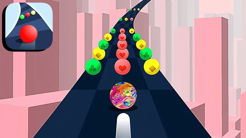
When it comes to creating visually stunning hyper-casual games, adhering to core artistic principles can make all the difference. Let’s start with material and shader selection. Have you ever noticed how certain games just seem to pop off the screen, with vibrant colors and a polished look? The secret lies in using cartoon-style shaders instead of standard Unity materials. These shaders are specifically designed to enhance colorimetry and contrast, resulting in a more visually appealing game that instantly grabs the player’s attention.
But great art isn’t just about pretty colors; it’s also about making smart choices. Enter color theory. Have you ever played a game where the colors seemed to clash, or the shadows were so dark that you could barely make out what was happening? That’s a prime example of why color theory is so crucial. By avoiding aggressive colors and black shadows, you can create a more harmonious and readable visual experience. Imagine a game where every element feels like it belongs, without any harsh contrasts or eye-straining hues. Doesn’t that sound like a game you’d want to play?
Speaking of readability, contrast, and detailing play a vital role in ensuring gameplay clarity. Think about it: how often have you struggled to distinguish between different objects or elements in a game because of poor contrast? Effective contrast management not only makes objects stand out but also caters to players with color vision deficiencies. And when it comes to detailing, it’s all about striking the right balance. Too much detail can overwhelm the player, while too little can make the game feel barren. By adjusting detail levels based on the player’s perspective, you can create a visually rich experience without compromising performance.
2. Optimizing Game Performance through Art

Creating a visually stunning game is one thing, but ensuring it runs smoothly is a whole different ballgame. That’s where polygon management comes into play. Have you ever wondered why some games seem to chug along, even on powerful devices? More often than not, it’s because of an excessive triangle count – the bane of game performance. By reducing the number of triangles and adhering to the “power of two” rule for textures, you can significantly improve your game’s performance without sacrificing visual quality. It’s like giving your game a sleek, lightweight body without compromising on style.
But what about depth and realism, you might ask? That’s where shadow utilization comes into play. Shadows can add a whole new dimension to your game, quite literally. However, they can also be a major performance drain if not used strategically. Consider using fake shadows or strategically placing real shadows to indicate depth without overburdening your game’s performance. Imagine a game that looks and feels immersive, without any hiccups or lag – that’s the power of effective shadow utilization.
3. Enhancing User Experience with Environmental Elements

hyper-casual games are all about creating a captivating and immersive experience, and environmental elements play a crucial role in achieving this goal. Take, for instance, dynamic environments. Adding elements like water can truly elevate the visual experience, but be mindful of how you configure animated textures and avoid complex shaders that might hinder performance. Imagine a serene lake glistening in the sunlight, or a rushing river cutting through a lush landscape – these are the kinds of details that can transport players to another world.
But what about the backdrop against which your game unfolds? That’s where skybox and background treatments come into play. The skybox design can significantly impact the overall atmosphere of your game, setting the mood and evoking specific emotions. And let’s not forget about backgrounds – simple yet effective backgrounds can enhance the feeling of progression and keep players engaged. Have you ever felt a sense of accomplishment or satisfaction as you traversed through different environments in a game? That’s the power of well-designed backgrounds and skies.
4. Visual Rewards and Player Engagement
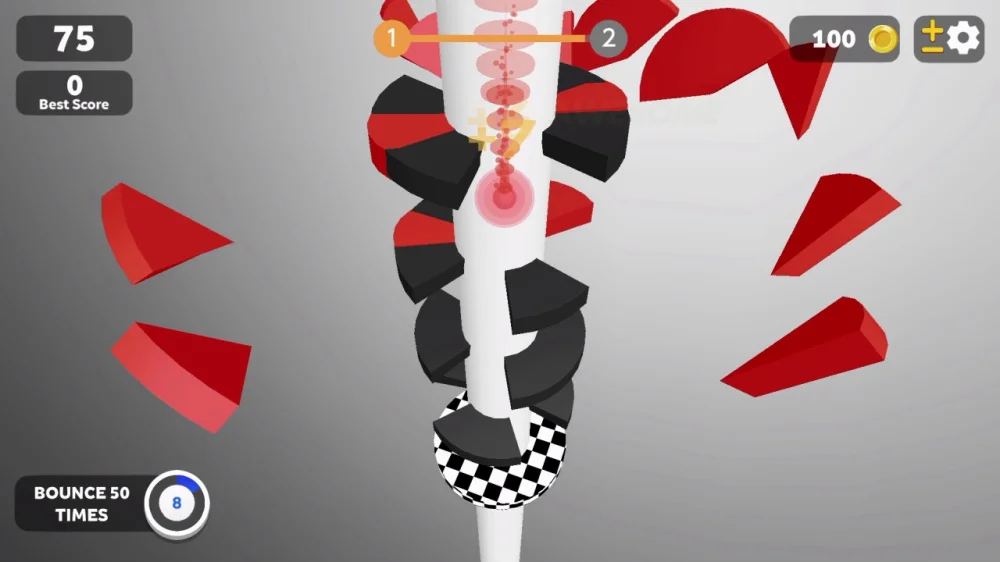
hyper-casual games thrive on player engagement, and visual rewards play a crucial role in fostering that connection. Imagine the satisfaction of seeing a burst of vibrant particles celebrating your achievement – it’s a simple yet effective way to keep players motivated and coming back for more. But have you ever stopped to think about the impact of those particle systems on your game’s performance?
While particle systems can undoubtedly add excitement and visual flair, overusing them can negatively impact performance. So, how do you strike the right balance? By using particle systems wisely and strategically, ensuring that they enhance the gameplay experience without causing any performance hiccups. After all, what’s the point of a visually stunning celebration if the game itself lags and stutters?
5. User Interface and User Experience Design
A well-designed user interface (UI) is the bridge between your game and your players. It’s the first thing they interact with and often sets the tone for the entire gaming experience. That’s why adhering to UI design principles is crucial. Have you ever played a game where the UI felt clunky or confusing, making it difficult to navigate or understand what was happening? Chances are, that game didn’t prioritize good UI design.
By making sure your UI elements are accessible and visually coherent, using structured canvases and consistent UI elements across different game screens, you can create a seamless and intuitive experience for your players. Imagine being able to navigate through menus and screens with ease, without any confusion or frustration – that’s the power of good UI design.
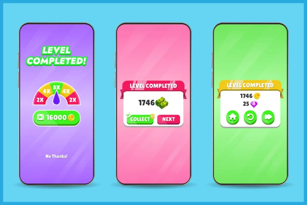
But UI design isn’t just about aesthetics; it’s also about functionality. Have you ever wondered how game developers optimize layout and ensure a smooth user experience? The answer lies in heatmaps and UX structure. By analyzing heatmaps and carefully structuring the user experience, you can ensure that players can navigate your game intuitively, without any unnecessary distractions or obstacles.
6. Practical Tips and Creative Templates
In the fast-paced world of hyper-casual game development, time is of the essence. That’s why using templates and creative assets can be a game-changer. Have you ever spent countless hours painstakingly creating assets from scratch, only to realize that you could have saved time by using pre-designed templates? These templates and assets can streamline your development process and maintain consistency in your game’s visual aesthetic.
In the fast-paced world of hyper-casual game development, time is of the essence. That’s why using templates and creative assets can be a game-changer. Have you ever spent countless hours painstakingly creating assets from scratch, only to realize that you could have saved time by using pre-designed templates? These templates and assets can streamline your development process and maintain consistency in your game’s visual aesthetic.

Conclusion & References for Further Study
In the realm of hyper-casual games, where attention spans are fleeting, the art of captivating visuals and seamless performance reigns supreme. We’ve explored the intricacies of material selection, color theory, contrast management, polygon optimization, and strategic shadow utilization – all essential elements that elevate these bite-sized gaming experiences into true masterpieces.
But nothing beats a field study, so if you want to learn more about what makes for great hyper-casual game art, grab your phone and start playing these titles:
- Color Road is celebrated for its vibrant and ever-changing color schemes that maintain visual interest.
- Its simple graphics ensure smooth performance across different devices.
- Helix Jump Features a striking use of bold and contrasting colors to create an eye-catching spiral tower.
- The straightforward artistic design emphasizes gameplay clarity with visual cues.
- Alto’s Adventure is known for its serene, pastel-colored twilight palette and atmospheric visuals that change dynamically with the weather.
- Though it’s more of an endless runner, it retains simple, hyper-casual mechanics that appeal to a broad audience.
- Paper.io 2 utilizes fluid, colorful graphics with smooth animations and bright color blocks.
- The minimalist design enhances the focus on competitive play, fitting the hyper-casual mold.
- Aquapark.io features a bright, summery aesthetic with simple, appealing water slide visuals.
- The game’s art is fun and uncluttered, which helps keep the gameplay intuitive and engaging.


