Color is a powerful element in art, serving as a visual language that expresses emotion, mood, and meaning.
In both traditional and digital animation, an artist’s choice of colors significantly shapes how viewers perceive the artwork.
But what is color theory? It is the study of how colors interact, complement one another, and contribute to visual harmony.
In this guide, we will dive into the essentials of color, covering the color wheel, advanced concepts like color harmony, and the significance of different hues.
By mastering color, every artist and animation studio can enhance their creations, crafting visuals that deeply connect with their audience.

Need Animation Services?
Visit our Animation Service page to see how we can help bring your ideas to life!
What is Color Theory?
Color theory is a framework that artists use to understand how colors interact and combine to create visually compelling artwork.
Colors, along with shape language technique, guide the arrangement of colors to achieve harmony, contrast, or emotional impact.
At the heart of color theory is the color wheel, which organizes colors into primary, secondary, and tertiary categories.
Color theory also allows artists to understand color harmony, which defines how different colors mix to create impactful visuals.
By mastering color theory, artists can make deliberate choices to shape mood, depth, and visual appeal in their work.
Now, let’s break down the color wheel and color harmony to explore their core purposes.
Read More: Why Colour Choices in Animation Make You Feel Things?
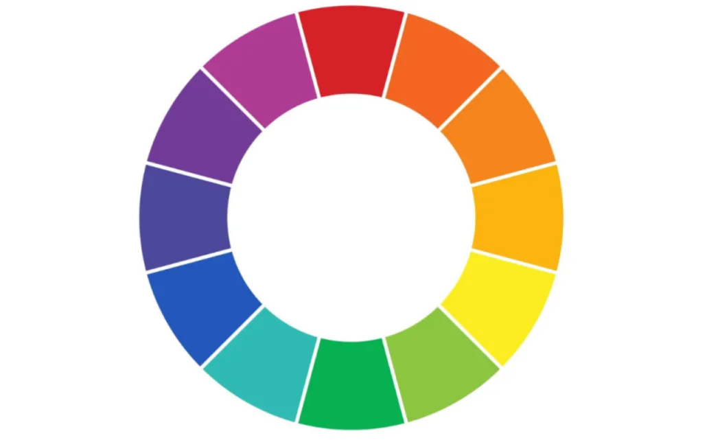
The Color Wheel: Primary, Secondary, and Tertiary Colors
The color wheel is a key tool in color theory, illustrating how colors relate to one another.
It’s divided into three categories: primary, secondary, and tertiary colors, which form the foundation for creating diverse color palettes.
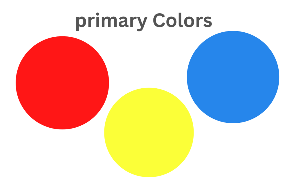
Primary Colors in Art:
Red, blue, and yellow are the primary colors and foundations of all the others.
They cannot be made by mixing other colors and serve as the starting point for any palette.
Artists use primary colors for bold, vibrant effects or as a base to create other hues.
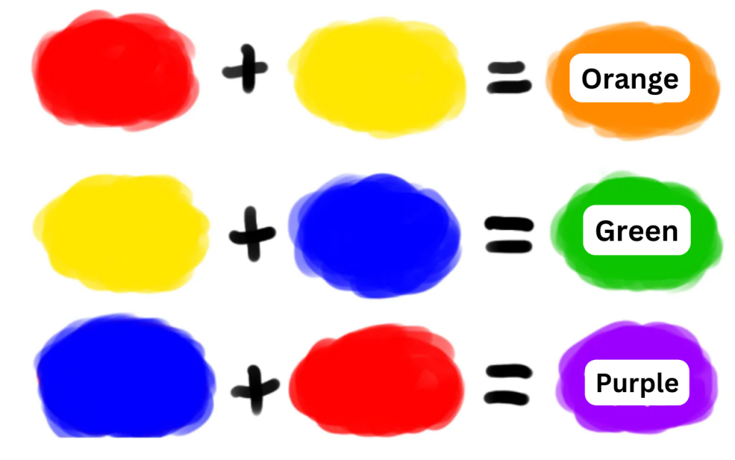
Secondary Colors in Art:
These are formed by mixing two primary colors.
For example, orange comes from mixing red with yellow, green is made by combining blue and yellow, and purple is created by mixing blue and red.
Secondary colors add variety and balance, enhancing contrast and enabling dynamic compositions.
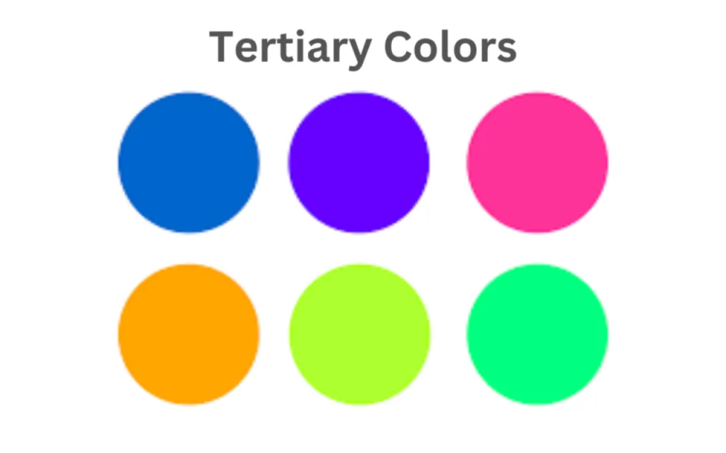
Tertiary Colors in Art:
Tertiary colors are created by mixing a primary color with a secondary color. They include hues like red-orange, yellow-green, and blue-purple.
These nuanced shades add depth and sophistication, allowing artists to craft richer, more complex designs.
In addition, if we draw a line through the center of this color wheel, we will have a range of warm colors on the left-hand side and cool colors on the right-hand side.
Warm colors in art show brightness and energy, whereas cool colors show calmness and peace.
What is Color Harmony?
Color harmony is the art of combining colors in a way that is visually pleasing and balanced.
It creates unity in a composition, guiding the viewer’s eye and evoking specific emotions or moods.
By carefully selecting color combinations, artists can achieve balance, contrast, or excitement in their designs.
Below are the key types of color harmony and the concept of color context:
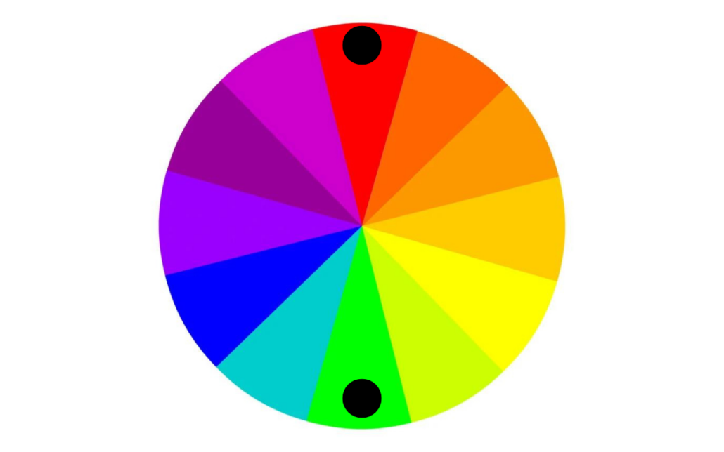
Complementary Colors
Complementary colors are positioned opposite each other on the color wheel, like red and green or blue and orange.
When paired, they produce a striking contrast, enhancing each color’s vibrancy.
Artists use complementary colors to emphasize key elements, create visual tension, and draw attention to focal points in their designs.
If you want to know more about complementary colors, click here and watch the video.
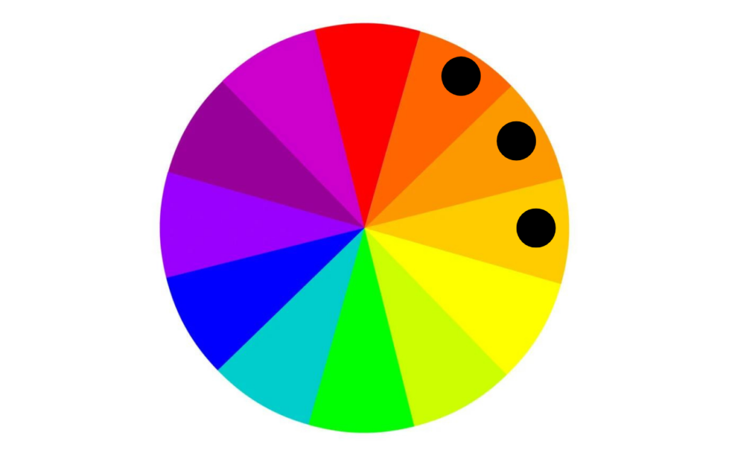
Analogous Colors
Analogous colors sit next to each other on the color wheel, such as blue, blue-green, and green.
These colors blend smoothly and create a calm and unified look. Analogous colors bring harmony and unity within a design while maintaining subtle variation.
They’re perfect for designs that aim for subtle variation, often evoking a tranquil, natural feel.
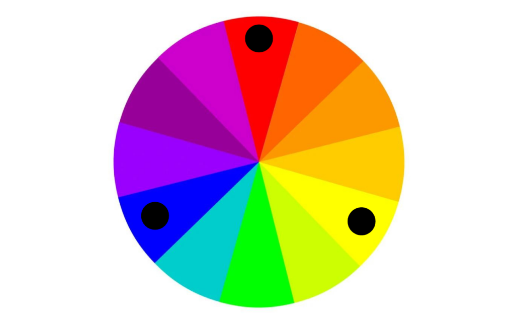
Triads Color
Triadic color schemes involve three colors evenly spaced on the color wheel, such as red, yellow, and blue.
This combination strikes a balance between contrast and harmony, resulting in lively, engaging compositions.
Triadic colors are often chosen for designs that need to captivate without overwhelming the viewer. There are only four triadic colors:
- Red, Yellow, Blue
- Red-orange, Yellow-green, Blue-violet
- Orange, Green, Violet
- Yellow-orange, Blue-green, Red-violet
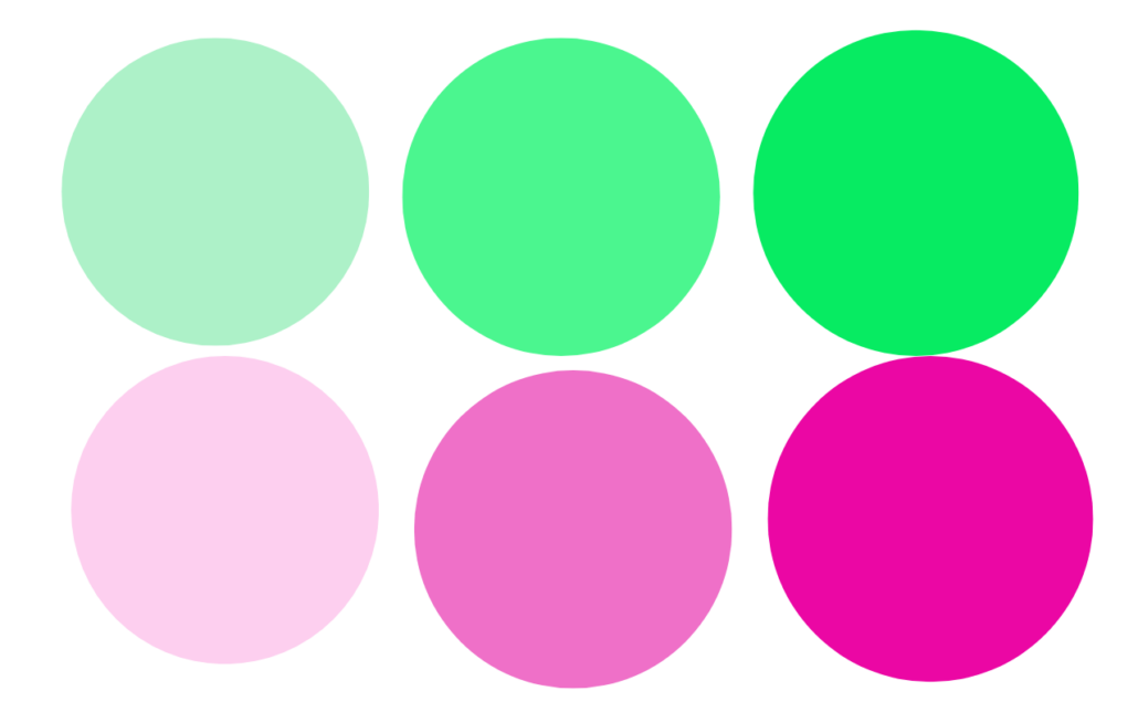
Monochrome
Monochrome schemes use variations of a single color by incorporating its shades, tints, and tones.
They are used to create a streamlined, minimalist aesthetic that can carry substantial emotional weight.
While lacking the contrast of other harmonies, monochrome designs excel at conveying simplicity, color correction, elegance, and a focus on texturing or modeling.
If you want to know more about monochrome colors, click here and watch the video.
What is the Color Context in Art?
Color context describes how a color’s appearance shifts depending on the colors around it.
For instance, a red square might look more vivid against a white background but less striking next to green.
This effect happens because colors influence each other based on their proximity, contrast, and hue relationships.
By understanding these color contexts, artists can control how colors are perceived and exploit specific elements in their work.
For example, during the color correction stage, while creating an animation, the color script outlines the specific color mapping, styles, and palette to adjust the colors of each frame.
What Are the Key Color Schemes for Harmonious Palettes?
A harmonious color scheme involves selecting and arranging colors in a composition to achieve an appealing and cohesive visual.
Well-known schemes like complementary, analogous, triadic, and monochromatic enable artists to craft designs with balance, unity, and emotional resonance.
Each scheme offers a distinct visual effect:
- Complementary colors create bold contrast.
- Analogous colors promote serene cohesion.
- Triadic colors deliver vibrant balance.
- Monochromatic schemes emphasize simplicity and elegance.
By skillfully applying these schemes, artists can develop environmental and character color palettes that enhance the aesthetic appeal of their work and convey meaningful messages.
Here are some color combinations with perfect harmony:
- Royal blue – peach
- Blue – pink
- Charcoal – yellow
- Red – Yellow
- Lime green – electric blue
- Lavender – teal
- Cherry red – off-white
- Baby blue-white
What is the Meaning and Definition of Color in Art?
Color in art is more than just aesthetics; it also carries psychological meaning and cultural symbolism, like what you can see in the psychology of animation color.
Each hue can convey distinct ideas, emotions, and themes, enriching the viewer’s experience.
- For example, red often represents passion, energy, or danger, while blue might evoke feelings of tranquility, melancholy, or introspection.
By understanding the meanings associated with colors, artists can deliberately shape the emotional response of their audience, deepening the narrative impact of their work.
The significance of color varies across different mediums and cultural contexts, making it a versatile and essential tool for transmedia storytelling.
In the following, you can review the most common meanings of each color:
Red: Power, Passion, and Energy
Orange: Joy and Enthusiasm
Yellow: Happiness and Intelligence
Green: Growth and Ambition
Blue: Peace and Confidence
Purple: Luxury and Creativity
Black: Power and Mystery
White: Safety and Innocence
What is the Difference Between Additive and Subtractive Color?
Color mixing is achieved through two distinct processes: additive and subtractive color.
These methods explain how light and pigments interact to produce new hues, each with unique applications in art and design.
What is Additive Color?
Additive color mixing involves combining light to create colors, using red, green, and blue (RGB) as the primary colors.
When these light sources are blended, they form new hues, with the combination of all three at full intensity producing white light.
This system is fundamental to digital displays, such as screens on TVs, computers, and smartphones, where varying intensities of red, green, and blue light create a broad spectrum of colors.
What is Subtractive Color?
Subtractive color mixing occurs when pigments or dyes are combined, using cyan, magenta, and yellow (CMY) as the primary colors.
This process works by absorbing (or subtracting) certain wavelengths of light, resulting in colors like red, green, or blue, depending on the mixture.
When all three primaries are combined fully, they produce black or a dark hue. Subtractive color is essential in physical media like painting, printing, and textiles, where pigments interact to create the desired color effect.
Final Words
Color is a major-league player in the visual arts! It shapes both the visual appeal and emotional resonance of artworks.
By leveraging color theory and selecting appropriate color palettes, artists can craft compositions that are visually cohesive and emotionally compelling.
Whether employing primary colors for striking contrasts or complementary colors to highlight key elements, mastering the use of color is essential for powerful storytelling and impactful design.
FAQs
What is the significance of color in art?
Color communicates mood, symbolism, and draws focus; it’s a universal visual element that conveys emotion, hierarchy, and meaning.
What’s the difference between traditional and modern color theory?
Traditional theory focuses on artistic applications and symbolism; modern color science emphasizes objective, perceptual accuracy.
How does color affect emotion in art?
Color theory explores how hues evoke feelings. Warm tones energize, cool tones calm, guiding the emotional tone of the artwork.
How do you choose a color palette effectively?
A good palette uses the color wheel and harmony rules while considering mood, context, and message to ensure visual impact.
Is color theory rigid?
No. It’s a helpful guideline, but once understood, artists are free to creatively bend or break the rules.
Can color theory vary across cultures?
Yes. While some color symbolism applies broadly, meanings often differ by cultural, social, and contextual factors.
Is color theory based on science?
Traditional theory guides artists; modern color science explains perceptive and physical color behavior.