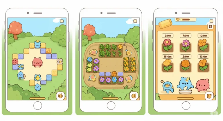
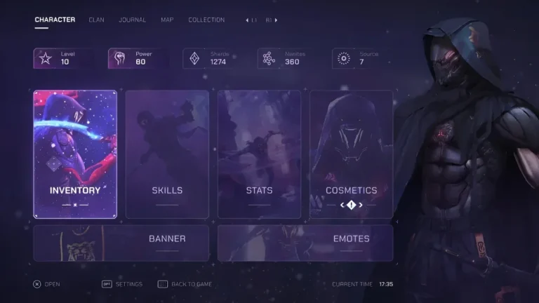
Game HUD (Heads-Up Display) design is the creation of on-screen interface elements that provide crucial information to players during gameplay. It typically includes vital stats, maps, inventory, and other game-specific data.Even the simplest of games is made up of hundreds of smaller parts. As a principal rule in any game design, we put the most emphasis on the parts that the player sees and interacts with the most.
In this article, we start with the basics and explain what exactly makes up a HUD. Then we will move on to talk about the 5 golden rules of game HUD design that should be observed and considered for any game HUD design, regardless of genre and style. This article is part of a series about creating dazzling game art; if you’re new to the field, I suggest starting with the principles of game art design first.

Need Game Art Services?
Visit our Game Art Service page to see how we can help bring your ideas to life!
What Makes Up a Game HUD?
A Heads-Up Display is a series of different interface elements that overlay the game itself. The purpose of HUD is to provide the player with vital information about the current state of the game and the player without getting in the way of the main action happening on the screen. Some of the most common HUD elements are the Health Bar, Energy/Mana Bar, Mini-Map, Ammo Count, and mission objectives.
Don’t confuse a game’s UI with its HUD, though. HUD is what you see during the gameplay; anything outside gameplay, like menus, falls under game UI design.
If you’re interested, we have a whole article about mobile game UI design that you can check out in Pixune’s blog section.
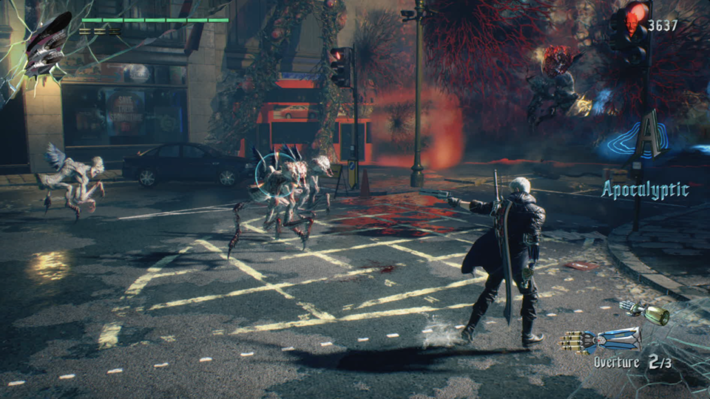
However, if you only pay attention to the “common” HUD elements, you might not recognize HUD elements that are less traditional. The gaming industry is one of the most fast-paced industries in the world, and game HUD design has evolved considerably since its conception. So there are countless styles and methods that game designers have employed over the years to create better HUDs. Some of these methods were so popular that they stayed with the industry and became new standards, while other methods faded away.
For example, the Call of Duty series has been popularized using a regenerative health system instead of a definitive health bar. When you get low on health in a CoD game, the game transmits that information to the player by displaying tunnel vision and red tinges on the screen, accompanied by the sound of heavy breathing.
Do you know of any other game that has presented old HUD elements in a new and creative way?
5 Golden Rules of Game HUD Design
On the surface, creating a HUD is easy. You just need to consider what information the player needs in order to progress through your game, make informed decisions and pass the obstacles in order to win. Then you need to create some graphical elements to present that information to the player and put them on screen.
However, as we mentioned before, a game’s HUD is one of its most crucial parts, and we are going to explore the fine nuances and principles of game HUD design to give your game a real edge. Without following these guidelines, you might end up with a crude HUD that drives the players away no matter how awesome the other parts of your game are.
1. Game HUD Design Should be Consistent with Theme and Style
This is actually a golden rule that goes beyond game HUD design. Every game should have a clear and thought-out theme, and consistency means all the various parts of the game should follow that theme and reinforce it, from the game narrative itself to the smallest HUD elements. If you’re making a horror game where the game world usually looks dark and grim, using colors in your HUD would be out of the theme. Is your game set in a futuristic world like Halo or Gears of War? Then you better employ minimalistic design in your HUD and use hard, angular lines.
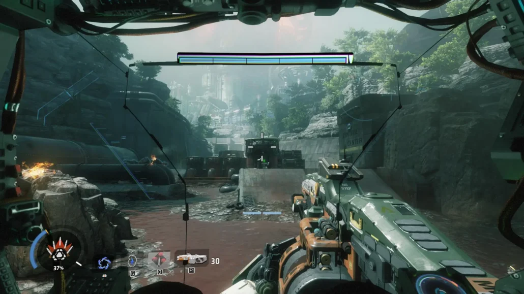
Shapes, colors, contrast and scale of HUD are all among the elements that should be in harmony with your art style. Read more about various game art styles in the Pixune blog.
2. Strive for Maximum Clarity and Readability
Remember that the role of HUD is to give players the information they can use to win the game. Now, even if you present all the necessary information with the prettiest of graphical elements, it won’t do the player any good if they can’t absorb that information in time. So here, clarity means that players should be able to absorb a lot of information on the screen with a glance.
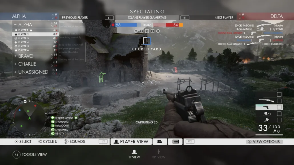
If your HUD is cluttered, or if you use weird fonts or shapes in it, the players will need to put more time and effort into getting that information, and that will result in them losing a lot, not because your game is difficult, but because you failed (for example) to effectively inform them that their health was low.
To achieve maximum readability with your game HUD consider your game background and its color palette. The color of your HUD must have sufficient contrast with your game’s background to be seen clearly. You can read more about video game background design on Pixune’s blog.
3. Consider Smart Placement of HUD Elements
It goes without saying that where you put each HUD element is a deciding factor in any great game HUD design. As a general rule of thumb, you want to place the most vital information as close to the center of the screen as possible because that’s where the player’s eye is focused most of the time. That is why in most fps games, the reloading process is shown around the crosshair in addition to anywhere else it is displayed.
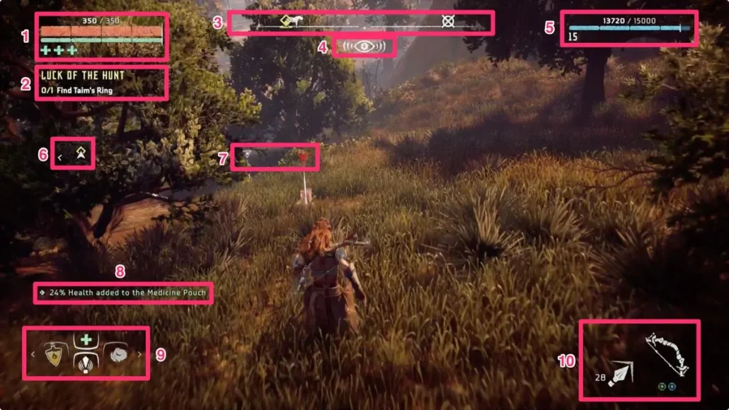
However, based on the genre and the nature of the game you’re making, it might not be possible to place anything near the center of the screen. Take a puzzle or strategy game, for example. In such situations, you should try to place the most crucial HUD elements in the top left corner of the screen. Why? Because most of your audiences use left-to-right languages, and their brain is trained to prioritize reading stuff that starts in the top left corner. This is why most of the games put the players’ health bar there.
4. Keep Your Game HUD Design on a “Need to Know” Basis
This rule might translate very differently between games and genres. But basically, it’s about presenting only the information that the players need at any given time. No more, no less. If you present too much information at any given time, even if you observe all the other principles of a good game HUD design perfectly, your HUD will confuse the player.
In fact, your goal here should be to show as little information as possible at any given time. Why? Because seeing HUD decreases the feeling of immersion in the game, and too much HUD breaks it completely. In reality, the amount of money in your pocket or ammo in your gun isn’t displayed over your head, so seeing those elements in the game sends a clear signal to the brain that “this isn’t real.”
A designer knows he has achieved perfection not when there is nothing left to add, but when there is nothing left to take away.
Antoine de Saint-Exupery
So why not use blood drops on the screen instead of a health bar to indicate how much damage you have taken? Or, instead of an Oxygen bar, why not use suffocating sound effects to indicate the player is running out of air? If you have a currency in the game, does the player need to be aware of his coin amount all the time or just when they are visiting a shop? These are the types of questions that you want to ask yourself before finalizing your game HUD design.
Increasing immersion is something that is of utmost importance to most games. It is due to this reason that, in recent years, games have employed increasingly minimal HUDs. A game like Gears of War shifts between showing you different numbers of HUD elements. In action sequences, an extensive HUD is always visible, and when you’re exploring the world, they completely disappear, so you can admire their amazing game world and meticulously designed environment.
A great HUD and a great environment usually go hand in hand. I highly suggest reading our article regarding game environment design tips on Pixune’s blog if you want to know more about creating great game environments.
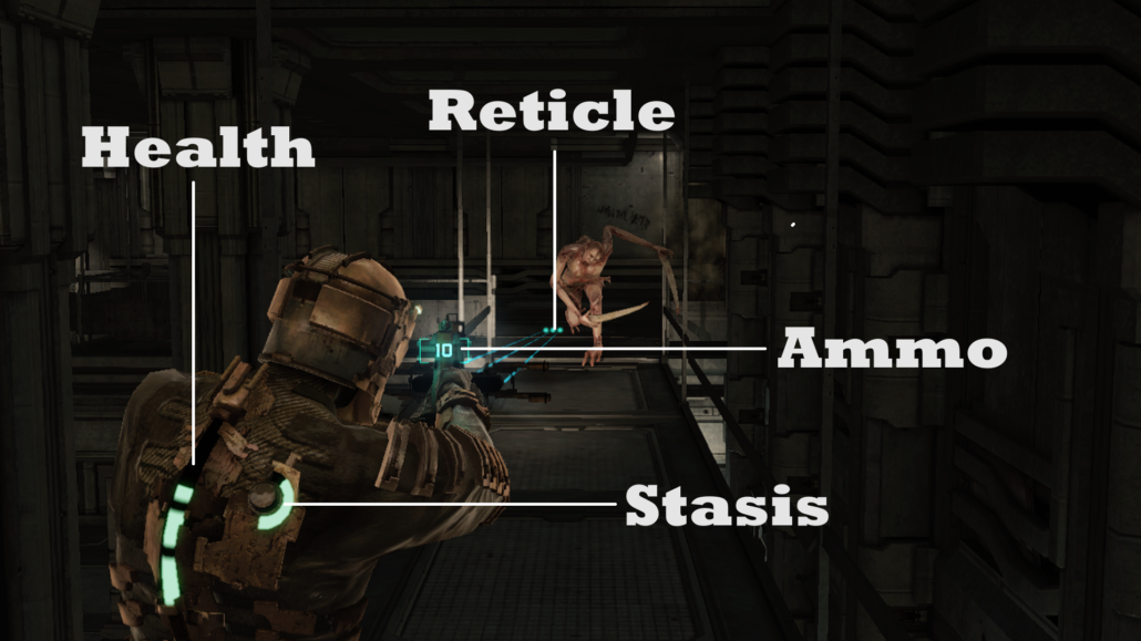
One of the best examples in this regard is the Dead Space series. When the first game came out in 2008, it attracted a huge fan base, in no small part due to its amazingly creative HUD design. Dead Space doesn’t include a single HUD element (at least in the traditional sense), yet it gives you all the information you need to survive in that hostile environment. How? It uses the game world itself to convey vital information to the player. Ammo count is displayed as a holographic part of the weapon itself, and the player’s health is shown as part of the advanced suit they are wearing.
Do you know of any other game that completely forgoes the use of traditional HUD elements like Dead Space?
5. Make it Customizable Where You Can
If the players can personalize their HUD (usually in regard to size and placement), it will give them more control to play your game the way they want. This is a good feature for any game, but keep in mind that having a customizable HUD is usually a very costly endeavor, and you should only go for it if you feel it’s necessary for your game.
Having a customizable HUD is usually important in games with a more competitive nature, where pro players are looking for every advantage they can get to climb the ladder board.
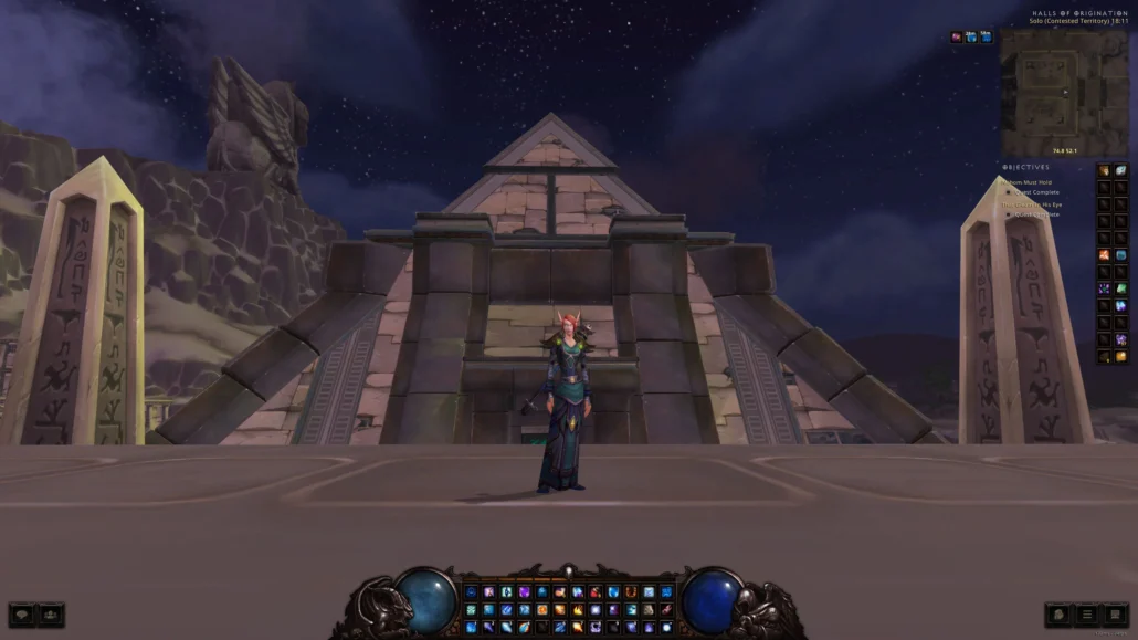
A totally customizable HUD might not be necessary for your game, but make sure to put some options like color blind mode or scalable HUD for players with color blindness or low vision to enjoy your game just like any other player.
Conclusion
A game’s Heads-Up display is one of the most crucial components that make up a game. And while designing an awesome game HUD is not difficult; you need to keep the golden rules in mind at all times during the design process. These principles are all the same across all games and genres, but the way you should implement those principles might be different for each game, so get creative!
