
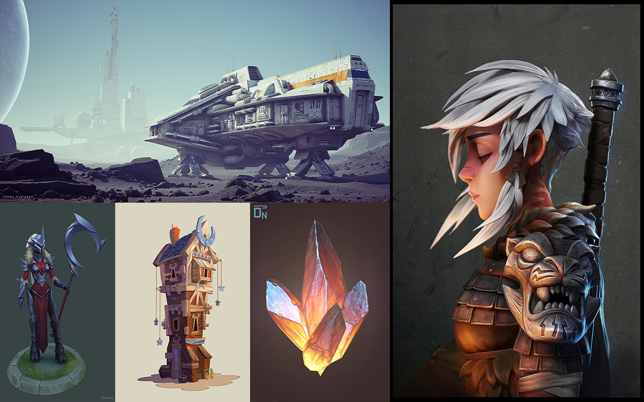
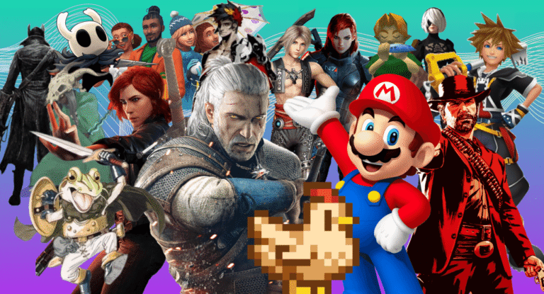
Game art design involves creating visually appealing and immersive graphics that enhance the player’s experience. To make a game look awesome, focus on consistent art styles, high-quality textures, and attention to detail in character and environment design. Game production is truly a multi-disciplinary practice as video games are complex systems at their core. A vast range of professions come together, each contributing to the creation of a game. Game art design is one such profession, and one of the most important ones, especially when you hire top-tier game art services to ensure polish, scaling, and art direction.
The visual arts of a game are literally its face. And just like a human face, it is the main instrument to communicate what you want your audience to know. Therefore, it is no wonder why studios spend a big chunk of their budget on creating superb arts for games, often by contracting expert game art services to hit both quality and efficiency.
Please note that while this article focuses on Game Art Design, you may apply most (if not all) of the principles discussed here to the process of creating animations as well.
Need Game Art Services?
Visit our Game Art Service page to see how we can help bring your ideas to life!
What is Game Art Design?
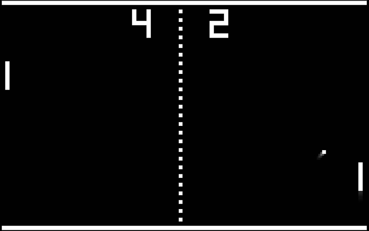
Game Art Design started a bit after the birth of video games as a new form of entertainment. True, video games, even those as simple and early as Pong, needed to have some sort of visual elements to work. Truth be told, while game developers designed visuals for the players, it is hard to call their work as “art”.
Back then, around the ’80s, game development was still more of a hobby or pet project for those programmers with a more playful nature.
There was absolutely no market for video games in those times, and so the budget for them was non-existent. So, those same programmers had to play the artist with codes. The result was dull and unimaginative graphics that frankly, were horrible.
Read More: Introduction to Game Art History
Now with interactive game art, visual elements aren’t just background or decoration. They respond to your inputs. Imagine an NPC that changes behaviour based on player choice, or environmental objects that you can manipulate. These features make games more immersive, because players feel like they are part of the world, not just observing it.
Even more, dynamic game art pushes the envelope: think of physics-based effects, destructible environments, weather changes, or lighting that shifts in real time. These aren’t fixed animations; they’re systems that adapt and evolve during play.
The Golden Era of Gaming
Shigeru Miyamoto was a brilliant game designer from Japan that took the next step toward fusing art into the game development process. He can be credited with introducing character design into games that used to consist of only shapes and limited colors.
It turned out that spending more of the game’s art pays off tremendously. Miyamoto’s characters like Mario and Donkey Kong became legends and made millions for their creator.
By the early ’90s, video games had become immensely popular. That’s why franchises such as Metal Gear, Metroid, and Prince of Persia can trace their birth to that era.
The growth in demand for video games allowed developers to allocate far more generous budgets for the game development process, and following that, video game art design truly began.
Artists became an intrinsic part of any game art outsourcing company, working closely with developers to ensure that the visuals of a game are as attractive as possible and also in harmony with the rest of the game.
This is an introduction to the core art principles that all video game artists use. And hopefully, it can jumpstart your own personal journey toward a career in game development.
Principles Behind Every Game Art Design
Game art design basically deals with everything that you can see and hear in a game. Artists are responsible for the characters, effects, enemies, the environment, the UI, and the animation, and the sound as well.
In this article, we will focus on the principles and core theories of the visual design of a game, as the music & sound design principles of a game are so complex and bulky that it needs its own article.
But why does every game look so different? And how do you choose what art is supposed to look like? I mean, is game art design about making games look pretty?
The answer is a big NO. Art and gameplay of a game are so intertwined that art inevitably acts as complementary to enhance the main functions of a game. We may break down the overall purpose of Game Art Design, regarding its purpose in the games, into three parts: Providing clarity, satisfaction, and style.
1. Visual Clarity
Clarity means making sure the player can easily understand what’s going on in the game, like knowing their current location, the right direction to move in, who the allies and enemies are, and how much health they have.
These are all examples of critical information that has to be immediately clear to players. It can get difficult to achieve clarity because games have a lot of things going on, and there is a huge amount of information that a player needs to understand in a really short amount of time.
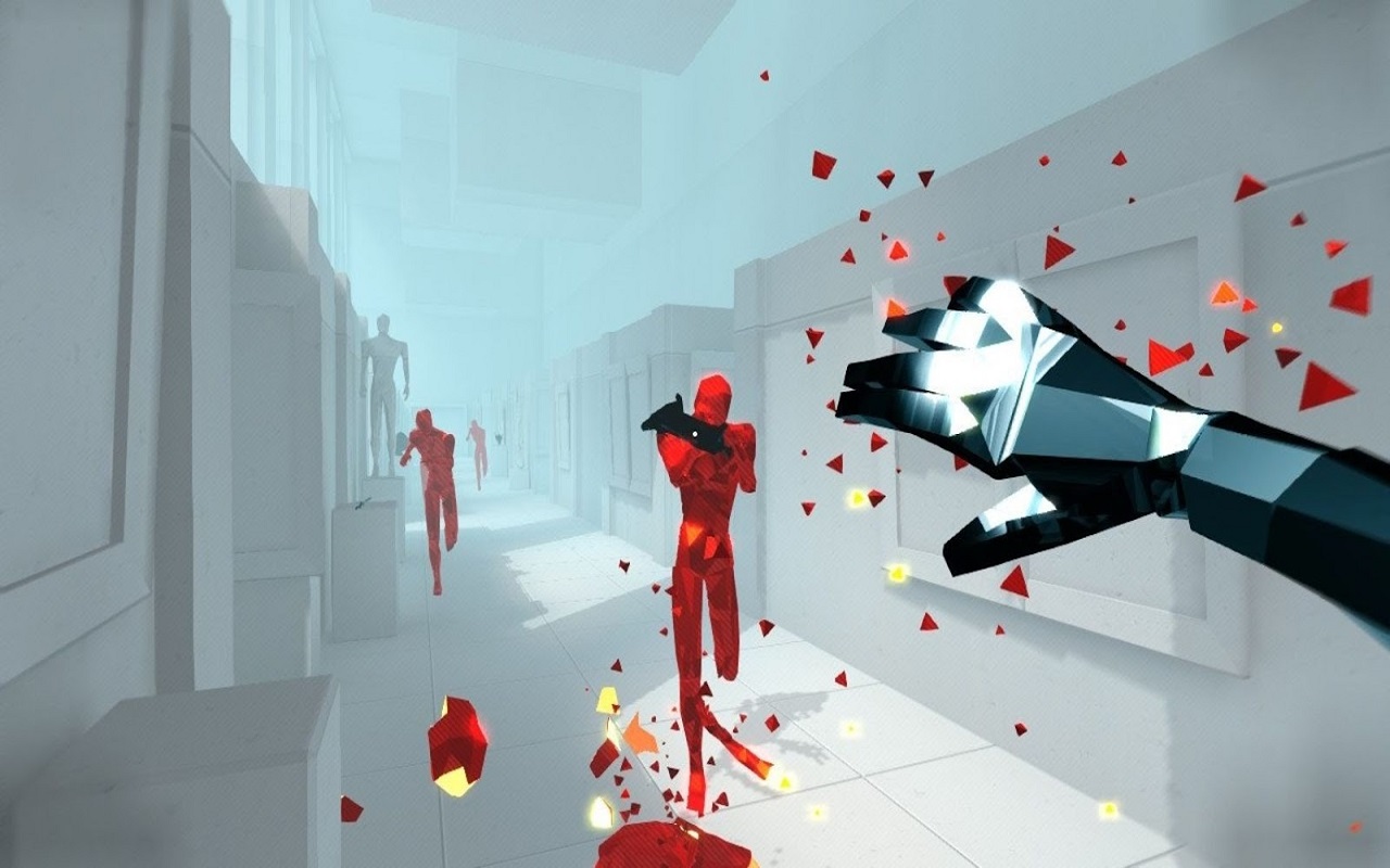
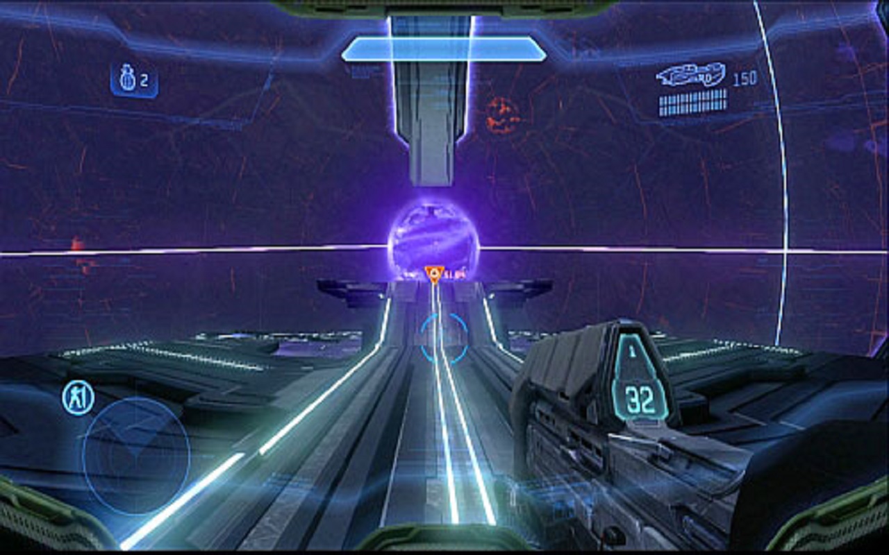
Imagine a crowded team fight in a MOBA game (such as League of Legends or DOTA2). Or a hack&slash game (Like the GOW series), where a large number of enemies are attacking you at the same time. Without efficient clarity, it will be easy to lose sight of your character amid the chaos on screen.
2. Satisfaction
Satisfaction means giving clear and responsive feedback to player actions. This includes things like an immediate change from a button press, feeling good when you succeed, and feeling bad when you fail. But deciding how to deliver clarity and satisfaction as a bundle is a whole question unto itself.
Whether it’s a meaty hit pause, a huge ceremony, flowing momentum, or even something as simple as running around and jumping. Every game action has to be responsive and satisfying to engage in. So, an artist has to make sure a game is clear and satisfying to play. But they still have to pick what style they’re going to do it in.
3. Fancy Style
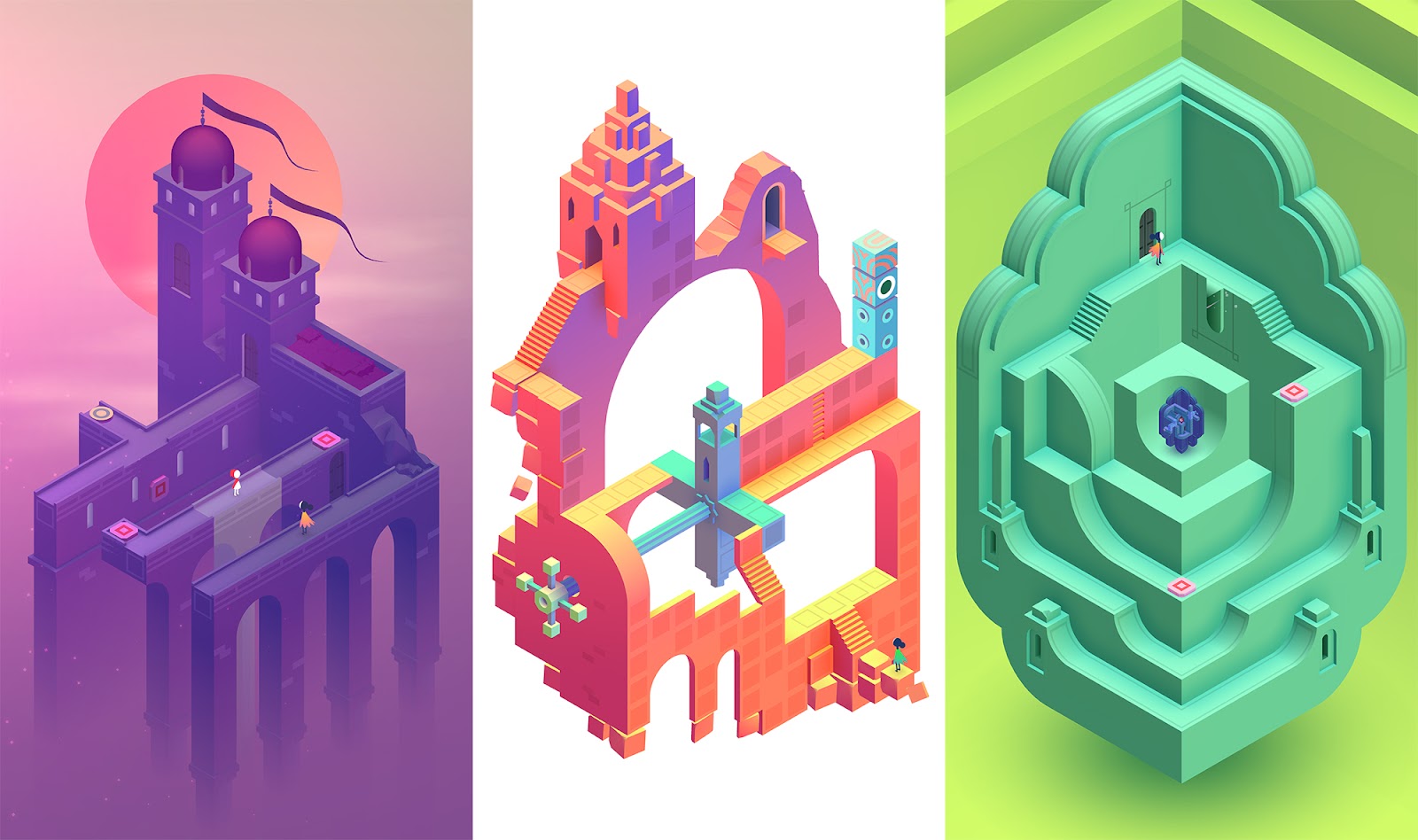
Every game has a different art style. The colors are different, the character designs, the environments, how realistic proportions are. Every type of art style can evoke a different emotion.
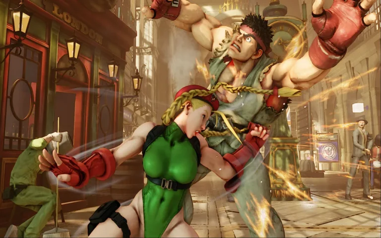
To use two games as an example, Overwatch and Counter-Strike, even though they’re very similar in gameplay, their art styles are different, and you feel differently when you play them.
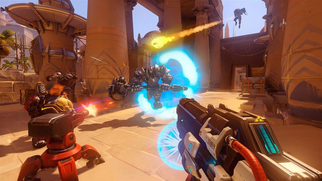
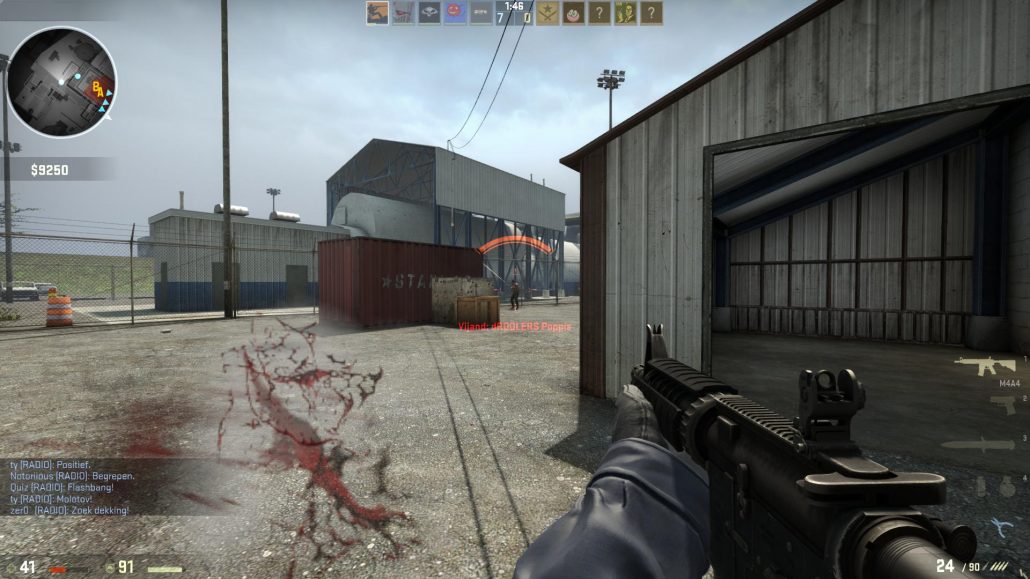
Overwatch has a lot more color, the characters’ proportions are very pushed, and evokes a little more light-heartedness, whereas Counter-Strike has a little less color, it’s a little more serious in tone, with real-world guns and environments. These factors make the experience of each game very different, just by altering the art style.
So, to recap, the formula to an effective game art design is to make sure that the game is clear, that it’s satisfying to interact with, and that the art fits a cohesive art style that sets an emotional tone.
Now that we have discussed the functions that art has to fulfill in a game, let’s talk about how to fit each art piece together.
4. Visual Hierarchy
Games have thousands of pieces of art, and it’s pretty hard to keep them from clashing. That’s why it’s critical to establish a visual hierarchy.
Visual hierarchy just means that the most important information is the easiest to see. The concept is close to the previously discussed “clarity”, but it’s about the relation of each visual when they interact with each other on-screen.
Together, the components of a game scene form a very important natural hierarchy. For example, a typical visual hierarchy is as follows: The player, followed by opponents, then interactive objects, followed by background visual clues.
Color can help to visually make the hierarchy more transparent. We use this theory in artistic works, such as paintings and movies, to direct the viewer’s visual attention on what is relevant.
Artists create the visual hierarchy by manipulating contrast to create areas of focus. As an artist, literally, everything you do can be framed in terms of contrast, both for creating focus and the overall feeling of an image.
There’s shape contrast, color contrast, saturation contrast, etc. You can create contrast with things like size, layout, or position. All art forms, actually, between sound, music, and narrative, use contrast in some way.
5. Value Contrast
We can start by looking at the basic contrast between light and dark and seeing how we can manipulate that contrast to change the focus and the feeling of an image. Consider a checkerboard. Every square on the entire board is either black or white.
As an artist, however, if you want the center square to be the focus, you would need to reduce the amount of contrast that every other square has so that players know where you want them to look.
6. Shape and Size
Another way to create contrast is by using shape and size. Shape and size play a huge role in establishing a visual hierarchy. You can use shapes to create distinct points of contrast and achieve clear silhouettes.
Shapes can also act as arrows and pointers to highlight where to look, what’s dangerous, and what’s safe
Size can be used the same way. By simply altering size we can establish which enemy is the most important to be aware of. Furthermore, we can alter the size of the game environment to invoke all kinds of emotions in the audience.
By placing the players in a cramped, narrow hallway we can convey a sense of being trapped or suffocated in the players. Just by changing shapes and sizes, we can communicate different kinds of information.
We will take a closer look at the meaning and effects of particular shapes, under “Dynamic Composition”.
Read More: Shape Language Technique (What/Why/How)
7. Color Contrast
The same thing’s true with color. A lot of games use stark color contrast to clearly denote things that are really important to see. Like the bad guys in “Superhot,” or where you need to jump in “Mirror’s Edge.”
Once color psychology is used in the creation of video games, it makes players consider visual elements extremely easy to recognize.
Color grading, tonality, lightness, brightness, contrast, and darkness all help to set the mood. These factors in turn can be manipulated to invoke a specific emotional response from players.
Now let’s take a closer look at the various emotions that some colors can elicit in a people:
- Blue: soothes pain, comforting
- Red: stimulates body and mind, increase blood circulation
- Orange: energizing, revitalizing
- Yellow: purifying, stimulates the nervous system
- Blue + Red: increases physical energy
While colors do have some fixed psychological value, one thing that you have to keep in mind is that the meaning of colors may change depending on the context. This means that their meaning might vary between cultures, or through different periods of time.
For example, in Eastern culture white is tied with Funerals, helpful people, children, marriage, mourning, peace, travel. While in Western culture white is associated with Brides, angels, good guys, hospitals, doctors, peace (white dove).
Read More: Color Theory in Art (3 Main Categories)
8. Attention to Detail
Perhaps one of the less obvious ways of establishing a visual hierarchy is how you apply detail to your game. There is always a question of where to put detail and how much to use. It is tempting, especially in the world of copy and pastes that we live in today, to cram as much detail into your game objects as possible.
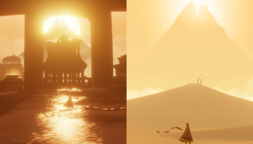
But that doesn’t support the visual hierarchy. Detail can be applied in the same way you might apply any other visual element. Creating areas of rest and areas of high detail is a great way to create contrast. Games like “Journey,” and “INSIDE” do this to a high degree.
But it’s not just something in stylized games. Very realistic games use this idea as well by implying detail. If you look at a game like “Uncharted” and “God of War” you can see how the detail is reduced in the distance, also called atmospheric perspective. This helps lead the eye and creates depth.
To summarize, we can tune all these different aspects of art to make sure that the most important parts of a game are the easiest to see. Now that we know what goals we have to keep in mind while designing the art of a game, let’s study the basic building blocks and architecture of a video game.
9. Psychology of Composition in Video Games
Every form of art is and should be, free. Art is not an empirical science like math or chemistry, and artists can’t produce and process it without a certain passion for the field.
However, psychology is an empirical science, and while we can’t “measure” art, we can study the effects it has on the human mind. Over countless generations of artists and men of science, we have accumulated a vast body of knowledge on the relation between art and the human psyche.
Game art design may have started quite recently, but it still is a medium for art, and therefore the general aesthetic principles and the effects they have on the psyche of the human mind holds true.
It only makes sense to use that vast repertoire of knowledge to make the best of our efforts toward creating an aesthetically impressive game. When you look at it that way, people like DaVinci, Rembrandt, or Van Gogh are all great teachers for an artist working on a game project.
Continuing on, we will discuss the link between the psychology of the human mind and aesthetics.
The goal here is that game artists reading this article will be able to consciously guide the direction of their art designs toward the specific impact that they want their works to have on the players. Without further ado, let’s take a closer look at the basic elements that compose a work of art.
10. Elements of Composition
It is important, as video game designers, that we appreciate both modern and classical aesthetic viewpoints. Though the clear-cut classical techniques are of more practical benefit to artists and designers than loose and freestyles of modern art. We can start by studying the root of visual design, in the lines, shapes, and volumes of the form.
Creating a photorealistic image is incredibly complex, that is why an artist breaks down the subjects into lines, shapes, and volumes to create their art one step at a time. Anyone working with digital art tools is already familiar with this issue.
No matter how detailed and complex a finished piece of art is, it always starts with the simplest shapes. Not only this makes the process of creating an impressive image tangible, but it also enables the artist to aim his/her work toward a specific goal at a basic level.
Each of the basic composition shapes conveys a different set of feelings and attributes to the viewer. These shapes are Circle, Triangle, and Square.
Experienced artists will employ these shapes in their work almost instinctively, knowing the effects by heart. Here, we will review the fundamentals of each shape briefly. Let’s start with the circle.
11. Psychology of Shapes
Circle – Sphere
Ancient greek has intriguing beliefs about the shape of a circle. According to the Greek scholar Proclus, “the circle is the first, the simplest and most perfect form”, and it’s true! A circle has perfect symmetry, a shape that can express a multitude of feelings, and all of them are positive.
Note how a bright, happy face is full of curved lines like a circle and how that same face will change its basic compositions to hard lines and sharper angles when expressing anger (like triangles, which we will study later on)
Using circles as the basic composition makes the whole image feel gentler, easier on the eyes, and invokes a sense of safety. Notice how characters designed for a children game or animation (except the villain) are all made up of round, curved shapes. We can trace The reason for this particular effect of the circle to the sense of touch.
Simply put, a circle or spherical shape is much less likely to cause you pain! Can you imagine playing volleyball with a cube or a pyramid without getting hospitalized?
The sun and the moon are spheres, both vital to our survival. This is embedded in us by the natural world right after we are born. Before we can even form a word or draw a simple shape. Even the breast of a mother that feeds the baby is circular in form.
Square – Cube
Now let’s get to my own favorite shape: Square. This shape transmits a sense of trust, steadfastness, stubbornness, and balance. Imagine a table with a sphere and a cube placed on top of it. Now imagine shaking that table just a little bit.
The sphere is more than likely to roll over the table’s surface and fall, while the cube will remain implacable. Even the table itself has a square shape, as do many other household objects designed to “hold” stuff reliably.
Many companies and institutions such as banks or real estate agencies operate partly based on the trust people place in them. So they use squares and cubes in their logos, buildings’ design, ads, etc.
If you use squares as the building blocks of a character in your game, that character will most probably exude a sense of cold confidence, experience, and maturity.
This is why characters that play the role of the mentor are often based on square shapes. Not only this will be complementary to the nature of their role, but it also aligns nicely with showing their advanced age.
Triangle – Pyramid
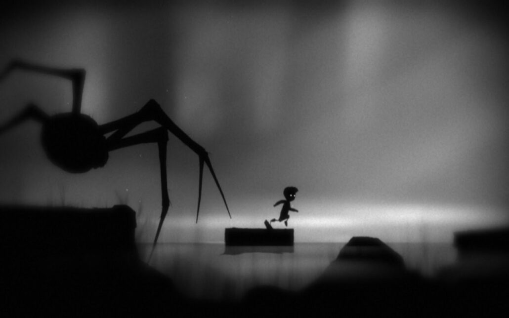
The most aggressive shape of all. We often associate Triangle with a sense of force and action. It behooves the viewer “to get ahead of the competition”, to move forward even if that means stepping on your rivals.
Almost every weapon designed in the history of warfare is composed of sharp angles and triangular shapes. From the star-shaped shurikens in ancient Japan to state-of-the-art missile warheads of the modern age, all are blatantly triangular.
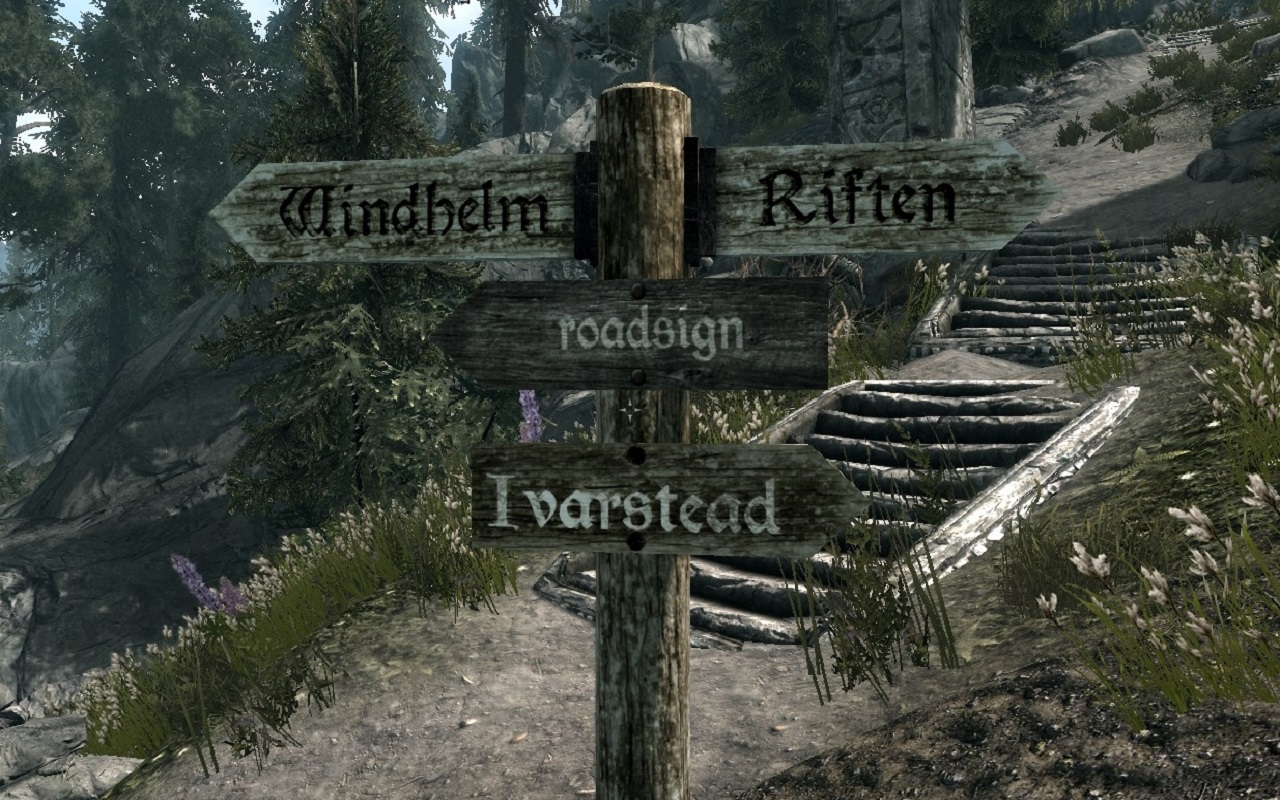
Or take road signs for example; the ones that require your immediate attention like danger signs are all triangular.
As we look at these sharp, triangular shapes, a part of our brain called the Amygdala becomes active. Amygdala is responsible for quick-thinking, responding to immediate danger, and generally saving our life! Veteran designers have always used this to their advantage, even in those historical times when the word amygdala wasn’t even invented yet.
Relation Between Triangles and Bad Guys
While the triangle itself bears no moral value, we often use it to depict villainous characters or insidious places. No wonder villains are so….edgy! (Pun intended)
This is not because the shape itself is evil in any way, but because bad guys in any story are always putting events in motion and are never passive. They always need to display a sense of peril, it’s for these reasons that triangle suits them perfectly.
The psychological foundation of these shapes means they are timeless components of art. They help us to discover connections between otherwise unrelated artworks and to better appreciate the aesthetics of video games.
Moreover, it allows us to make intelligent and informed design choices to achieve the desired effect with the players. We use simple shapes and lines as the basic building blocks to construct something greater than the sum of its parts.
The act of purposefully combining them toward achieving the desired effect in our finished work of art is called dynamic composition.
How to Apply Dynamic Composition in Game Art Design
The environment of a game, (especially AAA games) looks incredibly complex and detailed. It could be difficult to recognize the basic component parts present in a scene.
However, as players navigate through a masterfully designed game, they are faced with purposefully designed shapes and lines at any given point in a level. By taking a closer look, the dynamic composition of any given game can be revealed to us.
Dynamic Composition in Level and Environment Design
We use Dynamic Composition in every aspect of Video Game Art Design. But perhaps the environment design and pathfinding are where it comes to the play most prominently. Through careful construction of Dynamic Composition, a game can constantly reinforce the main theme and atmosphere of a game.
In a pure action game, it makes sense to base the composition mostly on triangular shapes and hard angles. This aligns nicely with the aggressive, breathtaking nature of such games. Everything is urgent, everything can be a potential danger to the life of the protagonist. So the players need to be constantly on alert.
We have elaborated on the nuances of game environment design in another article found here.
Please note that the Dynamic Composition of levels in a video game is not necessarily the same through all the levels. In many games, the pace of the game changes with each level; some levels are action-packed and filled with a swarm of enemies.
In the same game, a level might be puzzle-oriented or serve as a resting room between all the action, filled with dialogues and story elements. In such cases, the Dynamic Composition can and should be different from level to level.
Dynamic Composition in Pathfinding
Ideally, a game should be able to guide the player through the environment using Dynamic Composition alone. Without the players even noticing it.
When we provide the players with a certain pattern of lines and shapes composition since the beginning of a game, their brain makes out those patterns and adapts accordingly.
You don’t need to employ crude pointers on-screen or hold players’ hands through the starting line to the end. Through careful implementation of Dynamic Composition, you can direct the players. Their eyes and therefore their paths should move in any direction you desire.
Read More: In-Game Art vs. Promotional Art
Conclusion
The established guidelines for game art design are there for aspiring artists to find their way in the incredibly complex world of art. Ultimately, most interesting aspect about art is that it is free, so don’t be afraid to mix things up. You may even come up with your own style after you have gained some experience.
Can you name a few games with a great overall art design? Using what we have learned, you may now be able to break them down to their component parts to find out why they conveyed such a pleasant feeling to you!
FAQs
How can concept art help?
Concept art establishes strong visual direction and narrative, guiding consistent game aesthetics.
What role does color theory play?
Color sets emotion. Contrast draws attention; harmony supports mood, focus, and player immersion.
Why is composition important in game scenes?
Smart use of light, shadow, and layout builds atmosphere. Like moody lighting for tension, open scenes for calm.
How do lighting and shadows enhance visuals?
Lighting adds depth, realism, and mood. Dramatic shadows convey danger; soft light feels inviting.
Why study anatomy for game art?
Strong anatomy improves character believability, especially when crafting human or creature figures.
What polish techniques make visuals pop?
Add particle effects, screen flashes, and screen shake to enhance feedback and screen impact.
How do simple tools improve game art?
Limited palettes, expressive designs, layer tools, and brushes enhance polish even for less experienced artists.
Why trust players with intelligent visual design?
Trusting player intuition and avoiding over-explanation encourages exploration and visual engagement.
How do technical limits inspire creativity?
Constraints like hardware limits often lead to iconic design choices (e.g., Crash’s orange color or fog in Silent Hill).
What if artists explore life, not just games?
Drawing inspiration from diverse experiences (books, nature, sports) leads to unique and visually compelling ideas.


One Response
Thx! Its good to know we’re doing good in the eyes of the google gods! lol