UI/UX design in hypercasual games is crucial for ensuring a seamless, engaging, and intuitive player experience. HyperCasual mobile games have been very easily accepted in the vast industry of gaming. These quick-playing little experiences are nothing short of an international sensation, snatching the hearts (and thumbs) in every corner of this wide world. So, then what makes them so successful? It’s not simply a matter of nice colored visuals or punchy sounds. What lies is the magic of an integrated User Interface (UI) and User Experience (UX) of a hypercasual game?
Are you one of those people who say, “UI is like UX just a different set of letters?” Well, not quite. They’re closely related, especially in the world of hypercasual, but they each fulfill a separate role when it comes to making sure your game is engaging and has generated that “just one more round” feel that keeps players sticking around.
But let’s break it down, shall we?
Need Game Art Services?
Visit our Game Art Service page to see how we can help bring your ideas to life!
The Dynamic Duo: UI and UX in Hypercasual Games
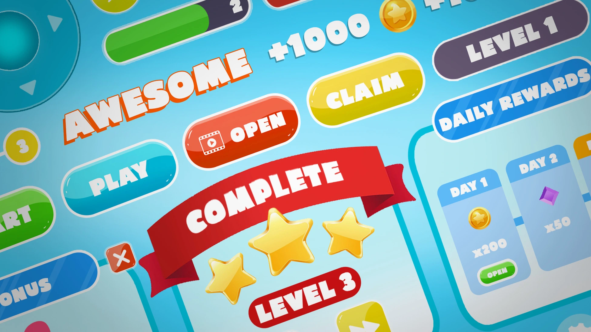
Imagine UI as your game’s face. This is what the players will be able to directly see and interact with. In the context of a hypercasual game, this could be anything from your start button to your score counter, character customization menu, or even a “Game Over” screen. It pertains to what elements are visible, where they’re placed, and how information is portrayed to the player.
And the heart of your game? UX. It’s all about how players feel when they are interacting with your UI. Is it intuitive? Frustrating? Rewarding? UX includes everything from when someone sees your app icon to how they feel after their hundredth attempt at trying to beat the high score.
At this point, you may ask, why discuss them in conjunction? Great question! The UI/UX design pipeline in hyper-casual games are just like peanut butter and jelly – awesome alone but some serious talent is required to make them magical together.
The Hypercasual Difference
So, to be useful in a follow-up blog post we need to elaborate on what makes hypercasual games different. They are all designed for you to pick up and instantly play, with little or no tutorial. Their basic, reductive mechanics and highly limited play sessions are undoubtedly suited to a rapid-fire mobile audience. Common examples are — Flappy Bird, Hole.io,” and “Helix Jump.”
Your user interface and your user experience especially in this genre should have a very high standard. In that span, you must draw the player in, teach them how to play and get players engaged with gameplay. This requires a design that represents beauty and functionality.
Quick Hook: one of the strengths of hypercasual games is that they are able to engage the players almost instantly. So, the details at the UI level should be minimal and only provide the basic elements. For example, “Flappy Bird” has a logo and a start button in addition to a score counter which represents all of the game UI elements. It is simple in a way which means players can just pick up and play without trying to figure out controls.
Simple and Clear: Every component of your UI needs to serve a straightforward purpose that should take no time to interpret. You can use the known icons, and symbols to avoid any learning curve. Just like how you lose a viewer if they have to stop and consider what button hits the gas in Mario Kart, etc. Keep your style consistent with the app’s color palette, button shapes, fonts, and icons so that you can create a universal visual language that players will instantly understand.
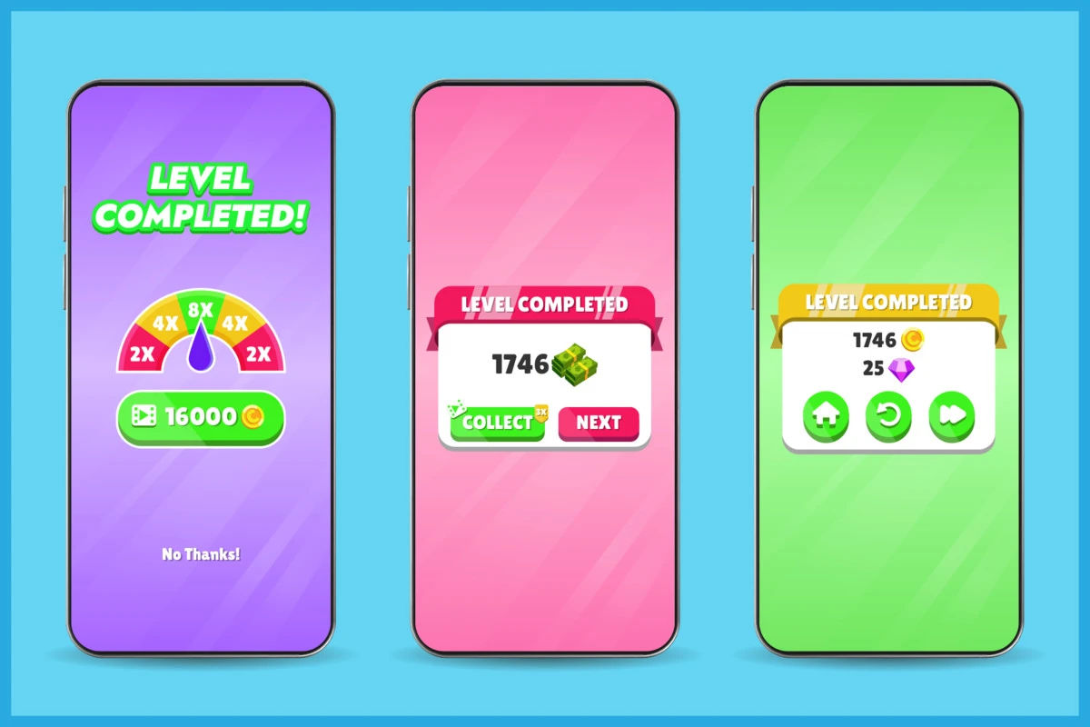
Immediate Feedback: Each of the players’ movements shall be accompanied by an instant visual or audible confirmation. E.g.: A button goes blue when clicked, or a high score displays bounches on the screen each time you make a point. This feedback helps keep the player in the loop about their actions in the game and makes that engagement more interactive.
Minimal Distractions: In hypercasual games, white space is not just there to look pretty. This allows us to focus on the most important elements and not have a visual overshoot. Don’t put too much information on the screen, give a clean and pleasant experience of play to players.
At the highest level, UI and UX should be simple, and interesting but it can get straight away in the case of hypercasual game genre. Focus on simplicity, focus on feedback, and create a great interaction that makes the players continue to play – but how?
The Key To A Great Hypercasual UI
Do not forget that in hypercasual games, more is less. Build a simple UI and you should add only the most important elements to your screens. I mean, look at “Flappy Bird”! The whole UI consists of a begin button, score, and the game parts. That’s it. No convoluted menus, and no crowded HUD. Just pure, simple gameplay.
Each individual part of your UI should serve a purpose and be easily understood. Utilize as many common icons and symbols. When a player has to process what the button does they are already gone, so keep it consistent in your game. This includes color schemes, styles of buttons used, fonts selected, and icon designs. It helps players understand your game’s visual language quickly.
Don’t forget about feedback! Each action a player does should be followed by an instant and recognizable visual or auditory reply. Tapped a button? It is supposed to either change color or animate. Scored a point? Make that number bounce! And please, do not hate leaving white spaces in your design. You can also use white space in order to direct the minds of your players so they know what is important, and you keep everything light enough not to overwhelm them visually.
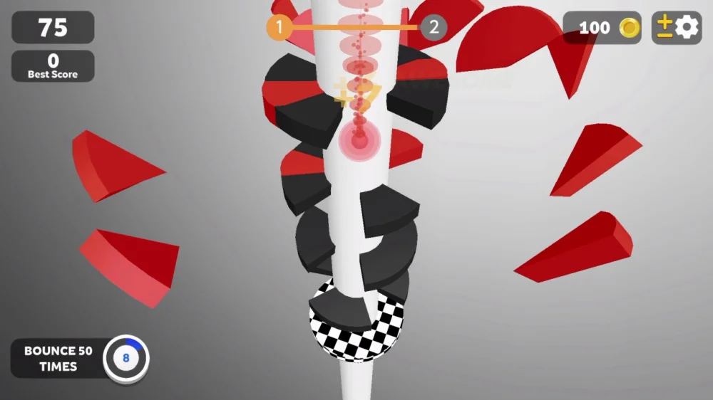
Case Study: "Helix Jump"
Helix Jump Here is an example of “good” hypercasual UI Design. In the game interface, I only traced to four components: ball, tower, level display, and scoring counter. The colors are minimal but striking, with the ball and obstacles standing out clearly on some simple background.
Menus are similarly pared back in the game. You just have three options in the main menu: Play, Shop, and Settings. All of these are indicated with a clean, universally in-evaluatable icon. The simplified nature of the UI should keep players focused on what keeps them coming back: gameplay.
UX Magic - Designing for Addictive Experiences
Now that we’ve covered the visual aspects, let’s dive into the experience side of things. Remember, great UX in hypercasual games is all about creating a frictionless, engaging experience that keeps players coming back for more.
Hypercasual games should provide feedback and rewards immediately following players’ actions. These micro-rewards, whether it’s a satisfying “pop” sound when clearing an obstacle or nothing more than a shower of coins after completing a level keep players engaged and motivated. Hypercasual games are usually played on your phone, meaning that they will be activated quickly or within a few minutes and occasionally while doing something else as well. Create your controls to take advantage of this. True play with one hand? With just a thumb? The easier to play, the more players return.
Already in hypercasual games, failing is a good thing. Just no one likes to be left waiting after they’ve lost. Ensure your game over-screen is followed up with a quick restart option. The less time players are spending dying over and over, the shorter the gen is going to be now that survivors can go back to breaking up incomplete gens faster. The central mechanic has to stay simple, but a progression of difficulty can keep players engaged longer. It can be faster gameplay, obstacles, or elements getting introduced over time.
The social features must not be forgotten In addition, adding leaderboards, achievements, and social media sharing features can give players more reasons to play your game over and over by keeping them competitive. Be cautious, however – you do not want these in-game features to clutter up your UI and disrupt gameplay.
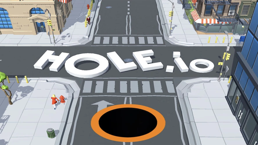
Case Study: "Hole.io"
The UX design in “hole.io” is practically a hypercasual version of a masterclass. The game’s core mechanic-the hole you control that grows as it swallows objects-is easily understood and instantly enjoyable. Instant start, clear progression, time pressure, and competition are characteristics that make the UX shine. It only takes seconds to start playing as soon as the app is opened, the hole gets bigger and bigger visually depending on what you eat in-game, a timer adds pressure that makes it enjoyable for us players once we swallow multiple objects at any given time, and competing with others provides new layers of immersion adding to an otherwise simplistic game.
The Marriage between UI and UX in Hypercasual Games
Let’s look at how UI and UX operate within the context of an ultra-popular game to help you understand that adage – a picture speaks more than words, after all. The UI acts as an implicit tutorial in hypercasual games. Case in point: Crossy Road. Your character will be spawned on a single road with one arrow pointing forward to start the game. It tells the player all they need to know: tap to go forward.
The best hypercasual games have a fast feedback loop, with everything you do reacting immediately onscreen. The quick fall of the bird directly following each tap in “Flappy Bird” creates a direct and clear cause-and-effect that players pick up within minutes. UI and UX of menu designs intercept each other frequently. The lone color wheel of “Color Switch” serves as a menu and an in-game object, blurring the line between navigation and gameplay.
Subtle UI changes indicate the same for some hypercasual games. In “Stack”, the smaller platforms further up on the tower are there to represent that this is where it gets harder visual binary reinforcement. Oh, and let’s not forget haptic feedback! An appropriately timed vibration here can make a collision feel good or alert the player to that new high score and add another layer of sensory feedback to back up your visual UI.
Common Pitfalls to Avoid
Even if you come with the best of intentions these are some common traps in which one could fall when designing a UI/UX for hypercasual games. The important thing to remember is that this “hyper” in hypercasual refers to simplicity – not necessarily speed. Giving players more than they need might get customers to be turned off. So the point is that ads and IAP are fine for monetization, but they should never take away from what makes your game fun in its normal state. Do not use pop-ups during gameplay or an excess of aggressive prompts to buy products.
Each mobile platform provides its guidelines, and expectations of the user. Not considering these will either make your game alien or foreign to the user. Also, take into account accessibility features like colorblind modes or adjustable text sizes in your minimalist design pursuits. And funnily enough, Hypercasual games are entirely about being yellow. In game UI/UX design services, too much UI and UX means you have failed on your path to making cry-worthy games.
Wrapping Up
Developing UI and UX for hypercasual games is tricky, Rather, they are about accessibility – an experience basic enough that players can be hooked in seconds and yet compelling enough so as to keep them coming back for hours. It’s about making sure every tap, swipe, and victory feels meaningful.
Remember, in the world of hypercasual games, UI and UX aren’t just about making your game look good or feel good – they’re about making your game irresistible. They’re the secret ingredients that transform a simple idea into a global phenomenon.
Now, armed with these insights, are you ready to create the next hypercasual sensation? The gaming world is waiting! Remember, if you need help with your game art, Pixune Studio offers a wide range of game art services. We love hearing from you and discussing how we can help to make your game look as awesomely hypercasual as possible!