Creating 2D art that feels three-dimensional is one of the most important skills in illustration, concept art, animation, and game design. Even though the artwork exists on a flat surface, artists use lighting, perspective, shadows, color, and composition to create the illusion of depth and volume.
From stylized cartoons and digital paintings to realistic environment art, adding a sense of 3D form makes artwork feel more immersive, dynamic, and visually believable. Modern artists also combine traditional drawing techniques with 3D tools and workflows to speed up production and improve accuracy.
In this guide, we’ll explore the most effective techniques artists use to make 2D art look 3D, including perspective, lighting, atmospheric depth, textures, and modern 3D-assisted illustration workflows.

Need Animation Services?
Visit our Animation Service page to see how we can help bring your ideas to life!
What Does It Mean to Make 2D Art Look 3D?
Making 2D art look 3D means creating the illusion of depth, volume, and spatial realism on a flat surface. Artists use techniques like perspective, lighting, shadows, gradients, color variation, and composition to make objects appear solid and dimensional rather than flat.
Even though illustrations, paintings, and animations exist in two dimensions, the human eye naturally interprets certain visual cues as depth. When these visual principles are used correctly, a flat image can feel immersive, cinematic, and believable.
This approach is widely used in:
- Concept art
- Character illustration
- Animation environments
- Game backgrounds
- Matte paintings
- Digital painting workflows
Modern artists also combine traditional drawing fundamentals with 3D-assisted workflows to improve perspective accuracy, lighting consistency, and production speed while maintaining a hand-crafted artistic style.
How to Make 2D Art Look 3D?
Creating dimensional 2D artwork requires multiple techniques working together. Perspective, lighting, shadows, color, and composition all contribute to the illusion of depth.
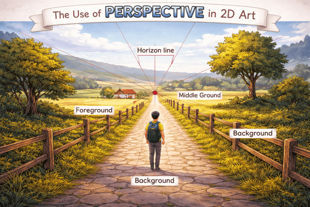
1. Use Perspective
Perspective is one of the most important foundations for creating depth in 2D art. It helps objects appear farther away or closer to the viewer based on spatial relationships.
Using vanishing points and horizon lines allows background artists to create believable environments, architecture, and object placement. Even stylized artwork usually relies on perspective principles to maintain visual consistency.
Foreground objects are often drawn larger and more detailed, while distant objects become smaller and compressed toward the horizon.
2. Add Light and Shadow
Light and shadow define the form of objects and help communicate their volume. Without proper shading, even well-drawn objects can appear flat.
Lighting artists and shader artists usually establish a primary light source and build shadows based on that direction. Highlights define raised surfaces, while shadows create depth and separation between forms.
Strong contrast between light and dark areas can dramatically improve dimensionality and visual focus.
3. Use Gradients for Form
Gradients help simulate curved surfaces and smooth transitions between light and shadow. Instead of using flat colors, artists gradually shift tones to create the illusion of rounded forms.
Soft gradient transitions often make artwork feel more polished and dimensional. This technique is commonly used on:
- Skin
- Fabric
- Metal
- Clouds
- Rounded objects
4. Add Cast Shadows
Cast shadows help anchor objects into the environment and improve spatial realism. They show how objects interact with surrounding surfaces and create stronger depth relationships.
Shadows become softer and lighter as they move farther away from the object casting them. Their direction should always match the scene’s main light source.
Even simple cast shadows can significantly improve the realism of flat illustrations.
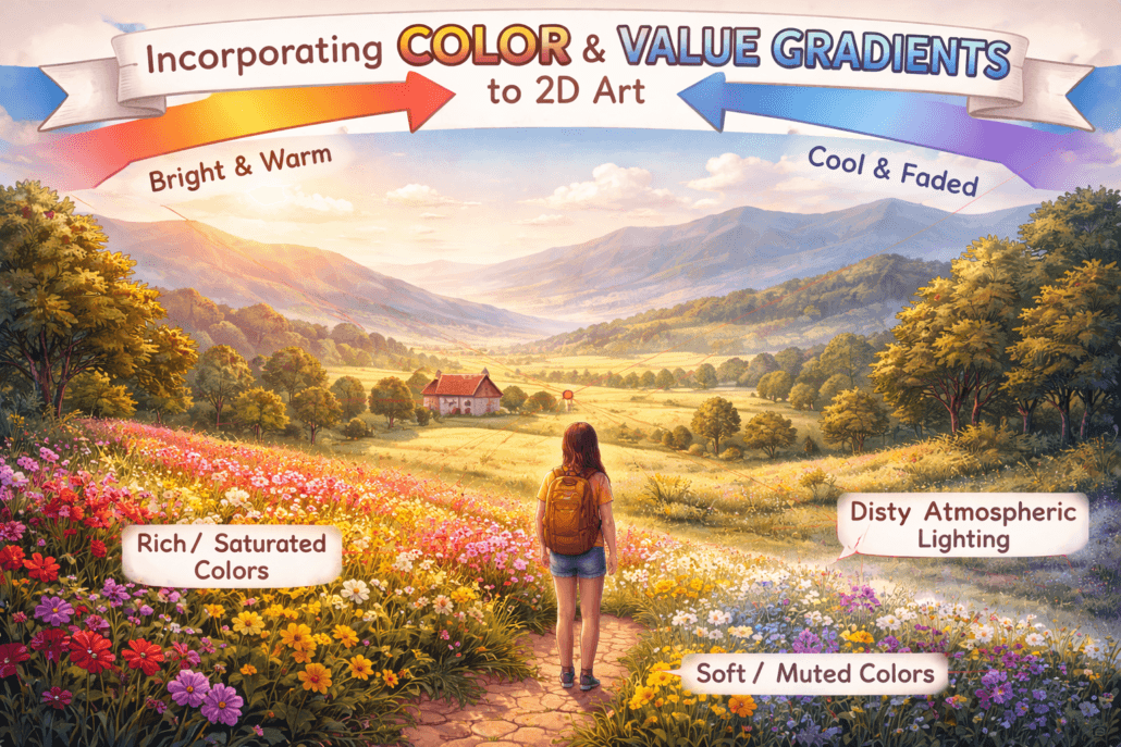
5. Use Atmospheric Perspective
Atmospheric perspective simulates how objects appear less detailed and less saturated as they move farther away from the viewer.
In real life, particles in the atmosphere scatter light and reduce visibility over long distances. This technique is especially important in landscapes and environment art. Environment artists recreate this effect by:
- lowering contrast
- reducing detail
- softening edges
- shifting distant objects toward cooler colors
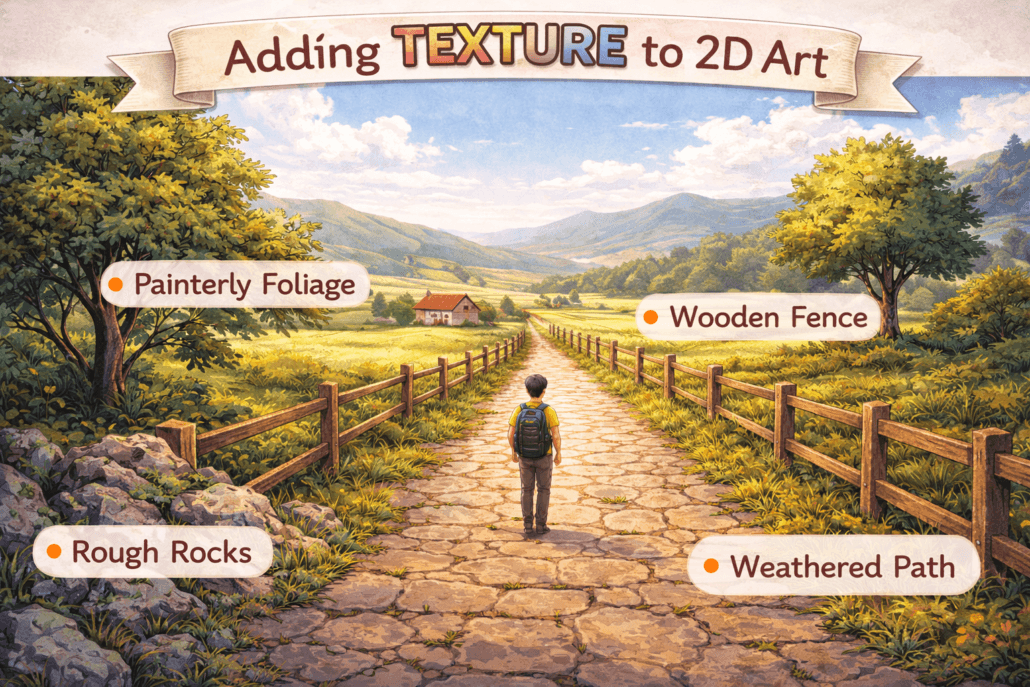
6. Add Texture and Surface Detail
Surface texture helps objects feel more tactile and believable. Materials like stone, metal, wood, fabric, and skin all react differently to light and require unique surface treatment.
Texture artists often place more detail in foreground elements while simplifying distant areas. This contrast improves focus and enhances the illusion of depth.
However, too much texture across the entire image can flatten the composition instead of improving it.
7. Use Focus and Blur
Selective focus is another powerful way to create depth in 2D artwork. Just like a real camera lens, artists can blur foreground or background areas to direct attention toward the focal point.
Sharp details naturally attract the eye, while softer blurred regions recede into space. This technique is especially common in services like cinematic illustrations, concept art, and environment design.
Subtle blur usually works better than excessive blur effects.
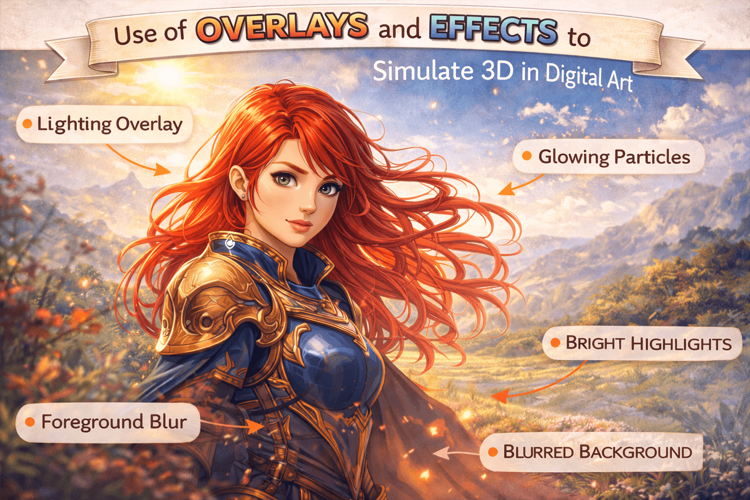
8. Add Highlights and Rim Light
Highlights and rim lighting help separate objects from the background and emphasize their three-dimensional shape.
Rim lights appear along the edges of objects where light hits from behind or from the side. This technique is widely used in cinematic art because it improves silhouette readability and adds visual drama.
Controlled highlights can also improve material realism, especially on reflective surfaces like metal or glass.
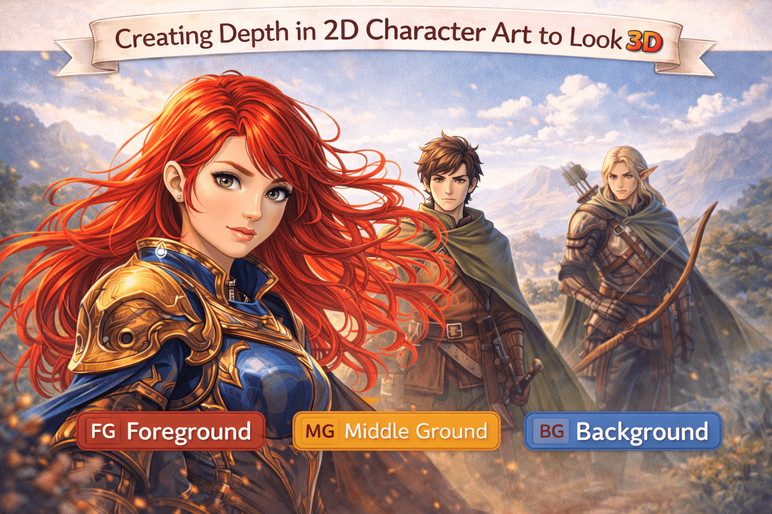
9. Separate Foreground, Midground, and Background
One of the easiest ways to create depth is by dividing the composition into multiple spatial layers.
Foreground elements create framing and scale. Midground objects usually contain the primary focus of the scene, while background elements establish atmosphere and environmental depth.
Layer separation helps the viewer understand spatial relationships more naturally and makes the artwork feel larger and more immersive.
10. Use Parallax for Motion
Parallax is a motion technique where foreground and background layers move at different speeds to simulate depth.
Closer layers move faster, while distant layers move more slowly. This creates a strong illusion of spatial depth even in fully 2D environments.
Even subtle movement differences can make scenes feel significantly more dimensional. Parallax is widely used in:
- Side-scrolling games
- Motion graphics
- Animated websites
- Cinematic UI design
- Social media animations
Examples of Successful 2D Art That Looks 3D
Some 2D artworks create such strong depth and atmosphere that they almost feel like fully rendered 3D scenes. These illustrations use perspective, lighting, texture, composition, and atmospheric effects to create believable dimensionality while still maintaining a hand-crafted artistic style.
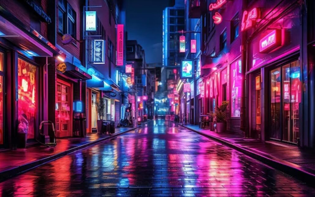
1. Neon Nights
The strong contrast between neon lighting and dark shadows creates dramatic depth in this cyberpunk-inspired scene. Reflections, perspective lines, and layered foreground elements help guide the viewer’s eye deeper into the environment.
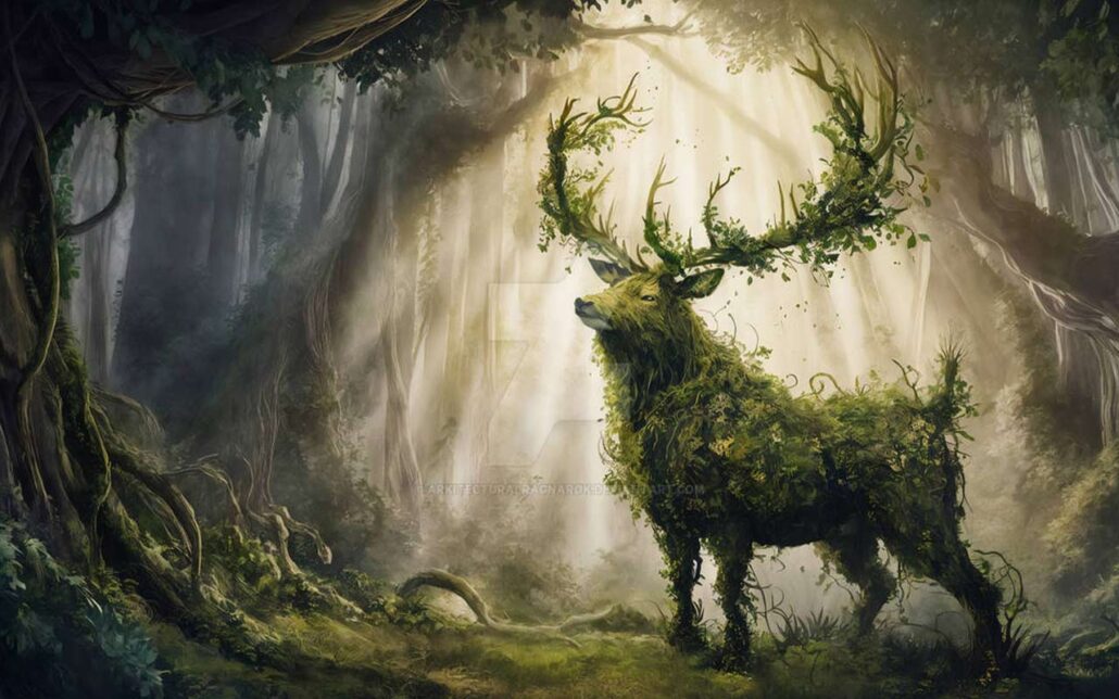
2. Forest Guardian
This artwork uses atmospheric perspective, scale variation, and soft lighting to create a believable sense of depth inside a dense fantasy forest. The layered vegetation and controlled color saturation make the environment feel immersive and spatially rich.
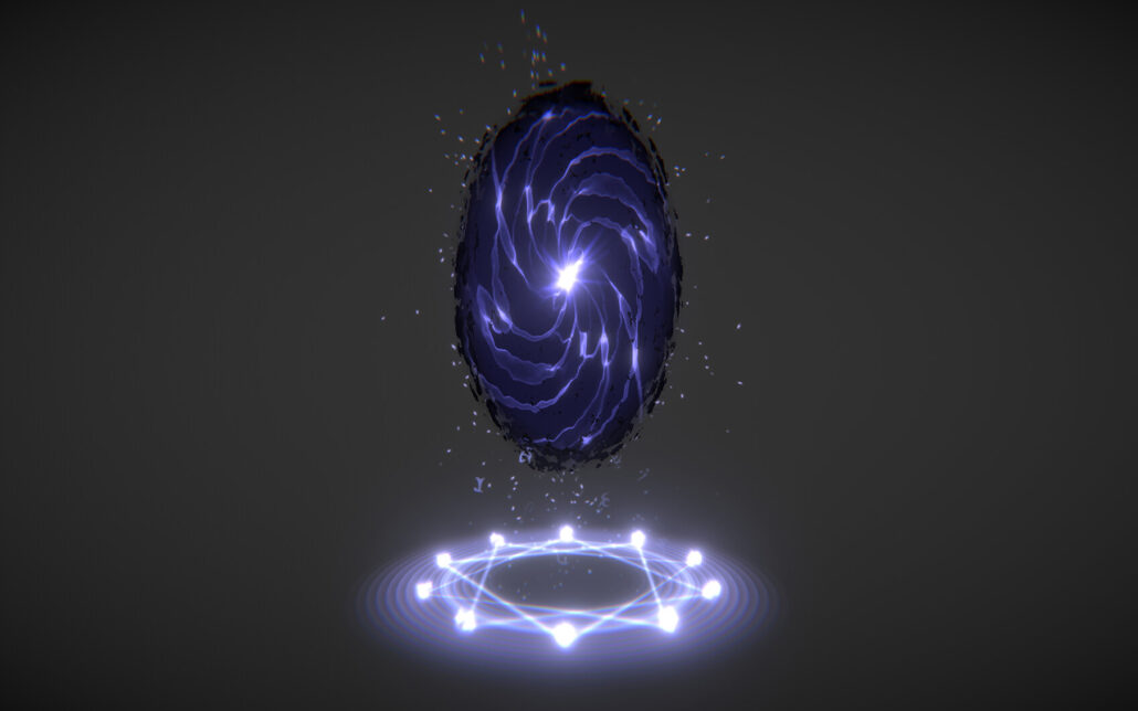
3. Mystic Portal
The glowing portal becomes the focal point through strong lighting contrast and depth composition. Surrounding fog, volumetric lighting, and foreground framing elements help create a cinematic 3D illusion.
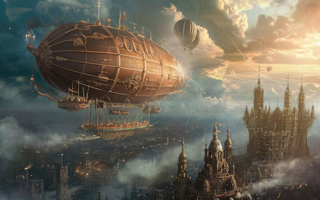
4. Steampunk Airship
Mechanical detail, perspective distortion, and realistic material rendering give this illustration a convincing three-dimensional appearance. The use of shadows and layered clouds also improves environmental depth.
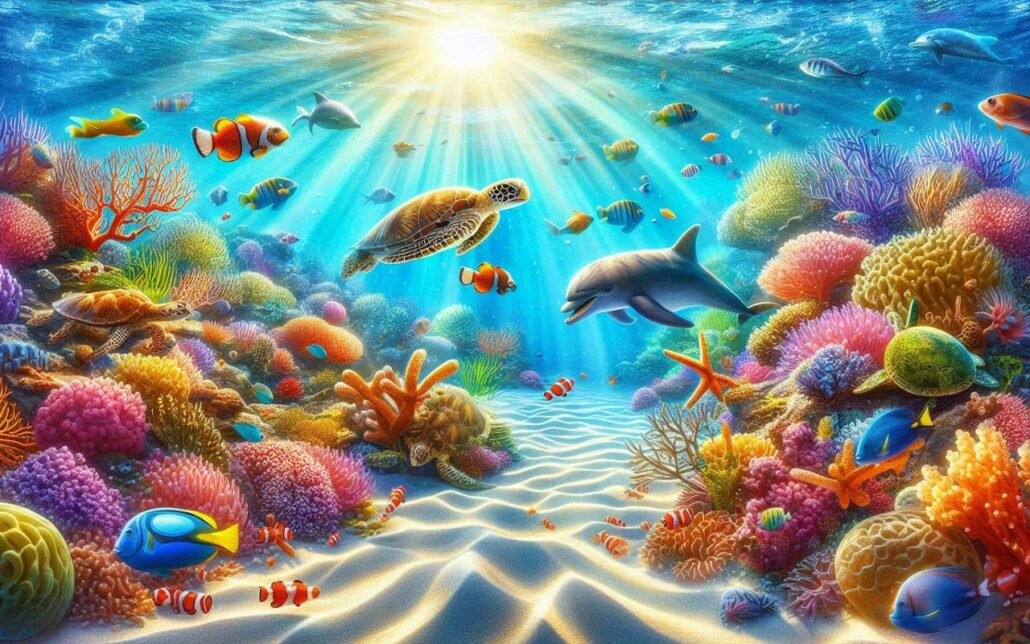
5. Underwater Paradise
Underwater scenes naturally benefit from atmospheric depth because light diffusion and color fading occur gradually through water. Soft lighting, floating particles, and layered coral structures help create strong spatial separation.
Common Mistakes to Avoid When Trying to Create 3D Effects
Creating depth in 2D art is not just about adding shadows or gradients. Many artists unintentionally flatten their artwork by misusing lighting, perspective, texture, or composition.
1. Inconsistent Lighting
One of the most common mistakes is using multiple conflicting light directions. If shadows and highlights do not follow the same lighting logic, the illusion of volume immediately breaks down.
Before rendering, lighting artists should establish a clear primary light source and maintain consistent shadow behavior throughout the entire scene.
- Mistake: Inconsistent lighting direction across your piece.
- Fix: Pick a main light source and stick to it.
- Pro tip: Use a directional arrow on a separate layer to remind you where your light’s coming from.
2. Overusing Highlights
Adding bright highlights everywhere can make materials feel unrealistic instead of dimensional. Strong highlights only appear clearly on reflective surfaces like metal, glass, or polished objects.
Using softer and more controlled highlights often creates a more believable result.
- Mistake: Slapping highlights on every single surface.
- Fix: Be selective! Only add strong highlights to actually shiny stuff.
- Pro tip: Vary your highlight intensity. A metal pot? So shiny. A cotton shirt? Not so much.
3. Ignoring Atmospheric Perspective
Objects in the distance should gradually lose contrast, detail, and saturation. Keeping background elements as sharp and colorful as foreground objects removes the sense of spatial depth.
Professional artists often reduce detail and slightly shift distant objects toward cooler colors to simulate atmospheric perspective.
- Mistake: Keeping the same level of detail and color saturation throughout the image.
- Fix: Use atmospheric perspective. Things far away should be less detailed, less saturated, and slightly bluer.
- Pro tip: Add a very subtle blue gradient overlay to your background elements.
4. Using Flat Shadows
Shadows are rarely pure black. Realistic shadows usually contain subtle environmental color information caused by bounced light from nearby surfaces.
Adding slight blue, purple, or warm color variation to shadows can make artwork feel much more natural and dimensional.
- Mistake: Using pure black or gray for all shadows.
- Fix: Tint your shadows with colors from the environment.
- Pro tip: Try using a dark purple (#4B0082) for shadows in a warm scene or a deep blue (#00008B) in a cool scene.
5. Excessive Texture Detail
Too much texture across the entire image can overwhelm the viewer and flatten the composition. Detail should be concentrated around focal points while less important areas remain simpler.
This helps guide the eye and improves depth perception.
- Mistake: Plastering every surface with intense texture.
- Fix: Use texture strategically. Vary the intensity and scale.
- Pro tip: Put detailed textures in the foreground and simplify as you move back into space.
6. Poor Edge Control
Edge quality plays a major role in creating depth. Sharp edges tend to move forward visually, while softer edges recede into space.
Professional painters constantly vary edge sharpness to control focus, atmosphere, and spatial hierarchy.
- Mistake: Having all edges equally sharp or equally soft.
- Fix: Vary your edge quality. Sharp edges come forward, and soft edges recede.
- Pro tip: Use a soft eraser to gently soften edges in the background or on rounded surfaces.
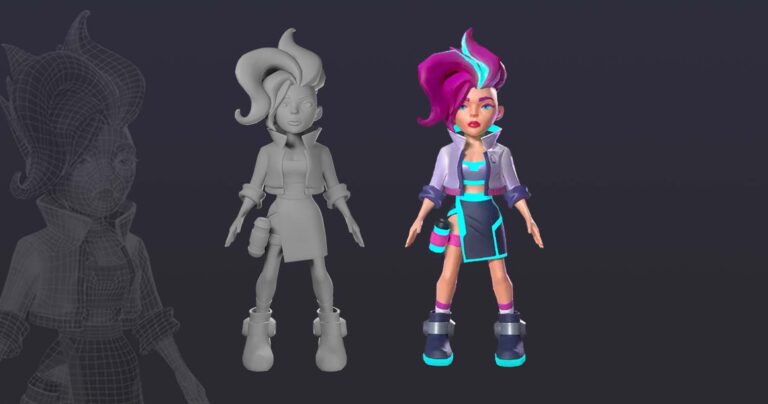
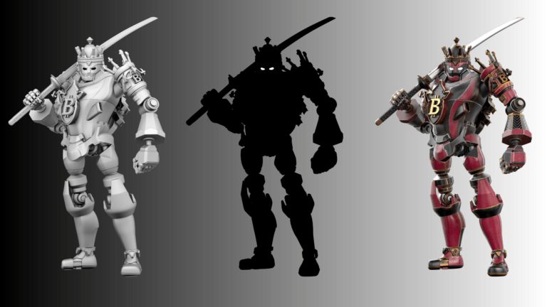
Creating Illustrations From 3D Models
Many modern illustrators and concept artists use 3D modeling as a foundation for creating 2D artwork. This workflow helps artists establish accurate perspective, lighting, proportions, and camera angles much faster than building everything manually from scratch.
Artists often begin by creating a rough 3D blockout using 3D software like Blender or SketchUp. These simple models act as guides for composition and spatial depth. Once the camera and lighting are established, the artist paints over the render to create a polished 2D illustration.
Using 3D models does not replace artistic skill. Instead, it helps artists focus more on visual storytelling, composition, and rendering while reducing technical perspective errors. This workflow is especially common in:
- Environment concept art
- Architectural illustration
- Matte painting
- Vehicle design
- Background art
- Game art production pipelines
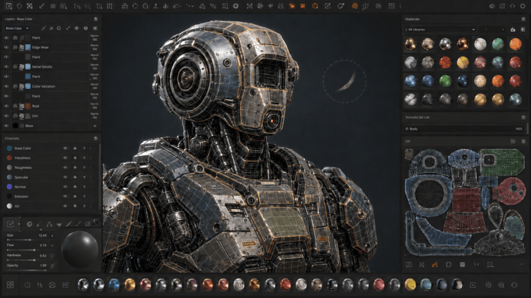
Tools for Making 2D Art Look 3D
Modern artists use a combination of 3D and 2D software to create artwork with stronger depth and realism.
Adobe Photoshop remains one of the most popular tools for digital painting, lighting, photobashing, and paint-over workflows. Procreate and Clip Studio Paint are also widely used for illustration and stylized rendering.
Many concept artists use Blender as a supporting tool for perspective blockouts, lighting setup, and camera composition before painting over the scene in 2D. This hybrid workflow has become increasingly common in game art and cinematic concept design.
Vector-based programs like Adobe Illustrator can also create depth using gradients, shadows, and layered compositions, especially in flat design and motion graphics workflows.
The best tool ultimately depends on the artist’s workflow, art style, and production needs rather than the software itself.
Conclusion
Making 2D art look 3D is all about understanding how light, form, perspective, and atmosphere work together to create depth. Strong dimensional artwork does not rely on a single trick but instead combines multiple artistic principles to build believable visual space.
Whether using traditional drawing methods, digital painting techniques, or modern 3D-assisted workflows, artists who understand depth can create illustrations that feel far more immersive, cinematic, and visually engaging.
As modern art pipelines continue evolving, the combination of 2D and 3D workflows is becoming increasingly common, giving artists more creative freedom to produce rich and dimensional artwork faster than ever before.