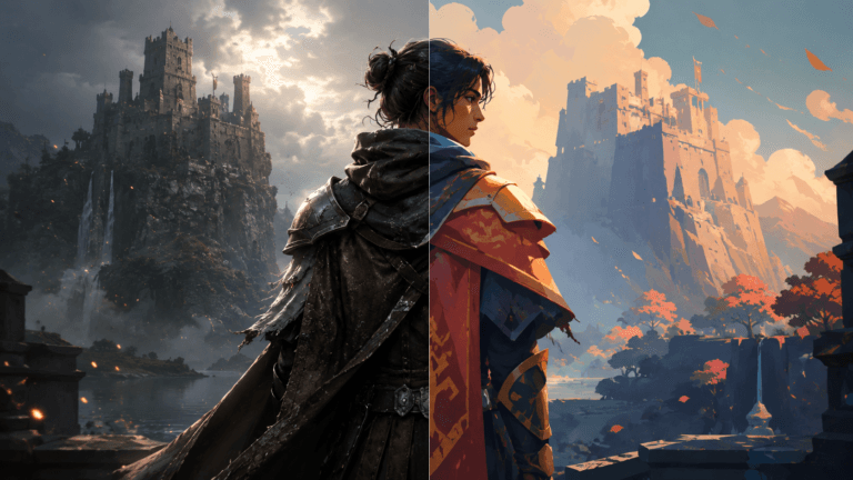
Color is arguably among the most powerful narrative tools in game design. It fundamentally controls the player’s emotional state, directs their focus, and defines your game art services.
From the ethereal glow of a magical forest to the harsh neon glare of a cyberpunk metropolis, a carefully chosen color palette transforms simple graphics into a profound emotional experience. However, effective color use in game art demands more than just instinct; it requires a solid grasp of color theory.
In this article, we will provide a practical, simplified guide to applying color theory principles to your concept art, 3D environments, and character assets, benefiting artists at any skill level.
Need Game Art Services?
Visit our Game Art Service page to see how we can help bring your ideas to life!
What Are the Basics of Color Theory?
Color theory is the scientific framework that governs how colors behave, mix, and impact human emotion. Its cornerstone is the color wheel theory in art, which logically arranges hues into primary, secondary, and tertiary colors.
Understanding relationships like Complementary Colors (those opposite on the wheel) or Analogous Colors (those positioned next to one another) allows artists to make deliberate visual choices that significantly boost player immersion.
In game art, this essential knowledge ensures visual coherence and clarity. For example, a stark red threat set against a serene blue background instantly grabs the player’s eye due to the strong contrast.
By mastering these basics, you can effortlessly direct player attention and manipulate the atmosphere solely through color. Once these fundamentals are second nature, you’ll recognize color not as mere embellishment, but as a critical design language.
Why Does Color Matter in Game Art?
Color communicates mood and intent faster than shape language, any line of text, or animation. It sets the atmosphere, improves gameplay readability, and establishes the brand identity. Think of the vibrant, high-saturation palette of a game like Super Mario Odyssey to convey joy versus the subdued, muted tones of The Last of Us, which establish tension and grit.
Effective color use also significantly improves the player experience. For instance, clear color coding in the user interface (UI) helps players make rapid decisions, and maintaining consistent palettes across levels ensures visual cohesion.
Ultimately, color goes beyond simple aesthetics; it is a functional form of visual storytelling in game art that seamlessly links the artwork to the gameplay purpose.
What Are the Core Elements of Color?
According to Munsell’s theory, every color can be deconstructed into three core properties: Hue, Saturation, and Lightness. Grasping these concepts allows you to create color harmony, contrast, and focal points in your artwork.
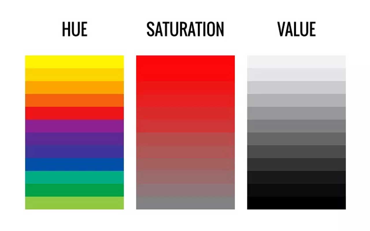
Hue
Hue is the purest form of a color, such as red, blue, or green, and is responsible for setting the general emotional temperature.
Warm hues (reds, oranges) are typically associated with energy, intimacy, or danger, while cool hues (blues, greens) suggest tranquility, distance, or melancholy.
Games such as Journey and Zelda: Breath of the Wild frequently employ subtle hue shifts to guide the game design psychology and the player’s emotional journey without relying on dialogue.
Saturation
Saturation defines a color’s intensity or purity; how vivid or dull it appears. Highly saturated, bright colors generate excitement and demand attention, whereas desaturated tones often suggest realism, age, or sadness.
It’s a common practice for concept artists to desaturate background elements to ensure key gameplay areas stand out. Ori and the Blind Forest is an excellent example of how varied saturation builds a compelling visual rhythm and emotional depth.
Value (Lightness)
Value refers to the lightness or darkness of a color. It is crucial for establishing depth, defining form, and creating visual hierarchy. Intense value contrast quickly draws the eye, while balanced value gradients maintain overall harmony.
Many artists first work in grayscale to guarantee the composition is clearly legible before any color is introduced. Games like Inside and Gris demonstrate how precise control of value dramatically enhances both the artistic style and the narrative impact.
What Are the Main Color Combination Schemes?
Color schemes offer time-tested recipes for achieving both harmony and contrast. In the context of game art, they guarantee that every asset and scene contributes to a unified art direction.
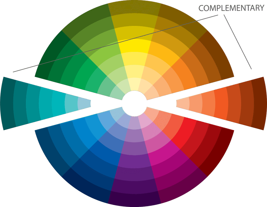
Complementary Colors
These colors sit directly opposite each other on the color wheel (like orange and blue). They generate intense, energetic contrast and visual drama. Many fast-paced action games, like Overwatch, utilize complementary palettes to make characters pop brightly against dynamic backgrounds.
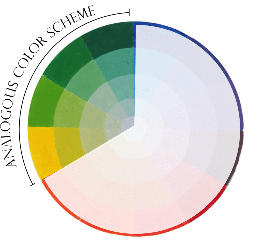
Analogous Colors
Analogous colors are situated adjacent to one another on the wheel (like green, yellow-green, and yellow). They create natural, pleasing harmony, making them perfect for peaceful or naturalistic environments.
Many open-world and RPG titles lean on this scheme to achieve believability and a comfortable experience during long sessions.
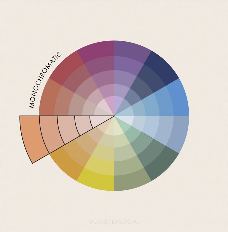
Monochromatic Colors
A monochromatic scheme uses a single hue but varies its brightness (Value) and Saturation. It is simple yet powerfully effective, often seen in highly stylized, moody titles such as Limbo, where minimal color amplifies atmosphere and emotional resonance.
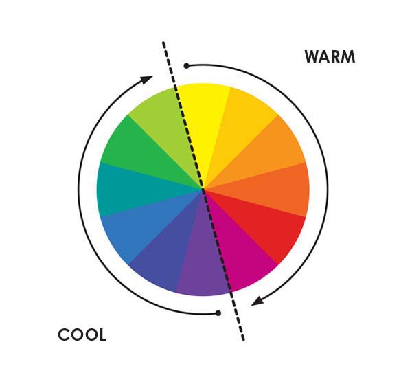
Color Temperature
Color temperature divides hues into warm (red, orange, yellow) and cool (blue, green, purple) categories. Warm tones feel close, energetic, or emotional; cool tones feel distant, serene, or unsettling.
The intentional mixing of warm and cool zones, like an orange-lit torch in a cold, blue cave, is a sophisticated technique that creates contrast, depth, and storytelling nuance in any game scene.
How Does Color Influence Emotion and Psychology?
Color has a direct and profound effect on a player’s emotional state while they interact with your world. Understanding color psychology is key to triggering the appropriate emotional cues.
- Warm vs. Cool Emotions: Warm colors typically convey excitement, passion, or aggression, making them ideal for scenes of action or urgency. Cool colors often evoke serenity, mystery, or fear, perfect for horror or meditative puzzle games.
- Cultural Meaning of Color: Color symbolism is not universal: red may symbolize danger in one culture, but deep celebration in another. Global studios often assess cross-cultural influences and meticulously test their palettes for cross-cultural impact to prevent sending unintended or conflicting signals.
- Using Color to Support Narrative Tone: An expertly planned palette can evolve alongside the narrative. For instance, the game Hades uses fiery reds for scenes of chaotic battle and shifts to cool blues for reflective, emotional moments, mirroring the narrative’s progression.
How Does Lighting Affect Color in Game Art?
Lighting is what truly brings a color palette to life. Even a perfectly chosen palette can fail if the lighting is executed poorly. Understanding how light interacts with surfaces ensures consistency and believability across all assets.
- Ambient, Key, and Rim Lighting: In 3D rendering, ambient light establishes the general mood, the key light defines the form of objects, and the rim light helps separate characters from the background.
The color balance between these lights dictates the overall atmosphere. Consider the soft, yellow-orange morning tones in Ghost of Tsushima. - Shader Color Adjustments: Game engines like Unreal Engine and Unity use shaders that can radically alter color perception. Effects like metallic sheen, subsurface scattering, or bloom can dramatically shift hues. Artists must continually preview materials under various lighting setups.
- Maintaining Color Consistency: Different times of day or environments (e.g., day vs. night, underwater) will naturally alter perceived hues. Consistent lighting and color calibration across all levels is essential to preserve the game’s core visual identity and prevent color discrepancies (color drift).
How to Build a Color Palette Workflow for Games
A structured color workflow ensures predictable, high-quality results across concept art, textures, and lighting design.
- Start in Grayscale: Blocking in values first guarantees a strong overall composition before the distraction of color is introduced. This helps focus purely on readability and contrast.
- Choose Key Moods and References: Gather color inspiration from real-world sources, photography, or cinematography. Tools like Adobe Color and Coolors are valuable for quickly refining harmonious schemes.
- Test in Game Engine: Crucially, import your color swatches into your engine early. Lighting, post-processing, and shaders will invariably shift hues; real-time testing is non-negotiable.
- Iterate Based on Player Feedback: Color perception is highly context-dependent. During playtests, observe whether players feel the intended mood and whether game elements are clear; then adjust hue, saturation, or brightness accordingly.
Common Mistakes in Applying Color Theory
Even seasoned artists frequently make simple color mistakes:
- Overusing Saturation: This leads to visual clutter, fatigue, and a lack of focus.
- Ignoring Value Contrast: This results in flat, muddy compositions where nothing stands out.
- Combining Too Many Hues: This breaks visual cohesion and creates a confusing experience.
- Forgetting Player Readability: Using bright UI elements on equally bright backgrounds severely reduces clarity.
The most effective colorists practice restraint. Often, simplicity in a palette amplifies impact far more than complexity.
How Can You Use Ready-Made Color Palettes in Game Art?
Pre-made color palettes are significant time-savers for both indie game developers and large AAA game art studios.
Platforms such as Coolors, Paletton, and Canva Color Wheel can generate aesthetically pleasing, harmonious schemes instantly. They are excellent starting points for quickly defining a preliminary art direction or for prototyping.
However, you must always tailor these palettes to fit your specific narrative tone and gameplay feel. For example, a generic “cool futuristic” palette might fit a sci-fi theme but feel emotionally detached in a fantasy RPG.
Use these tools as intelligent guides, not rigid templates, and always finalize testing under your actual game lighting design setup.
Final Words
Color theory in game art is a blend of technical knowledge and emotional intuition. It dictates the atmosphere, governs player attention, and imbues every scene with meaning.
By thoroughly mastering the interaction of hue, saturation, value, color temperature, and lighting, artists gain the power to create immersive virtual worlds that resonate both visually and emotionally.
Start by practicing with limited character color palettes, closely studying how your favorite games utilize contrast, and consciously observing color in the real world. Over time, your handling of color will evolve from mere instinct to truly intentional artistry.