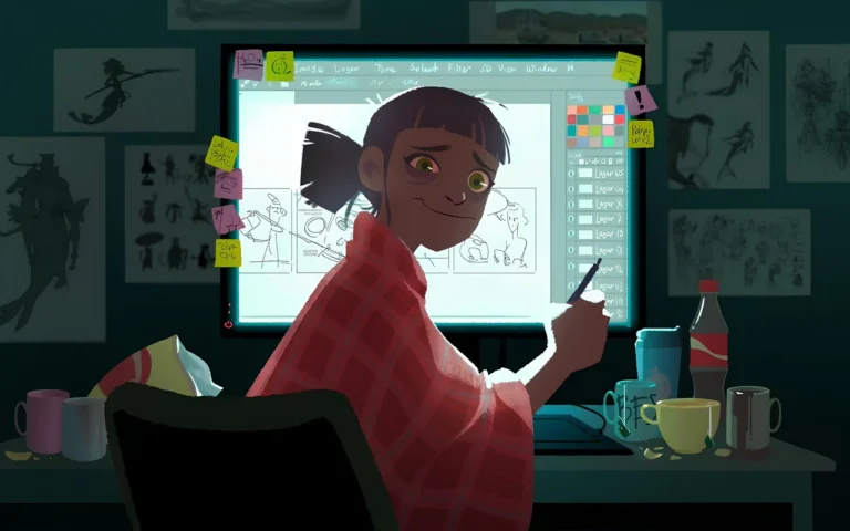
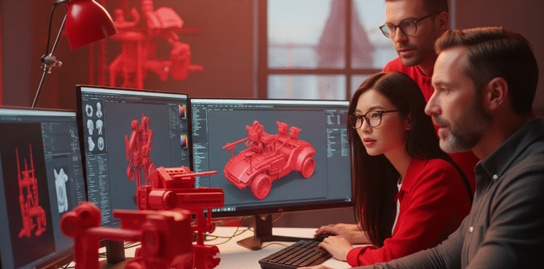
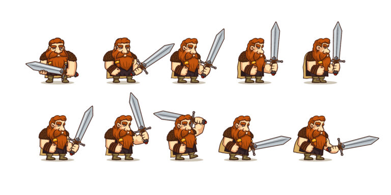
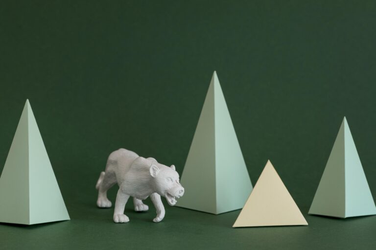
Making 2D art look 3D or creating 3D effects in 2D art is like doing a magic show: you’re giving flat objects a true and profound impression! Artists utilize deft methods to trick our eyes into imagining depth when none exists.
One important tactic is shading. Making elements of an item darker helps it to seem to be curving away from the light. For instance, if you’re drawing a ball, the side that faces the light source will be bright, and the side that faces the other way will be dark.
Perspective is another amazing method. Everything here is about shrinking objects as they go further apart. Think of a road extending into the distance; it narrows as it travels. That’s the viewpoint in use here.
In this article, we will go deep into all the techniques for making 2D that looks 3D.
Need Animation Services?
Visit our Animation Service page to see how we can help bring your ideas to life!
What is Light and Shadow in 2D Art?
The dynamic team that gives your 2D work living vitality is light and shadow. They are the secret sauce that gives your digital creations reality, depth, and atmosphere; they are not just about appearances.
When we make 2D art, we’re simply making a flat-screen look like a 3D world. The scoop is light striking things in your scene from a source, such as the sun or a lamp. There, you get shadows where it cannot reach.
That’s straightforward! Here’s where it gets fascinating, though: the way shadow and light interact with your items will entirely affect the tone of your work. Now, let’s break down a bit more about how to make 2D look 3D:
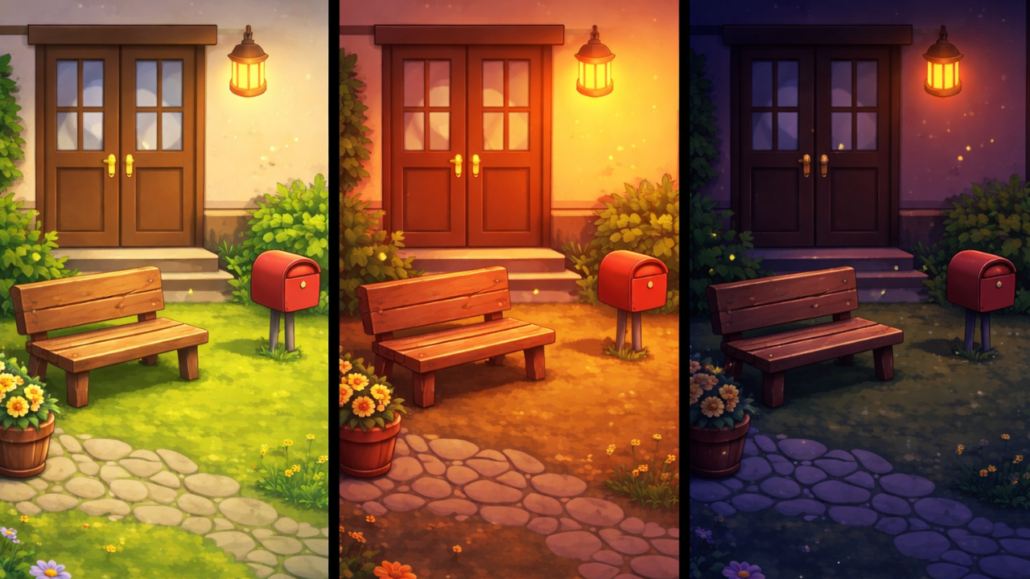
1. Light Sources
Think of light sources as the stars of your 2D art show.
- Key Light: This is your main actor. It’s usually the brightest and sets the overall mood. In a sunny beach scene, the sun would be your key light. It’s typically placed at a 45-degree angle to your subject.
- Fill Light: It’s softer and less bright than the key light. Fill light’s job is to soften shadows and add detail to darker areas. In nature, this could be light bouncing off other surfaces. In a beach scene, it might be light reflecting off the sand or water.
- Rim Light: This is a light that hits the edges of your subject, creating a bright outline. Rim light helps separate your subject from the background. Consider a person standing with their back to a sunset – that glowing outline is rim light in action!
2. Shadows
Shadows are where the magic of depth really happens.
- Form Shadows: These things live on the thing itself. They express the subject in the form and shape that matters. If you look at a round item like an apple, the surface slowly goes from light to dark as it moves away from the light source.
- Cast Shadows: These are the shadows your objects throw onto other surfaces. They connect your objects to their environment. Generally, the length and direction of cast shadows depend on the light source’s position and strength.
3. Brightness and Contrast
This is all about the range from your lightest lights to your darkest darks:
- Highlights: The brightest spots, where light directly hits a surface. On a shiny object, you might see a small, intense white spot.
- Midtones: The in-between areas. Most of your objects will probably be in midtones.
- Core Shadow: The darkest part of the shadow on your object, usually right where the form turns away from the light.
- Reflected Light: Light bounces back into shadowed areas, softening them. This is super important for realism!
4. Color in Light and Shadow
Light and shadow aren’t just about brightness; color plays a huge role and this shows the importance of color theory in art.
- Warm vs. Cool: Warm light (like sunset) tends to create cool shadows, while cool light (like moonlight) creates warm shadows. This color contrast can add amazing depth and mood.
- Color Bleed: When light bounces off a colored surface, it carries some of that color with it. A red apple on a white table might cast a slightly reddish shadow.
5. Texture
How light interacts with a surface tells us a lot about its texture:
- Smooth Surfaces: Think of a shiny ball. You’ll see sharp, defined highlights and reflections.
- Rough Surfaces: Like a fuzzy peach. Light scatters more, so highlights are softer and more spread out.
- Translucent Objects: Light can pass through these, creating cool effects. Think of how light looks shining through a leaf.
How to Use Perspective to Create Depth in 2D Art?
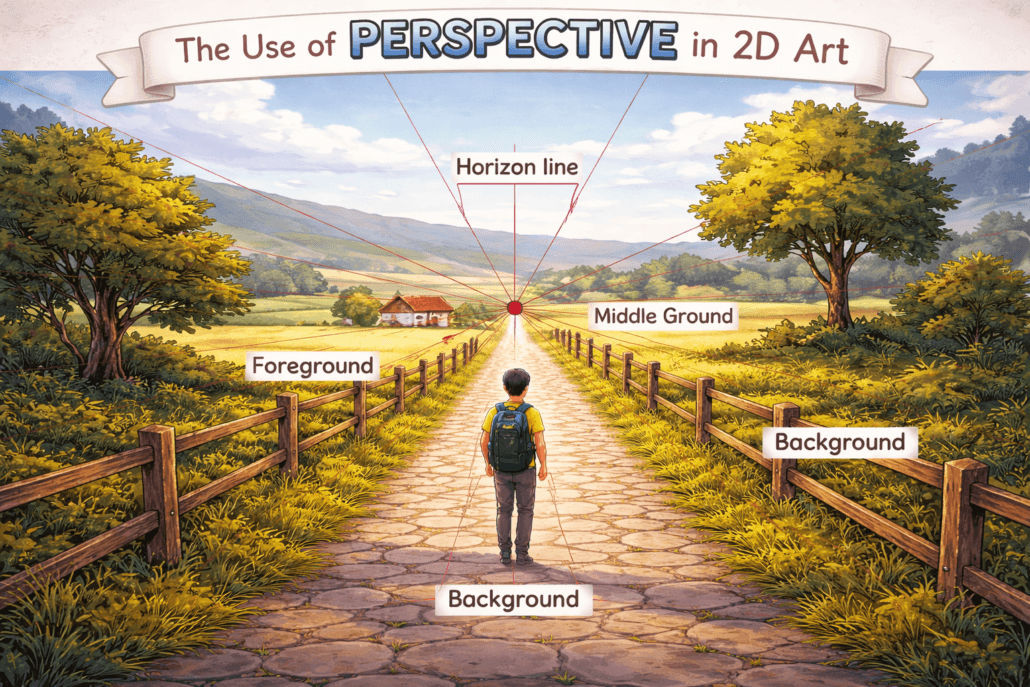
A great technique for adding complexity in 2D graphics is perspective, which replicates how human eyes see the surroundings. Artists can generate a convincing illusion of three-dimensional space on a flat surface by using size variation, where things seem smaller as they recede into the distance, and linear perspective, in which parallel lines converge at vanishing points.
1. Linear Perspective
Deepness in 2D art is created using linear perspective. It is predicted that our eyes will see parallel lines converging in the distance. By using this method, you can make your art look much bigger than it is.
- One-point perspective: All lines meet at a single point that doesn’t exist. For instance, sketching a corridor wherein the floor, ceiling, and wall lines all converge at one spot.
- Two-point perspective: Using two vanishing points, typically for corner views of buildings. Such as drawing a street corner where buildings’ horizontal lines converge to two points on the horizon.
- Three-point perspective: It adds a vertical vanishing point, which is great for dramatic views. It is much more like looking up at skyscrapers where vertical lines also converge.
Take drawing a long hallway as an example. From a one-point view, the floor, ceiling, and wall lines would all converge at one point straight ahead. This gives the scene great depth and pulls the observer in.
- Advice: To make things look more natural, put your vanishing points outside of your painting. Generally speaking, place them 1.5 times the breadth of your canvas away from the margins.
2. Size and Scale
Our brains interpret smaller objects as being further away. This principle, known as diminishing scale, is crucial for creating a sense of depth in your art.
For instance, in a cityscape, buildings in the foreground might take up half the canvas height, while similar buildings in the distance might only occupy a tenth of that space. This dramatic size difference immediately communicates depth to the viewer.
- A helpful rule: For every doubling of distance, an object’s perceived size halves. So if a person appears 6 inches tall at 10 feet away in your drawing, they should be 3 inches tall at 20 feet away and 1.5 inches at 40 feet away.
3. Atmospheric Perspective
Often referred to as aerial perspective, this method reflects how air shapes our view of far-off things. It works especially well for scenes with a distant backdrop or for landscapes.
- Color shift: As distance increases, colors become less saturated, cooler (shifting towards blue), and lighter in value.
- Contrast reduction: Distant objects have less contrast between their light and dark areas.
- Edge softness: Far-off elements have softer, less defined edges.
Example: Suppose you are painting a mountain range. The nearest mountain might be a rich, dark green with high contrast and sharp details. A mountain 10 miles away could be a lighter, blueish-green with less contrast and softer edges. Mountains 50 miles in the distance might appear as pale blue silhouettes, almost blending with the sky.
4. Detail and Texture
The level of detail in your artwork can greatly enhance the sense of depth. Our eyes naturally focus on nearby objects, seeing them in greater detail, while distant objects appear less distinct.
- Foreground (0-10 feet): Highest detail. You might even depict individual blades of grass or leaves.
- Midground (10-100 feet): Medium detail. You’d see overall leaf shapes but not individual veins.
- Background (100+ feet): Low detail. Trees might be just simple silhouettes.
In a digital painting of a meadow, for example, you could render individual flowers and grass blades in the foreground. The midground might show clumps of flowers without individual petals, while the background could be simple color washes suggesting distant foliage.
5. Focus and Blur
Mimicking camera focus can enhance depth perception.
- Use sharp focus for your main subject.
- Slightly blur elements in front of and behind your focal point.
Example: In a portrait, have the person’s eyes in sharp focus, their ears slightly soft, and the background quite blurry.
6 Techniques for Adding Texture to 2D Art
Giving 2D art texture gives flat objects life and a tactile touch that appeals to viewers on a more profound level. Custom brushes, layering different textures, or adding digital effects like noise and grain, all of which help to create a more realistic and visually appealing work.
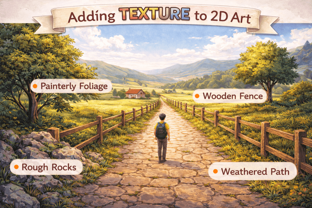
1. Layer It Up Like a Boss
Consider your digital canvas like a sandwich; it tastes better with more layers! Stacking many textures and experimenting with opacity will provide depth that will cause viewers to double-take.
- Start with a base layer for your main subject.
- Add shadow layers underneath to ground your subject.
- Pile on highlight layers to make things pop.
- Experiment with blending modes for each layer (multiply for shadows, screen for highlights).
- Don’t forget those mid-tones, they’re the secret sauce!
Example: For example, imagine you’re drawing a fuzzy monster. Your base layer is the overall shape; then, you add shadows under the belly and arms. Next, pop in some highlights on the fur tips. Play with the color until it looks just right. Boom! Your 2D monster now looks like it might jump off the screen and hug you.
2. Brush Up on Your Brush Game
Your brush tool is like a magic wand; wave it appropriately to create textures that will astoundingly blast brains.
- Experiment with brush hardness and softness.
- Try different brush shapes. Who says they all have to be round?
- Play with brush spacing for different effects.
- Use brush dynamics to vary size and opacity with pressure (if you have a pressure-sensitive tablet).
- Create custom brushes for unique textures.
Example: Assume you’re sketching a tree. For the bark, use a rough, dispersed brush; for the leaves, use a soft, cloud-like brush; maybe a speckled brush for some moss. Mix and match until your tree seems so lifelike you can practically smell the wood!
3. Light It Up Like a Pro
Lighting is the secret weapon of making a drawing look 3D. It’s all about creating the illusion of form through highlights and shadows.
- Choose a consistent light source direction.
- Add cast shadows to ground your objects.
- Use rim lighting to separate objects from the background.
- Play with ambient occlusion for extra depth.
- Don’t forget about reflected light!
Example: Let’s say you’re drawing a shiny red apple. The main light hits it from the top left, creating a bright highlight. The bottom right has a deep shadow, and there’s a subtle reflection of the table it’s sitting on. Add a soft shadow underneath, and bam! That apple looks good enough to eat.
4. Get Down with Gradients
Gradients are your best friend when it comes to creating smooth transitions and the illusion of roundness.
- Use radial gradients for spherical objects.
- Linear gradients work great for cylinders or long objects.
- Play with gradient opacity to blend with underlying textures.
- Try multi-color gradients for more complex forms.
Example: Suppose you’re creating a metallic robot. Use a radial gradient on its dome-shaped head, transitioning from a bright highlight to a darker edge. For the arms, a linear gradient can suggest a cylindrical form. Add some color variation with a gradient map, and your robot will look ready to roll!
5. Texture, Texture, Everywhere!
Don’t be shy about slapping on some texture overlays. They can add that extra oomph that takes your art from flat to fantastic.
- Collect photos of interesting textures (or make your own).
- Experiment with blending modes when applying textures.
- Adjust texture opacity to suit your needs.
- Use layer masks to control where textures appear.
- Combine multiple textures for unique effects.
Example: Let’s say you’re drawing a weathered superhero shield. Start with a clean metal base, then overlay a rust texture with the Multiply blending mode. Add some scratch textures set to Overlay and maybe a subtle fingerprint texture on Soft Light. Adjust the opacity of each, and you’ve got a shield with a story to tell!
6. Noise and Grain Effects
Adding noise or grain to your 2D art can simulate surface roughness and add a tactile quality to your images. This technique is particularly useful for creating the appearance of skin texture, fabric weave, or rough paper.
- Use monochromatic noise for subtle texture.
- Experiment with colored noise for more complex effects
- Adjust noise size and intensity for different surfaces.
- Combine with layer blending modes for integration.
How to Incorporate Color and Value Gradients?
Color and value gradients are important for giving 2D art depth and shape, and they let artists model how light moves through three-dimensional things.
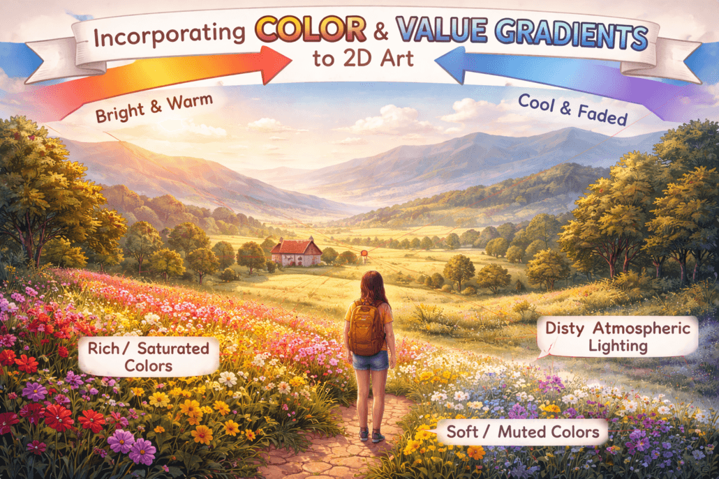
1. The Ol' Light to Dark Trick
This is the 3D illusion granddaddy. Say you are painting a ball. You start light, say a pastel yellow, then progressively deepen it (through oranges and reds) until where the shadow falls, maybe a deep maroon. Instant roundness.
- Start with a light yellow (#FFFFA0) for the highlight.
- Blend through orange (#FFA500) for the mid-tones
- End with a deep red (#8B0000) for the shadows.
- Use a soft brush and build up gradually for smooth transitions.
2- Cool vs. Warm Color Combat
This method is like a struggle between cold and warm colors; your 3D-looking artwork wins! It looks like warm colors are moving forward, and cool colors are moving backward.
- Use warm colors (reds, oranges, yellows) for foreground elements.
- Cool colors (blues, greens, purples) work great for backgrounds.
- Try a warm orange (#FF7F50) for a close object.
- Balance it with a cool blue (#4682B4) in the distance.
3. Atmospheric Perspective Magic
Ever notice how distant mountains look hazy and blue-ish? That’s atmospheric perspective, and it’s a killer trick for adding depth to landscapes or any scene with distance.
- Keep your foreground colors vivid and contrasty.
- As objects recede, slightly desaturate their colors (maybe 5-10% per “layer” of distance).
- Gradually shift colors towards blue as they get further away.
- Reduce the contrast between light and dark areas in the background.
4. The Power of Complementary Colors
Complementary colors, opposite on the color wheel, produce striking contrast. This will help you to create space and highlight particular places.
- Red and green, blue and orange, yellow and purple are complementary pairs.
- Use a complementary color for shadows to add depth (e.g., reddish shadows on green leaves).
- Try a gradient from one color to its complement for a striking effect.
- Mute the complementary color slightly so it doesn’t overwhelm.
5. Value Contrast for the Win
Strong value contrast, that is, the difference between light and dark, can provide the impression of shape and depth. It’s like giving your work a little front stage!
- Use high contrast for areas you want to pop (like the edges of a face).
- Soften the contrast as surfaces turn away from the light.
- Try a range of at least five values from light to dark for a smooth gradient.
- Remember: squint at your art, the forms should still be visible!
6. The Sneaky Subsurface Scattering Effect
This works well with clear things like skin, leaves, or thin cloth. It replicates the way light passes and diffuses within an item.
- Use a base color for your object (like a peachy tone for skin).
- Add a subtle warm glow in shadowed areas (reddish for skin, greenish for leaves).
- Keep the effect subtle, maybe 10-20% opacity
- This works great with the radial gradient technique!
7. The Trusty Reflected Light Technique
Don’t forget about the bounced light! This adds so much depth and realism to your shadows.
- Identify your main light source and shadow areas.
- Add a subtle, warm glow to the edges of shadows (this is reflected light).
- Keep it subtle, maybe 50% lighter than your darkest shadow but still darker than your midtones.
- The color of nearby objects can influence your reflected light color.
8. Edge Highlighting for Extra Pop
Sharp highlights along edges can really make your forms stand out and look three-dimensional. It’s like outlining but way cooler.
- Identify edges that would catch the light (usually on the light-facing side of objects).
- Add a thin, bright highlight along these edges.
- Keep the highlight fairly narrow, just a few pixels wide.
- Try a slightly warmer color than your main highlight for extra realism.
8 Tricks to Use Overlays and Effects to Simulate 3D in Digital Art?
By adding depth, texture, and visual intrigue, overlays and effects in digital art may turn flat pictures into apparently three-dimensional works. 2D items seem to explode off the screen by use of techniques like shadow layers, light effects, and mixing modes, thereby creating a sense of volume and space.
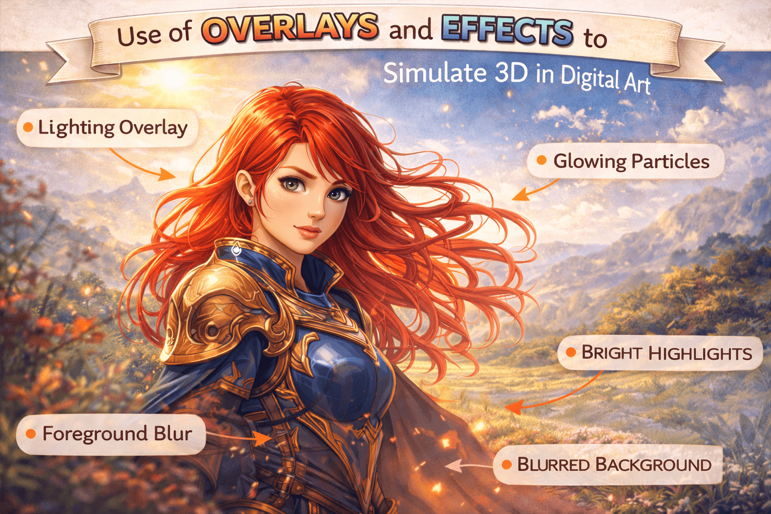
Read More: The Role of Shader Artist
1. The Shadow Play Magic
Your quick depth hidden weapon is shadows. Consider it like creating paper cutouts; a gap creates a shadow. Put a dark layer under your main shapes in your digital work and move it around a bit.
- Use a soft brush to create a shadow layer beneath your object.
- Try a dark gray (#3A3A3A) at 50% opacity for a natural look.
- Offset the shadow slightly, maybe 10-20 pixels, for a floating effect.
- Blur the shadow edges a bit for extra realism.
2. The Glow-Up Technique
Adding a subtle glow can make things look like they’re popping out.
- Create a new layer and set it to “Overlay” blend mode.
- Use a soft white brush to paint a glow around the edges of your object.
- Keep it subtle; try 20-30% opacity.
- For extra pop, add a touch of color to your glow (like a soft yellow #FFFACD).
3. The Bevel and Emboss Boogie
This effect is like giving your shapes a tiny facelift. It adds highlights and shadows to the edges and makes them look raised or sunken.
- In most software, look for a “Bevel and Emboss” layer style.
- Start with a size of about 5-10 pixels.
- Use a light color (#FFFFFF) for the highlight and dark (#000000) for the shadow.
- Adjust the angle to match your main light source.
4. The Depth-of-Field Dazzle
Blurring some parts of your image while keeping others sharp is a great way to create depth. It’s like focusing a camera on your main subject.
- Duplicate your background and apply a Gaussian blur (try 5-10 pixels).
- Mask out the areas you want to keep in focus.
- Use a soft brush on the mask for gradual transitions.
- This works great for creating foreground or background blur.
5. The Reflection Razzle-Dazzle
Adding reflections can make your art look super polished and 3D.
- Create a copy of your object and flip it vertically.
- Place it below the original and reduce opacity (try 30-50%)
- Add a gradient mask to fade out the reflection.
- For extra realism, add a slight blur to the reflection.
6. The Chromatic Aberration Cheat
This fancy term just means adding a slight color shift to the edges of your objects. It mimics how camera lenses work and adds a subtle 3D effect.
- Duplicate your layer three times, one for each RGB channel.
- Offset the red layer slightly to the right and the blue to the left.
- Keep the green layer in the middle.
- Reduce the opacity of the red and blue layers to about 50%.
7. The Atmospheric Fog Finesse
Adding a touch of fog or haze will create the illusion of deep space in your art.
- Create a new layer and fill it with a light color (like #E6E6FA).
- Set the blend mode to “Screen” and reduce opacity to about 20-30%.
- Mask out the foreground to keep it clear
- Gradually increase the effect on the background
8. The Parallax Pretender
This technique mimics how things move at different speeds when you’re moving. It’s great for adding depth to backgrounds.
- Separate your image into foreground, midground, and background layers.
- When animating, move the background slower than the foreground.
- Even a slight movement difference (like 5–10 pixels) can create a big effect.
- This works great for social media posts or web banners.
7 Tips for Creating Depth in Character Art
Adding depth to character art means using different lighting methods and small details to make 2D models look like they are in three dimensions.
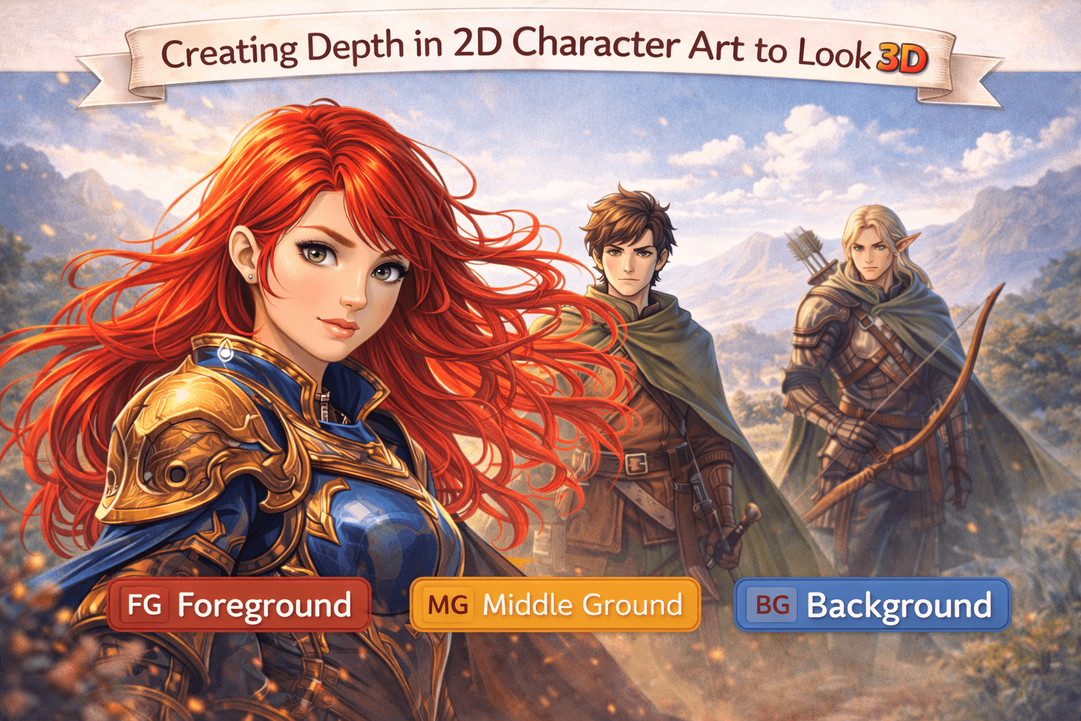
Read More: Character Art Styles
1. The Contour Lighting Trick
Imagine your character standing in front of a bright light. That edge lighting can really make them pop!
- Add a thin, bright line along the edges facing your light source.
- Use a color slightly warmer than your main light (like #FFE0B2 if your light’s white).
- Keep it thin, maybe 2-3 pixels max.
- Vary the brightness to show form, brighter on raised areas, dimmer increases
2. The Subsurface Scattering Illusion
This is how light plays through semi-transparent stuff, like ears or fingers.
- On a new layer, paint a soft, warm glow in thin areas (ears, nostrils, fingers).
- Use a reddish-orange (#FF7F50) at low opacity (10-20%)
- Blend mode: Soft Light or Overlay
- Stronger in thinner areas, weaker in thicker parts
3. The Ambient Occlusion Cheat
A fancy term for darkening where surfaces meet. The effect is the same as if you were to add the fine shadows that give an image depth.
- Create a new layer and set it to multiply.
- Use a soft, dark brush (#3A3A3A) at low opacity (20-30%).
- Paint in crevices under the chin, where arms meet the body
- Build it up slowly, it’s easier to add than remove!
4. The Fresnel Effect Fakery
In real life, surfaces get more reflective at glancing angles. We can fake this for more depth!
- Add a lighter tint to the edges facing away from the viewer.
- Use a color that’s a mix of your light source and local color.
- Keep it subtle, maybe 10-20% opacity
- Stronger on shiny surfaces (like metal), weaker on matte ones (like cloth)
- Adjust opacity to taste; usually, 30–50% looks good.
5. The Micro Shadow Finesse
Tiny shadows can add tons of detail. Think eyelashes on cheeks, hair on forehead, that kind of thing.
- Use a small, soft brush with a very dark color.
- Paint super thin shadows where small details would cast them.
- Keep opacity low (10-20%) and build up gradually
- Great for adding realism to hair, clothing folds, etc.
6. The Color Rim Lighting Boost
Like contour lighting, but with color! It’s a great way to add atmosphere and depth.
- Choose a color that contrasts your character (blue for warm scenes, orange for cool).
- Paint a thin line on the opposite side of your main light.
- Keep it subtle; 10-20% opacity usually does it.
- Vary the color slightly for different materials (clothes vs. skin).
7. The Dynamic Brush Technique
Using brushes with texture or shape dynamics can add instant depth. It’s like painting with a magic brush!
- Create or download brushes with interesting textures or shapes.
- Use them for things like hair, fur, or clothing textures.
- Vary the pressure to create depth, lighter touch for raised areas, harder for recesses.
- Combine multiple brushes for complex textures.
Examples of Successful 2D Art That Looks 3D
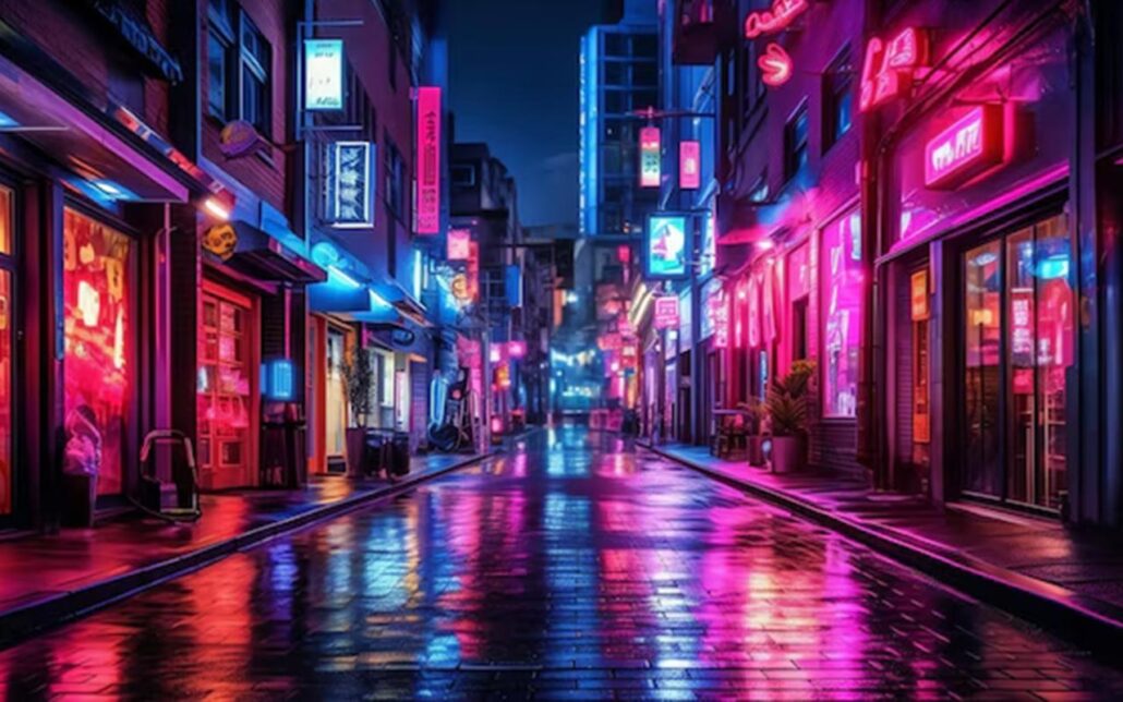
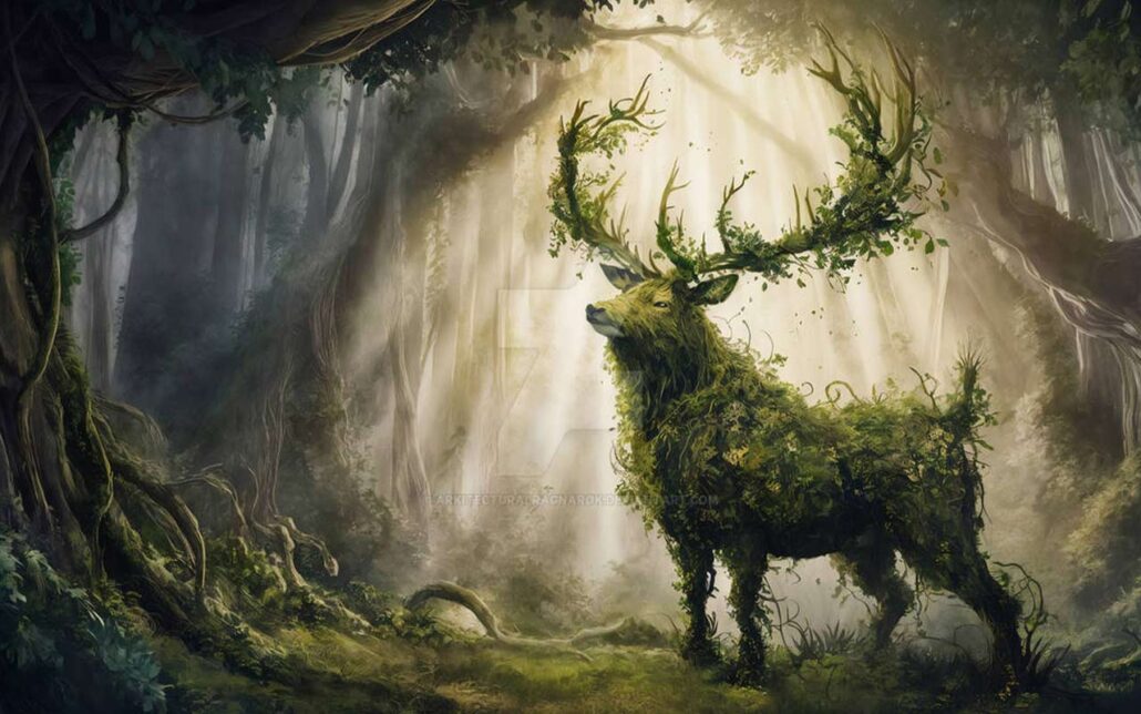
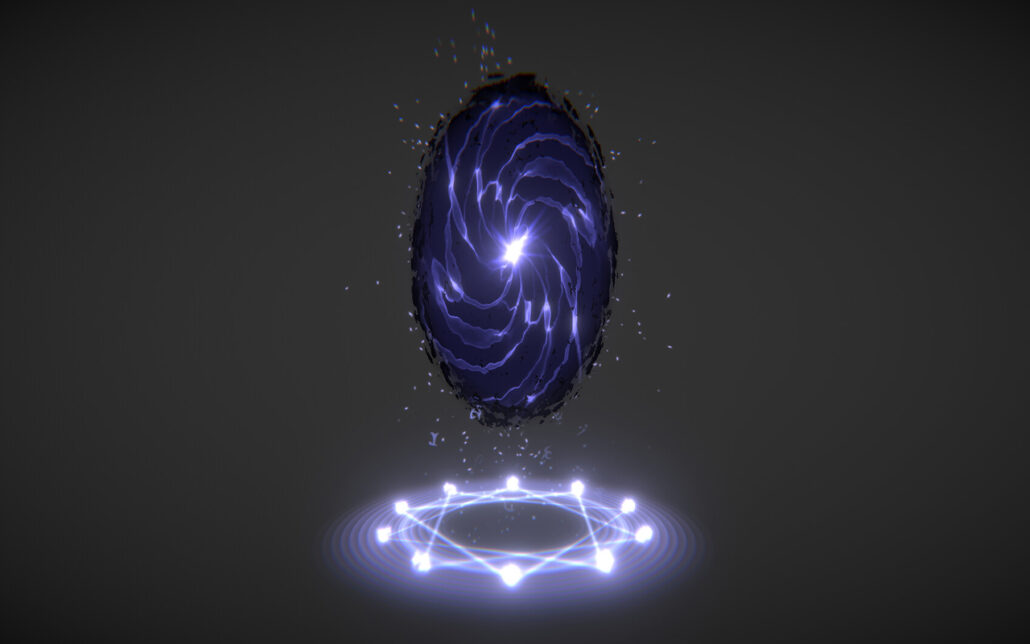
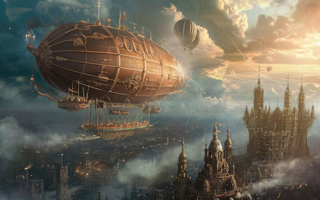
Here are some mind-blowing examples of 2D art that look so 3D you’ll want to reach out and touch it!
1. Neon Nights
2. Forest Guardian
4. Mystic Portal
5. Steampunk Airship
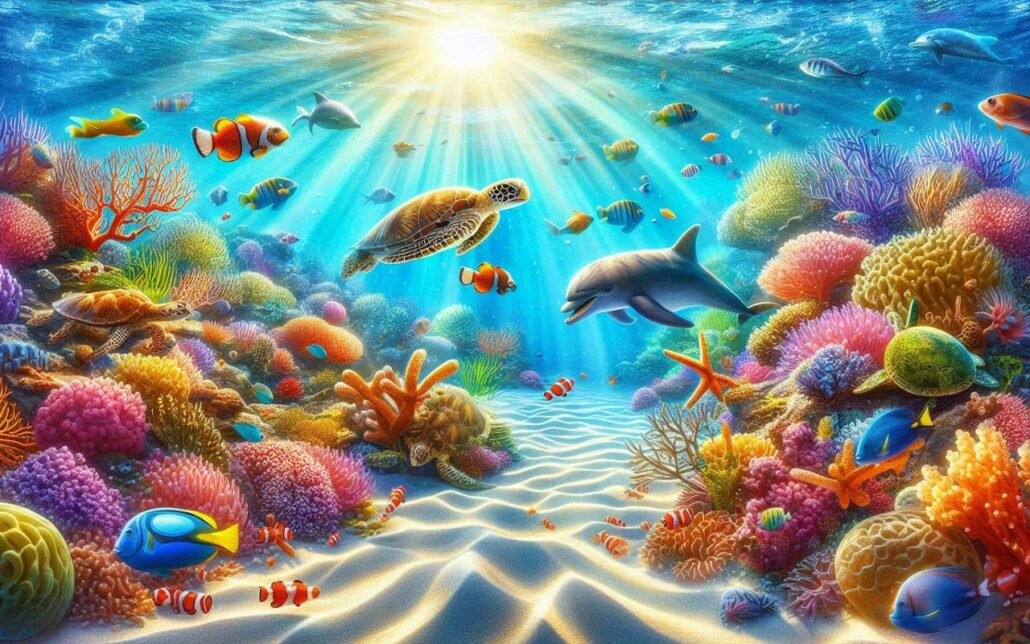
6. Underwater Paradise
Common Mistakes to Avoid When Trying to Create 3D Effects
I’ve seen these mistakes a million times (and made most of them myself!), so let’s break it down so you can avoid them and make your art pop like crazy! Avoid these to make 2D animation look 3D.
1. The "Everything Is Shiny" Syndrome
Do you know how some folks think adding highlights everywhere makes things look 3D? Yeah, that’s not how it works in real life.
- Mistake: Slapping highlights on every single surface.
- Fix: Be selective! Only add strong highlights to actually shiny stuff.
- Pro tip: Vary your highlight intensity. A metal pot? Super shiny. A cotton shirt? Not so much.
2. The "Forgot About Light Direction" Faux Pas
This one’s classic. Your light’s coming from the left, but somehow, there are shadows on the right side, too. Oops!
- Mistake: Inconsistent lighting direction across your piece.
- Fix: Pick a main light source and stick to it religiously.
- Pro tip: Use a directional arrow on a separate layer to remind you where your light’s coming from.
3. "What Atmosphere?" Blunder
Have you ever seen a landscape where the mountains in the back are as sharp and colorful as the flowers in the front? That’s not how our eyes work!
- Mistake: Keeping the same level of detail and color saturation throughout the image.
- Fix: Use atmospheric perspective. Things far away should be less detailed, less saturated, and slightly bluer.
- Pro tip: Add a very subtle blue gradient overlay to your background elements.
4. The "Shadows Are Just Black" Blooper
Shadows aren’t just the absence of light. They’re filled with bounced light and color from the surroundings.
- Mistake: Using pure black or gray for all shadows.
- Fix: Tint your shadows with colors from the environment.
- Pro tip: Try using a dark purple (#4B0082) for shadows in a warm scene or a deep blue (#00008B) in a cool scene.
5. The "Texture Overload" Trap
Adding texture can make things look 3D, but too much of a good thing can backfire.
- Mistake: Plastering every surface with intense texture.
- Fix: Use texture strategically. Vary the intensity and scale.
- Pro tip: Put detailed textures in the foreground and simplify as you move back into space.
6. The "Forgot About Edges" Flub
Edges are super important for creating depth, but they often get overlooked.
- Mistake: Having all edges equally sharp or equally soft.
- Fix: Vary your edge quality. Sharp edges come forward, and soft edges recede.
- Pro tip: Use a soft eraser to gently soften edges in the background or on rounded surfaces.
Last Words
Illusions of 3D in 2D digital art are an interesting mix of science, art, and smart tricks. Artists can bring flat pictures to life and make them look like they’re jumping off the screen by learning techniques like perspective, playing with light and shade, color theory, and applying textures.
The secret is close observation of the actual world and converting those findings into digital methods. The ideas are the same whether you are building abstract shapes, scenes, or characters: deceive the eye, add depth, and realize your vision.
