Mobile games UI design is one of the most important steps throughout the production process of a title.
Did you know that 88.9% of people around the world play mobile games?
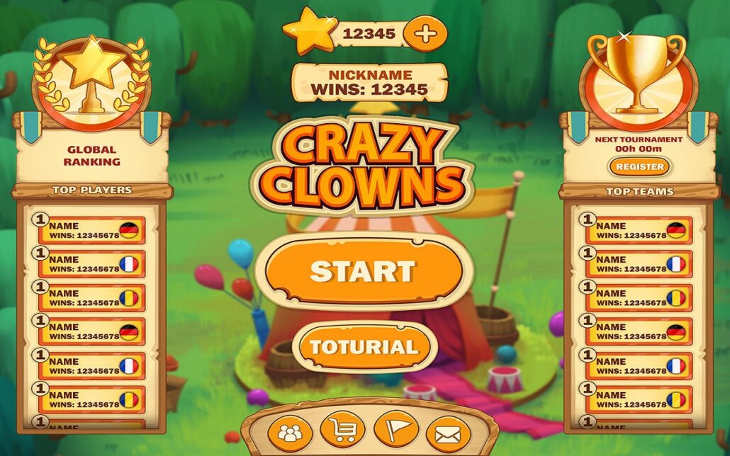
A game’s UI is the first thing players see after running your game, and so it’s the main hook for attracting players to your game. In this post, we talk about how to come up with a mobile game UI design that will make your players coming back for more.
This post will be specially useful for:
- Those who are looking to understand the concept of Mobile Games UI design
- Managers looking to hire a Mobile Game UI designer
- Those looking to learn Mobile Game UI design
- Artists looking for an idea to design UI for the Mobile Games
7 Essentials of a Good Mobile Game UI Design
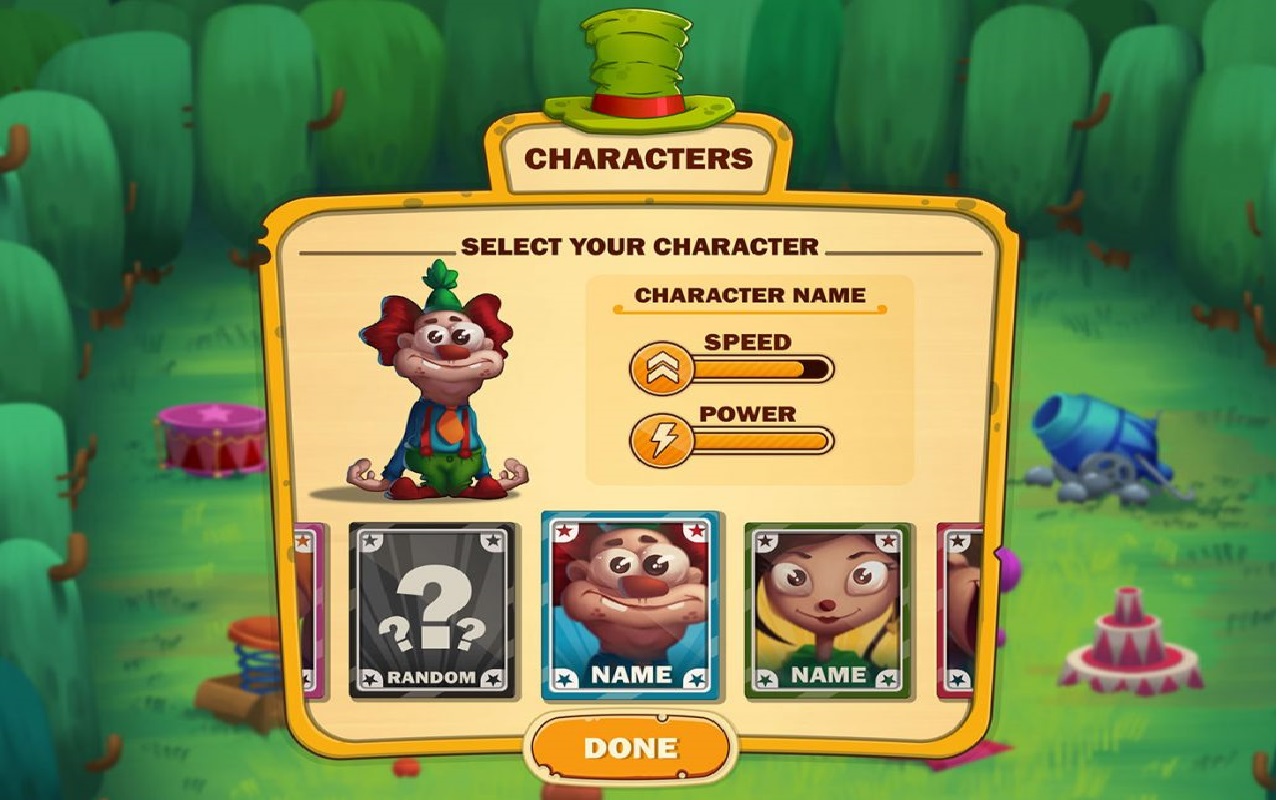
How you feel about a game depends largely on the user interface design. UI design is the main reason why you can easily interact with a game for hours, while another game makes you frustrated after 5 minutes.
Now the question is, what is a mobile game user interface? Mobile game UI is the point of interaction between you and a game. 7 basic elements of a good mobile game UI design are:
- Clarity,
- Discriminability,
- Conciseness,
- Consistency,
- Detectability,
- Legibility,
- and Comprehensibility
UI Design Terminology
In designing UI for mobile games, you will probably come across three important terms:
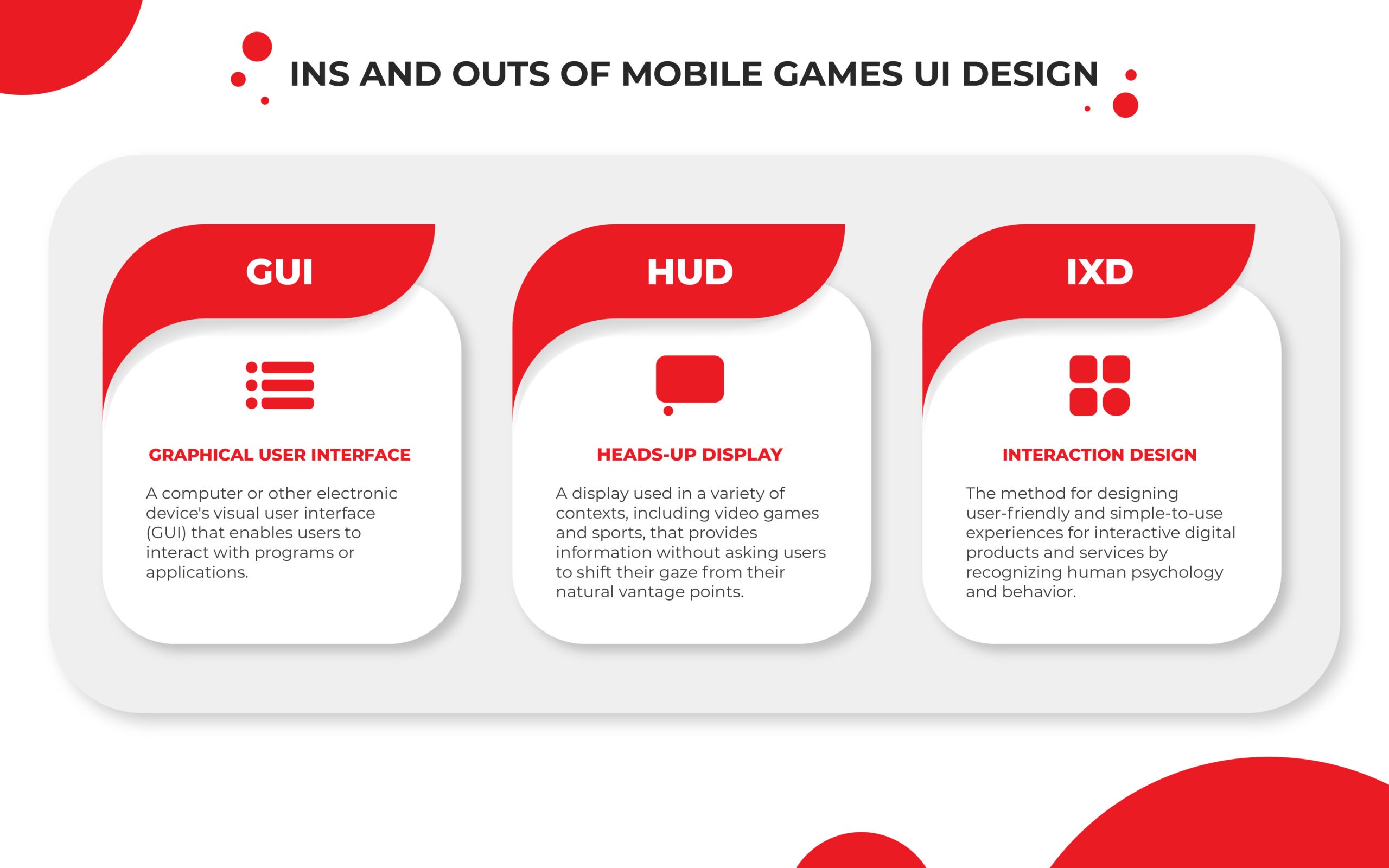
When players are in the game, a good game HUD design must show important information while not being distracting. Also, the HUD should not overwhelm the player with too much information.
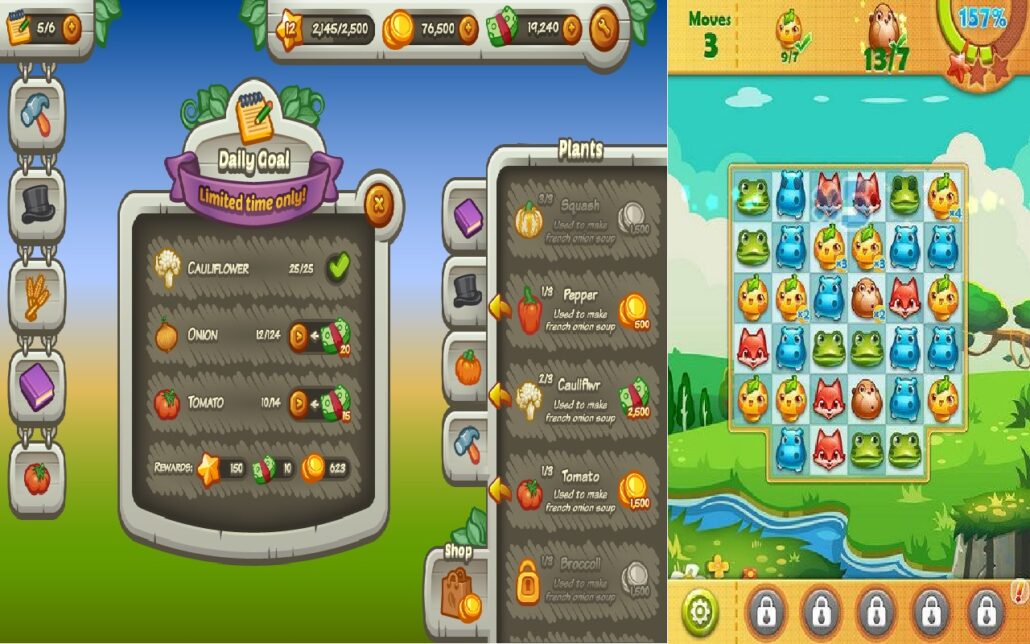
Mobile game HUD design requires us to consider some important things. In addition to the small screen, mobile phones have different screen sizes, and in recent years almost all companies have added notches to their smartphones. These features cause limitations in HUD design for mobile games.
– Interaction Design (IXD)
Interaction Design (IXD) is the structure and behavior of interactive systems of a mobile game. A good IXD can create meaningful relationships between players and the game. IXD designers should study how a user interacts with games and facilitates the actions we want to be taken by players.
Importance of Efficient Mobile Games UI Design
With the growth of the gaming industry for mobile devices, competition between game developers has intensified. Mobile game UI design is the way through which you can improve the user’s overall experience.
So, game developers should try to make the player enjoy interacting with the game. Mobile games UI design requires a good understanding of player needs.
Today, mobile games are made in different genres. The audience of each genre has a different personality than the audience of other genres. Understanding the needs of players requires knowing them.
To understand this, you first need to know who your audience is. What do they like or dislike? If you know the exact answer to this question and use it to design your mobile game UI, you will have a great chance to beat your competitors.
Different Art Styles of Mobile Games UI Design
The art style is an important issue in attracting players. The art style of a game designed to attract women is very different from a game designed for men.
Understanding this requires a thorough study of the players’ personalities. Our target community determines the best art styles for games.
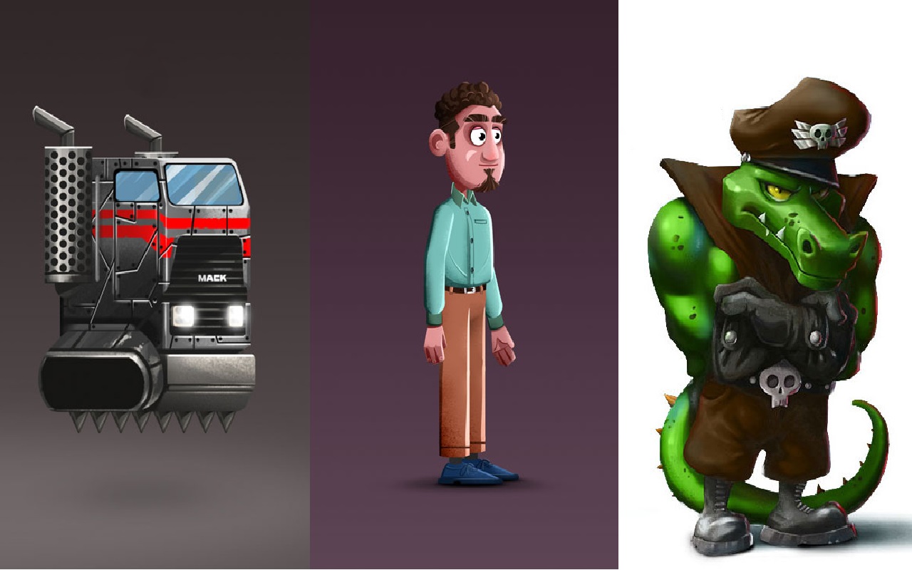
You should also pay attention to the current trends in the world. What is appealing today may not be appealing to the player next year. Of course, some principles do not change much for the general public. For example, children like bright and cheerful colors.
On the other hand, you have to consider the balance in the design. What we mean by “balance” is the understanding of the differences between men and women with different age groups. These are just some tips that you should use for designing UI for the mobile games.
How to Design Beautiful UI for Mobile Games
If you want to design mobile games UI by yourself, there are a few things to keep in mind. Try to play games similar to the one you’re making. This will make your mind ready for new ideas that will put you ahead of your competitors.
Searching on Google is the best source for learning anything. There are many sites that teach you how to design mobile games UI. Also, don’t forget YouTube.
Many videos from various designers have been uploaded to YouTube and you just have to watch them, but practice and perseverance will help you learn quickly.
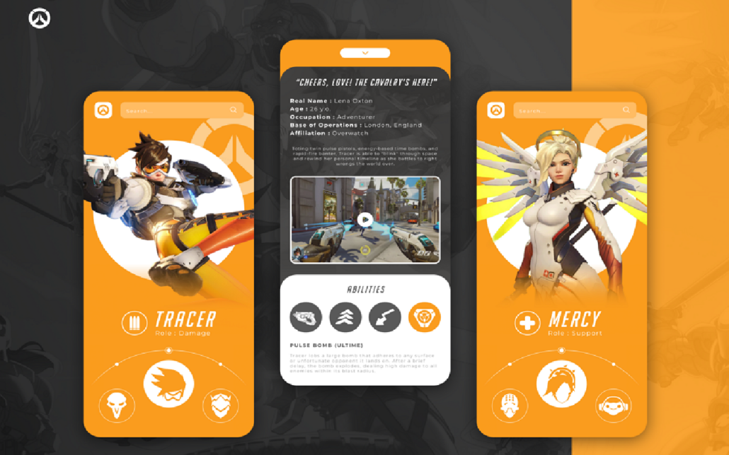
Mobile Games UI Design Process
Before diving deeper into the intricacies that make up for a good mobile games UI design, let’s discuss the process that goes into its creation.
- Analyzing and ideation
- Wireframe Design
- Sketch
- Modifying
Analyzing and ideation

First of all, the most important thing for you is to find an accurate understanding of your game. What exactly do you want to do? Do you make a game for kids or a game for professional gamers?
You have to visualize your game in your mind. Even before the game is made, you can put yourself in the players’ shoes and play the game in your mind. When you think about everything the player needs to interact with the game, it’s time for the second step of mobile games UI design.
Wireframe Design

At this point, you have to write down the UI elements needed by the players. Having a wireframe design can help you a lot. For example, you can draw the shape of the buttons at this point. Are they circular or square? Are they glossy or matte? What will the text font look like?
You don’t have to spend a lot of time on the exact details, but keep in mind how elements will look. You can get a lot of ideas by reviewing inspirational references. Tools that can help you in the wireframing are:
Are you ready to take your game to the next level with top-quality, captivating visuals with quick turnaround times? We’ve got you covered! Don’t settle for less than the best – Contact us today to help you keep your players coming back for more with superb game art.
Sketch

Once the wireframe design is complete, you can prepare the sketches. At this stage, you can use these mobile games UI design tools. Here are top 14 mobile games UI design tools:
Modifying

You can test the game when it is made with your designed UI. Our suggestion is to show the game to a few other people who don’t know you.
You don’t have to say anything or guide them. Just watch them playing. Can they easily communicate with the game? This will help you understand the flaws and correct them.
4 Useful Sites for Mobile Games UI Design Inspiration
8 Mobile Games with Extraordinary UI Design
Alto’s Odyssey
“Alto’s Odyssey” is a Sequel for “Alto’s Adventure”, a hit game by Noodlecake Studios Inc.
Badland
“Badland” is the game of the year with more than 50 MILLION players. This beautiful game is a standout game published by Frogmind.
Machinarium
“Machinarium” is the award-winning adventure game developed by Amanita Design. This game has win IGF, Excellence in Visual Art Award.
Samorost 3
Another game by Amanita Design. “Samorost 3” is the most ambitious experience of this Czech indie studio.
Homescapes
“Homescapes” is one of the best match-3 games with colorful Interior design and A huge, beautiful mansion published by Playrix.
Pudding Monsters
“Pudding Monsters” is a casual and fun game by ZeptoLab, who developed “Cut the Rope”. This game is a deliciously addicting puzzle adventure with wacky characters and innovative gameplay.
Clash of Clans
Who has never heard the name of “Clash of Clans”? This game with extraordinary mobile games UI design has millions of players worldwide. Supercell is one of the best companies in making strategy games.
Subway Surfers
“Subway Surfers” is one of the most downloaded mobile games with more than 1 billion installs. Kiloo and Sybo did a great job in designing this game.
10 Common Mobile Games UI Design Mistakes
1. Inconsistency
One of the most common and worst mistakes in mobile games UI design is Inconsistency between design elements. If there is a mismatch between the design elements, it will cause user dissatisfaction.
To have a coherent and consistent design, you should avoid using too many different styles. Instead, having a design with a consistent look will create confidence and a pleasant experience for users.
2. Incomprehensible Elements
Your design should be clear, and it should always meet players’ expectations. If players cannot read texts easily, or can’t understand the meaning of shapes, they will confuse and uninstall your game. You must avoid buttons that are too small or are hard to see.
3. Non-responsive Design
Another common mistake in mobile games UI design is non-responsive design. Today, mobile devices are made with different screen sizes and you have to consider all of them.
The screen of some mobile phones has a notch, and if the placement of your design elements is not correct, they will not be seen on those phones. The responsive design is necessary to attract a lot of players to your game.
4. Too Much Information
Some designers believe that if they provide more information to the players, the players will understand the concept better, but this belief is not true at all.
The most important thing in mobile games UI design is simplicity and easier transfer of messages to players. Therefore, using understandable and familiar elements with the audience’s mind will have a great impact on solving this problem.
5. Bad Placement of buttons
In some games, the player has to do a lot of actions. We need to help him play more easily by placing the buttons well. Also, buttons with important action should be further away from other elements so that they are not activated by mistake.
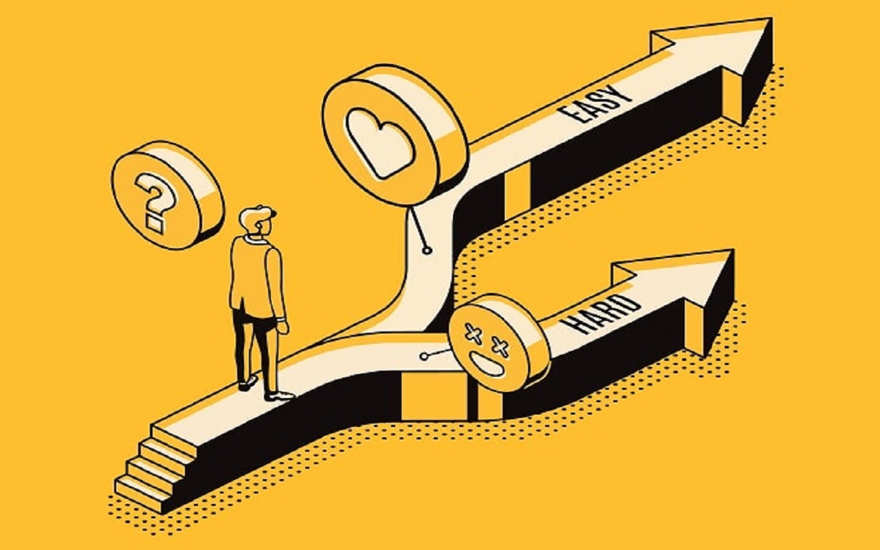
6. Low Contrast
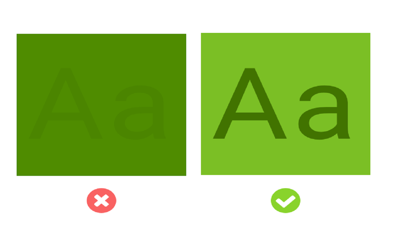
One of the most important elements in a game is creating contrast. When you have poor contrast between the UI elements of your mobile game, the appearance of all the elements will be similar to each other, and this will lead to the boredom of the user.
For example, is it right to put a green button on a green background? Certainly not. If the colors of these two are different, the user’s attention will be more focused.
Also, You can explain a lot to the audience by creating contrast. For example, the dangerous area and the safe area can be shown by the color contrast between red and green.
7. Indulging Yourself
It will be easier if you evaluate your audience and know what audience you are going to design for. In this way, you can design according to the needs of players and prevent the most common mistakes that may occur. As much as possible, You have to put yourself in the players’ shoes and look at the UI elements from their point of view.
8. Making the Audience Think
What is clear and understandable to you may not be clear to the players. You should try to use intuitive elements in your mobile games UI design.
This causes the players to encounter elements that have formed in their subconscious. Most mobile game players don’t have the time to think deeply about the game, so you need to convey the goal of elements in the simplest way possible.
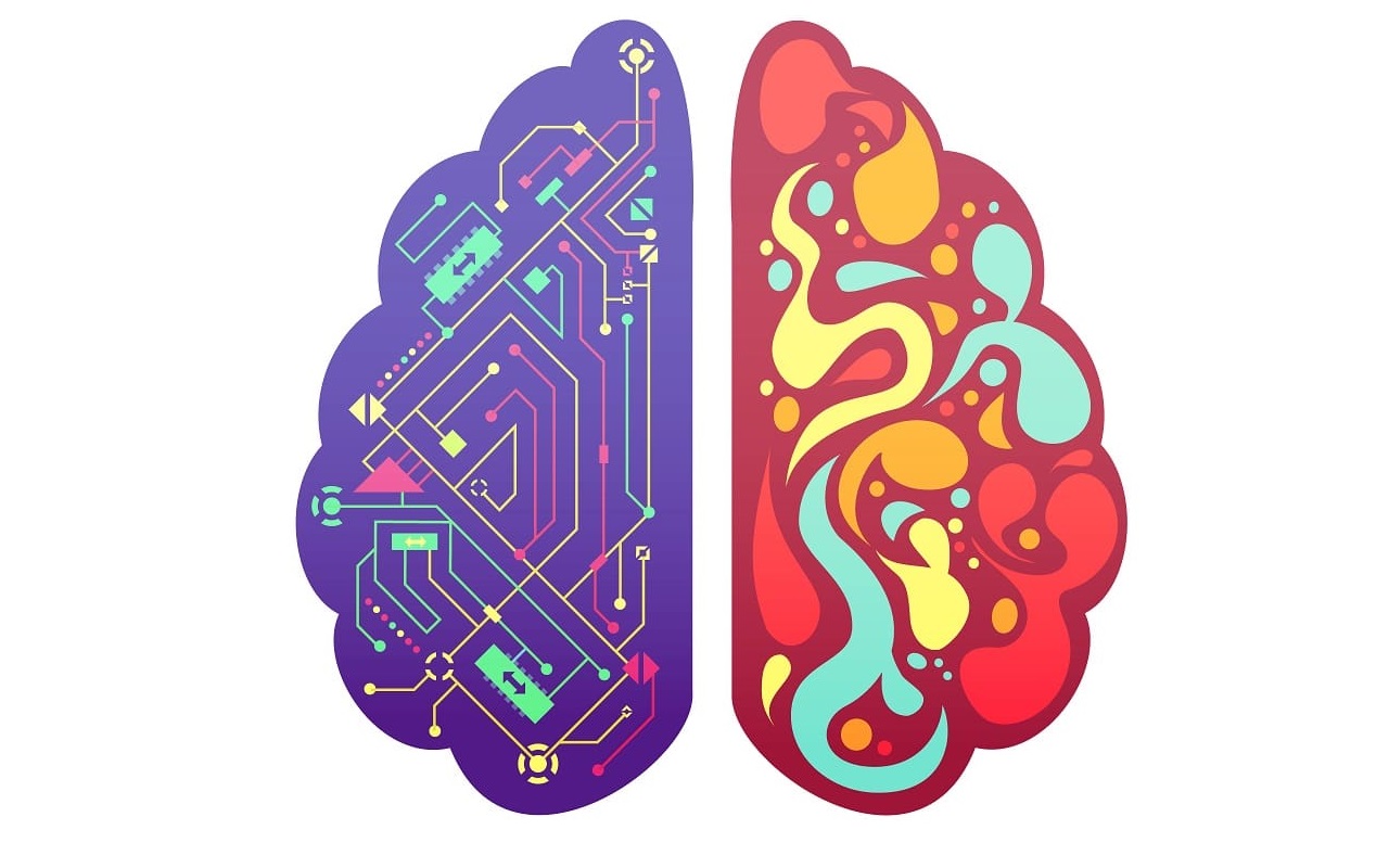
9. Attention to Creativity Rather than Usability
Although creativity is a very important element in designing UI for mobile games, overwork will reduce its quality. Always focus on your goal. Our goal is to make players enjoy playing. They have to play our game for a long time.
So while a beautiful and creative look may appeal to them at first glance, if we sacrifice usability for creativity, players will get tired of playing in the long run.
10. Become Rule or Trend-obsessed
Finally, always remember that you don’t have to stick to principles too much and always come up with a repetitive design. All you have to do is dedicate 70 percent of your focus to game UI design rules for mobile games and spend 30 percent of your effort on innovation.
How to Hire the Best Mobile Game UI Designers

We talked about how to design UI for mobile games, inspirational resources, examples, tools, and the design process. You can design a game UI for your own game by yourself. However, there are those who want to give the job to an expert.
There are many ways to find a mobile game UI designer. Sites that offer freelance services, such as freelancers, Upwork, Guru can help you to hire a UI designer. But trusting a freelancer also has its problems.
You need to make sure that your work is done in the best possible way and with the highest quality. At Pixune Studio, we’ve put together a team of the best mobile game UI designers ready to work on your game.
Pixune is an award-winning game art outsourcing studio that designed art of more than 30 games. We have won 4 awards for Development & Game Design. We follow the latest methods and tools in our designing process.
You can check out our portfolio and if you want to get a free quote for mobile game UI design, click here.
Conclusion
UI is the way that you talk to your end-user and delivers what is behind the curtains. In a way, it’s a showcase of your passive language and must be a clear and nice looking one. If it fails to deliver well, it will leave a bitter taste in user’s mouth and that is a tough state to come back from.
So, to achieve a solid outcome, we have to consult with experts and do our best to attract the players. Have you found your reliable and professional consultant? We are ready to answer your questions.
FAQs
What makes mobile game UI unique from PC or console?
It must be clear, concise, and legible on small screens. Focus on clarity, discriminability, and consistency.
What are the key principles of a good mobile game UI?
Prioritize clarity, legibility, consistency, ease of detection, and comprehension.
How can I design intuitive mobile game interfaces?
Use simple and recognizable buttons, cues like glow effects, and test iteratively for usability.
Why is contrast so critical in game UI?
High contrast ensures players can understand resources or status at a glance. It’s especially critical under time pressure.
How do I balance UI clarity with immersion in design?
Game UI must overlay essential info like HUDs subtly, fitting the theme while preserving immersion.
Why must mobile game UI be responsive to different devices?
Mobile screens vary. Layouts need to adjust around notches, touch zones, and aspect ratios.
How does mobile UI improve retention and engagement?
Smooth, intuitive UI increases ease of play, boosting retention, engagement, and even revenue.
What UX elements complement good mobile UI?
Clear navigation, fast loading, intuitive menus, and seamless interaction enhance mobile game UX.
How do visual appeal and style affect UI design?
A cohesive visual style, from menus to HUD, reinforces game identity and streamlines user experience.
Where can I find inspiration and templates for mobile game UI?
Studios often use assets from UIUX Repo, Figma Community kits, Freepik, and Behance, but customize them to maintain a unique style.
