Animators use colour theory as a guide to mess with your feelings. It shows which colours go well with each other and how they make you feel when you see them on a screen.
Studios that offer animation services don’t just pick colours at random and hope they work out. They stick to a science plan that has been tried and tested on millions of people. So, when they look at the colour wheel, it tells them which colours go well together and which ones make you feel bad.
- Basic Colours: Boss colours are red, blue, and yellow. Mixing these three makes every other colour.
- Secondary Colours: When you mix primary colours, you get secondary colours like orange, green, and purple. The colour orange is made up of red and yellow, the colour green of blue and yellow, and the colour purple of red and blue.
- Rules for Colour Harmony: Animators choose colours that either go well together (like different shades of blue) or stand out (like red and green). Both make you feel certain things in your brain.
Why Animators Care About Colour Rules?
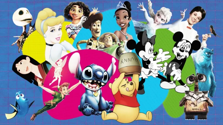
There’s more to Pixar’s success than just drawing pretty pictures. Each and every colour pick is meant to make you feel a certain way.
They’ll fill the screen with warm, bright colours to make you happy, and if they want you to feel scared, everything turns dark and cold.
These rules work for everyone, which is crazy. People of all ages and feelings react to colours in the same way. So that’s why authors can use colour theory so effectively.
Wait! Colours Can Really Change How I Feel?
Definitely! Your brain is a colour-reading machine that was made to help you stay alive. Your brain doesn’t believe it’s a picture when it sees red in an animation. Anytime it sees red, your body automatically reacts because it thinks “something important is happening.”
How does this actually work?
Your eyes spot a colour → send signal to brain → brain checks its colour file → releases chemicals → you feel something.
Everything happens in less than 2 seconds.
Remember any fight scenes from Marvel? When those red flames show up on the screen, your heart beats faster. And of course, you’re not afraid of pictures. Just like when you smell pizza and feel hungry, when your brain sees red, it tells you to do something. This is why red is often used in intense character art style choices to create urgency and emotion.
This is something that happens to everyone on Earth. Even that person who says they “don’t get upset” at movies. Everybody has the same basic colour programming.
What Does Each Colour Do to You? The Secret Colour Code
Now you know exactly what artists are doing to your brain. Put this away and try it out the next time you watch a movie.
There are three groups of colours that reflect different emotions, and the way each family makes you feel and how much energy you have are very different. That’s why choosing the right character color palette is so important in shaping how we connect with the characters and the story.
Warm Colours and Energy
Colours that are warm are like mental coffee. They make you feel more intense and excited, wake up your brain, and speed up your heart. That’s why warm colours are often used in character design to create energy, urgency, or strong emotions.
Red: The Best Energy Booster
It does the strongest job in animation. No matter what you’re doing, it makes your muscles tense up and your heart beat faster.
Where can you see it?
- Marvel superhero movies: Every fight scene and explosion
- Cars: The red paint job on McQueen’s car speeds him quickly.
Your old brain still thinks that red means joy or danger. Since blood and fire are both red, your brain knows to pay attention when the screen is red.
Orange: The Colour That Makes You Feel Good
Orange brings together the energy of red and the happiness of yellow. So, it makes you feel cozy, happy, and warm without being too much.
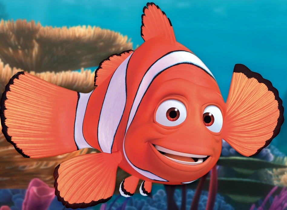
Animation Examples:
- Finding Nemo: Nemo’s orange stripes make him look cute right away.
- Toy Story: Woody in Toy Story feels friendly and easy to talk to because of his orange vest.
- Sunset scenes in all Disney movies: It’s always magical and beautiful to see an orange sunset.
Yellow: Feeling Happy Immediately
The colour yellow is much like sunshine. When bright yellow takes over a cartoon scene, it’s hard to feel sad.
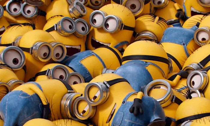
Yellow in Animation:
- Minion: The colour yellow makes them hard to hate.
- SpongeBob: His bright colour always makes him feel good.
- Beauty and the Beast: The dance scene with Belle’s yellow dress makes any person on earth happy.
- The Simpsons: It’s fun to watch The Simpsons because everyone has yellow skin.
The colour yellow makes the brain release the same chemicals that sunshine does. Because of this, cartoon yellow figures are always happy and full of energy.
Cool Colours and Calmness
The masters of rest in animation are cool colours. It makes you breathe deeper, feel peaceful, sad, or mysterious, and slows down everything.
Blue: Colour of Mood
Blue is the most useful colour for showing feelings in animation and can make you feel calm, sad, cold, magical, or good about yourself, depending on how you use it—especially when aiming for a unique character art style.
Blue’s Different Sides:
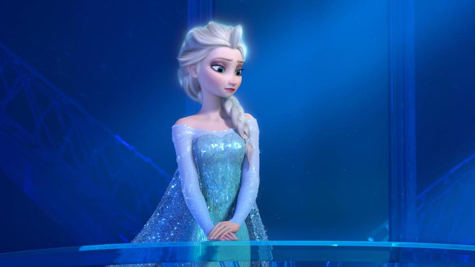
- Light blue means magic and peace. Think of Elsa’s ice home that sparkles. When you see light blue, you think, “Wow, something beautiful is happening!” and you feel calm and amazed.
- Dark blue means it’s time to be sad. Pixar floods the screen with dark blue when they want you to break out in tears. Without you even realizing it, your brain sees it and says, “Time to feel sad.”
- Bright blue gives you energy for a new beginning. You can tell that everything is going to be okay when the sky is clear blue. It’s like getting a boost of happiness right in the head.
- Navy blue means calm and sleepy (calm): You can relax and unwind when the scenes are dark and navy blue. It makes you think of going to bed and being safe.
Green: Getting Relaxed in Nature
When you look at the colour green, you quickly feel calm and at ease because it reminds you of safe places and healthy things.
Green colour in animation:
- Movies from Studio Ghibli: Those thick, green woods make you feel calm.
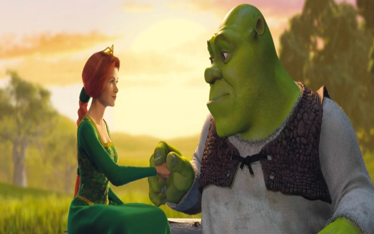
- Shrek: His green colour makes him feel normal and down-to-earth, not scared.
- The Jungle Book: Scenes of lush jungles seem secure and welcoming
- Monsters Inc.: Mike is nice instead of scary because he is green.
The secret is that when things are healthy and growing, they are all green, and your brain learned to connect green with safety and plenty.
Purple: Makes Mysteries
Purple isn’t often found in nature, so when it shows up in animation, your brain pays extra attention. It means magic, royalty, or events that are very important.
The power of purple in animation:
- Magic scenes at Disney: Purple sparkles are usually a part of beautiful moments.
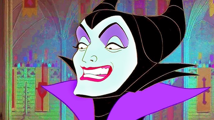
- Maleficent: Purple gives her a sense of strength and mystery.
- Inside Out: Fear is purple because it makes you unsure.
- Frozen: Elsa’s purple shadows as she changes
Neutral Tones and a Soft Touch
Colours that are neutral are the supporting actors in animation. They’re not the main attraction, but they improve the show and make you feel things in a gentle way.
Black: The One Who Made Drama
Black gives any cartoon scene more weight and seriousness. It can make you feel trained, scared, focused, or strong.
Black in animated movies:
- Villain costumes: Scar, Jafar, and Maleficent all wear black to look dangerous.
- Formal scenes: Black makes people look important and serious in formal scenes.
- Scenes at night: Black adds mystery and tension
- Silhouette moments: dark shapes against bright backgrounds look intense
Black has a strong emotional impact because of its relationship with nighttime and the need for caution.
White: The New Start
Simply put, white rests your eyes and brings out other colours, and it feels pure, clean, calm, or empty and lonely at times.
White’s Jobs in Animation:
- Angelic characters: White makes them feel good and pure
- Clean, modern spaces: White makes places seem clean and contemporary, which makes them feel like the future.
- Snow scenes: White gives a peaceful sense of winter.
- Background: White lets other colours shine
Gray: The Mood Shift
Gray takes scenes and turns them into more emotional ones. Also, it makes happy times seem more important and sad times seem lost.
Gray Uses for animation:
- Sad flashbacks: The colour gray makes memories seem far away and sad.
- Urban scenes: Gray gives cities an actual but boring air.
- Character aging: Characters with gray hair seem older or more worn out.
Brown: Where You Feel At Home
Brown feels grounded, solid, and trustworthy and gives cartoon scenes a grounded and real feel, like your favourite cozy spot.

Brown’s use case in animation:
- Scenes from home: Brown furniture makes a space feel warm and lived-in.
- Animal characters: Brown gives animal figures a natural and friendly look.
- Adventure gear: Brown boots and backpacks seem dependable and useful.
Animators Are Secretly Playing With Your Feelings
Since the 1980s, animation companies have been messing with your emotions, and they’re really good at it. Each and every colour used in cartoon movies is meant to make you feel a certain way.
What was crazy about it? A lot of people don’t even notice it.
Sharpness Mind Game That Controls Your Mood
- Bright, saturated colours = “Happy time!”
- Dark, muted colors = “Serious stuff happening”
Some cartoon movies are very good at making you feel different things by using colour.
Take Up as an example. The movie starts with a sequence of Carl and Ellie’s very happy times together. When she dies and he’s left alone, the movie slowly loses all of its colour and brightness, making you feel like the joy has been taken away from his life.
WALL-E does the same thing by showing you sad, dark brown Earth scenes that make you feel like there is no hope at all. Then, all of a sudden, they show you that bright green plant finding scene, which gives you hope again.
The Hero vs Villain Colour Code
It’s likely the oldest animation trick, but this one still works every time.
- Heroes = bright, warm colours
- Villains = dark, cool colours
Disney has used the same colour trick for many years, and it always works. It’s always clear who the good guys are—the heroes get warm, bright colours, and the bad guys get cool, dark colours.
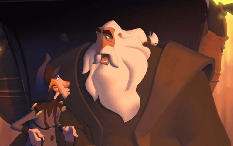
Scar wears only dark brown and black, while Simba gets golden colours. Aurora gets pretty pink and blue, while Maleficent wears scary black and purple. And, Aladdin rocks purple and white, but Jafar looks scary in red and black.
Even Elsa follows this pattern. At first, when she’s the “bad guy” in Frozen, she wears dark blue and gray. But when she becomes the “good guy,” Disney changes her to bright blue and white.
Saturation Switch and Emotional Volume Control
- High saturation = turn up emotional volume
- Low saturation = turn down emotional volume
- Gray/washed out = emotional numbness
Perfect Examples:
- Inside Out: Riley’s memories lose colour when she gets depressed
- Coco: The real world is muted, the spirit world is super colourful
- Moana: The Ocean goes from scary, dark blue to magical, bright blue
Famous Animated Scenes That Use Colour Well
Some cartoon scenes use colour so well that you will always remember them.
Disney/Pixar Examples
Going through Carl and Ellie’s whole life story in Up shows you how colour can change how you feel. Everything is yellow and orange when they’re young and in love, and that’s exactly the way it should be: warm colours make your brain happy.
As they get used to being married, the colours get lighter, like pastels and soft tones. These colours make you feel calm and happy because your brain links them with stability and safety.
Then, you can see the colours slowly going away as they get older, which makes you feel nostalgic and sad because fewer bright colours mean less happiness.
And when Ellie dies, almost everything on the screen goes gray, and your heart breaks because your brain thinks there is no more happiness when there is no more colour.
Studio Ghibli’s Use of Atmosphere
Studio Ghibli doesn’t just use colours to tell stories. They use colours to create entire emotional worlds that feel more real than reality. In fact, their colour choices make you want to live inside their animated universes.
You can feel all kinds of emotions in Spirited Away just by changing the colour temperature in different spots. Everything looks cool and quiet when Chihiro is stuck in the real world, which makes both of you feel bored and normal.
As soon as she walks through the doorway to the spirit world, warm, strange colours appear, and you feel the fear and joy that come with going on a journey. The crazy bathroom has a lot of rich golds and reds on the screen, which makes everything feel magical but also very intense, just like Chihiro does in this crazy new world.
Finally, on that quiet train ride, soft blue colours cover everything, and you feel quickly calm and thoughtful.
Indie Animations With Bright Colour Schemes
Independent animators can use more colour since they don’t have to impress a lot of people. So, colour psychology in these animations gets very artistic and bold.
Spider-Verse did something completely new when it gave each Spider-Person their own set of colours that perfectly matched who they are.
Miles is active and still working things out, so he gets red, black, and electric blue. But throughout the movie, those colours change as he gains confidence.
Gwen wears pink, white, and teal, which makes her cool and emotional at the same time. The colours are so new and trendy that they change her into a different kind of warrior.
And because Noir Spider-Man is meant to be a classic detective, he only wears black, white, and red. These retro colours make him look like he just stepped out of a 1940s movie.
Peni Parker, on the other hand, gets bright anime colours that make her look cute and tech-savvy. She feels like she belongs in a Japanese comic instead of an American superhero movie.
Colours in Animation Just Trigger You
Animation colour manipulation isn’t evil or sneaky. It’s smart storytelling that makes movies more emotional and memorable. Now that you know these tricks, you can:
- Appreciate the artistry behind your favourite animated movies
- Understand why certain scenes hit you so hard emotionally
- Predict your own reactions while watching
- Still enjoy movies (maybe even more) because you see the craft involved
Even knowing these tricks doesn’t make them stop working. Your brain is hardwired to respond to colours, and that’s what makes animated storytelling so powerful.