Grand Theft Auto VI launches on November 19, 2026 for PlayStation 5 and Xbox Series X|S, and since the first trailer dropped in December 2023, artists have studied its frames almost as closely as fans have. The reason is simple: GTA 6 looks unlike any GTA before it. It pushes photorealism further than Rockstar Games ever has, yet it still reads unmistakably as a satire of American life.
Below, we break down how GTA 6’s art direction pulls that off, from Vice City’s sun-bleached color palette to the vertical phone videos that fill its trailers, and what game teams of any size can borrow from it.
What Is GTA 6’s Art Style?
Quick answer: GTA 6 uses a cinematic, hyper-realistic rendering style with a heightened, art-directed color palette and a satirical approach to its characters and culture. It’s inspired by Miami, Florida’s “Florida Man” reputation, the 1980s Miami Vice look of the original Vice City, and modern social media.
The rendering aims for the look of a modern film or high-end commercial: physically based materials, dense crowds, wet asphalt reflections, humid haze, and lighting that shifts from harsh midday glare to neon nights. Rockstar has said Trailer 2 was captured entirely in-game on a PS5, so the realism isn’t a pre-rendered trick. It’s the target look of the game itself, running on the studio’s proprietary RAGE engine.
Realism is only the surface, though. On top of it sits caricature. The people of Leonida, the fictional state standing in for Florida, are exaggerated just enough to read as commentary: influencers filming everything, “Leonida Man” headlines, strip-mall excess and swamp-side chaos. The rendering is realistic; the casting of the world is satirical.
The Three Visual Layers of GTA 6
| Layer | What it does | Examples |
|---|---|---|
| Realistic rendering | Makes the world feel like real footage | Lighting, materials, weather, crowds, reflections |
| Stylized color | Turns Vice City into a postcard or music video | Neon pinks, sunset oranges, turquoise water |
| Satirical content | Exaggerates real culture for commentary | Influencers, news chyrons, ads, viral-style clips |
Realism vs Stylized Satire: How GTA’s Look Has Evolved
Every GTA game has balanced realism and satire differently. Understanding that history explains why GTA 6’s approach feels new.
The 3D Era: Stylized by Necessity
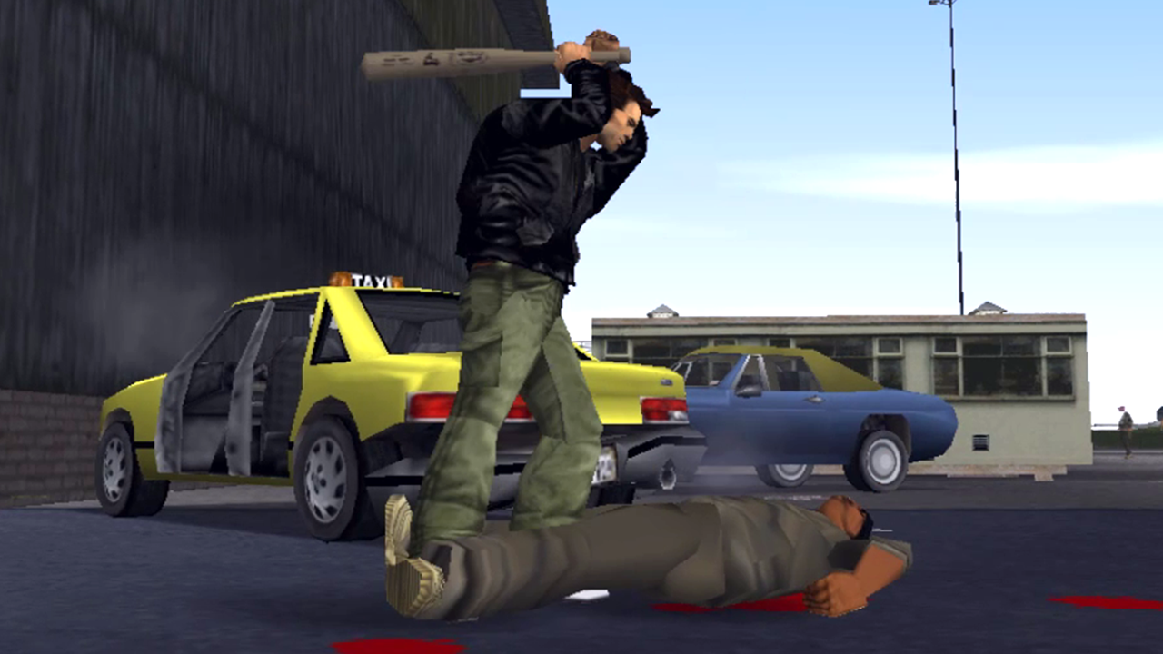
GTA III, Vice City and San Andreas were stylized because hardware demanded it. Chunky characters and flat textures meant the satire (radio ads, characters, signage) carried the series’ identity.
GTA IV and GTA V: Grit, Then Gloss
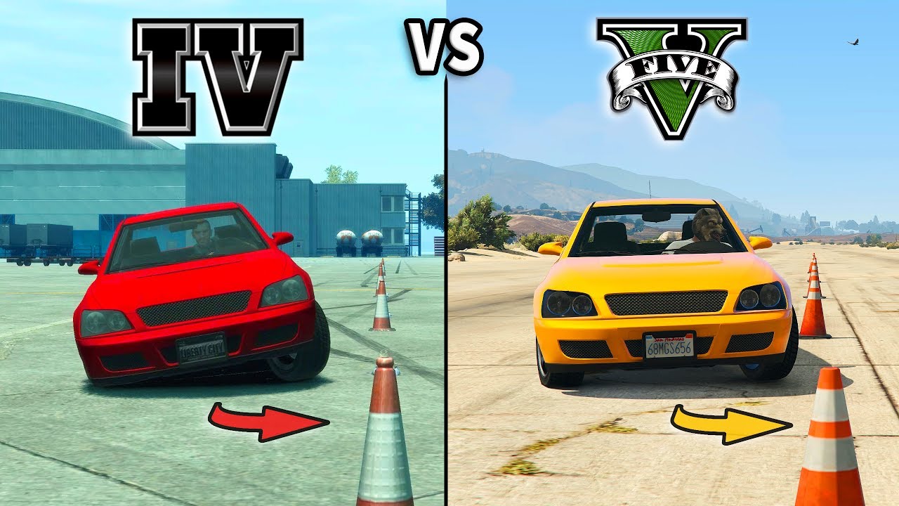
GTA IV swung toward gritty, desaturated realism. GTA V brightened things up again with a sunnier palette, and its humor often leaned absurd.
GTA 6: Realistic Rendering, Satirical Casting
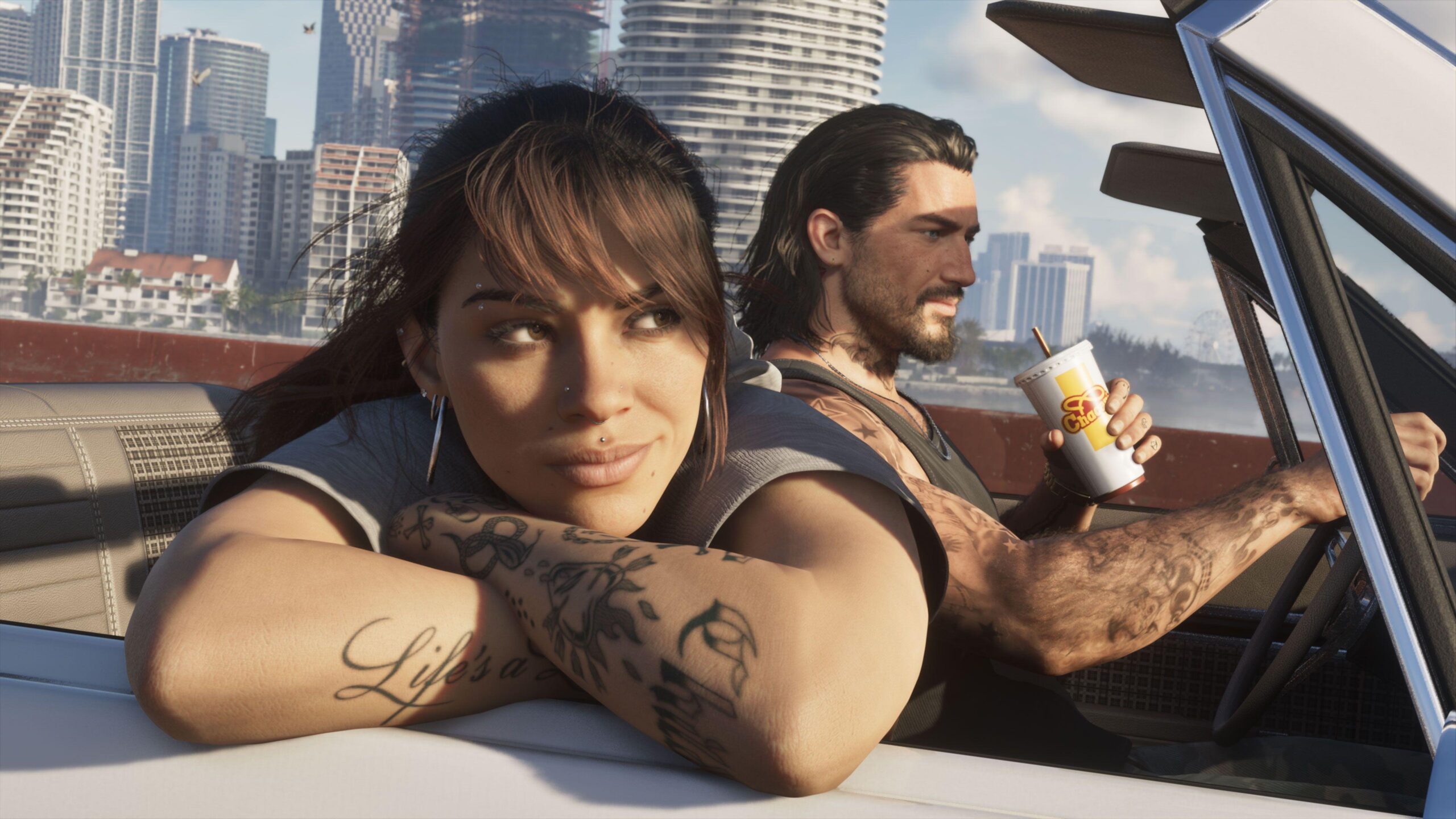
GTA 6 takes a different route and game art style. Coverage of Trailer 2 noted that its striking visuals come with a noticeably more grounded tone than GTA V. Instead of making the world cartoonish to deliver jokes, Rockstar renders it as realistically as possible and lets reality do the joking. When a gator wanders into a backyard pool or a woman dances on the roof of a speeding car, the comedy works because it looks real, just as viral Florida clips are funny precisely because they actually happened.
The key art direction insight: satire lands harder when the visual treatment is believable. Exaggeration moves out of the shaders and into the writing, the casting and the framing.
Vice City’s Color Palette & Mood
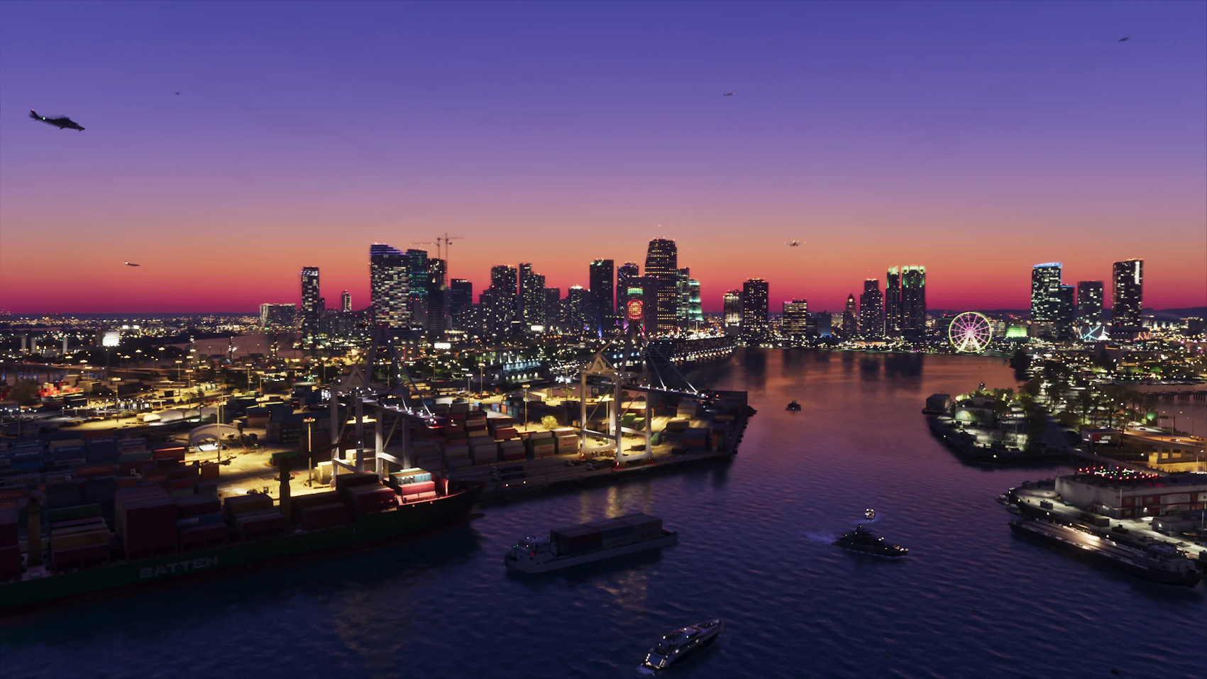
Color is where GTA 6 lets itself be stylized. Even with realistic lighting, the palette is clearly art-directed rather than neutral.
The Core Palette
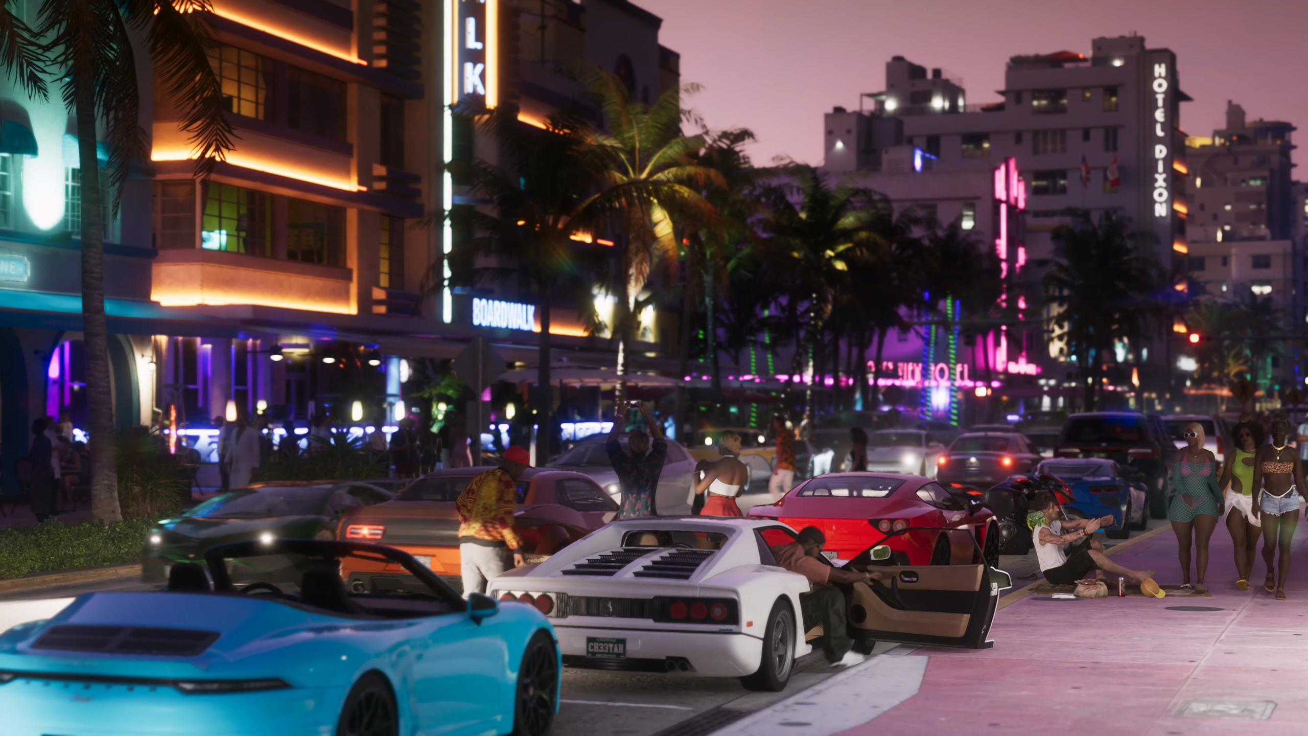
- Pinks, corals and teals drawn from Miami’s art deco architecture and its neon-lit beachfront.
- Saturated sunset oranges and magentas that bathe the skyline in golden-hour light, a nod to the 1980s Vice City and Miami Vice aesthetic.
- Deep greens and murky browns in the swamps and wetlands, humid and dangerous rather than idyllic.
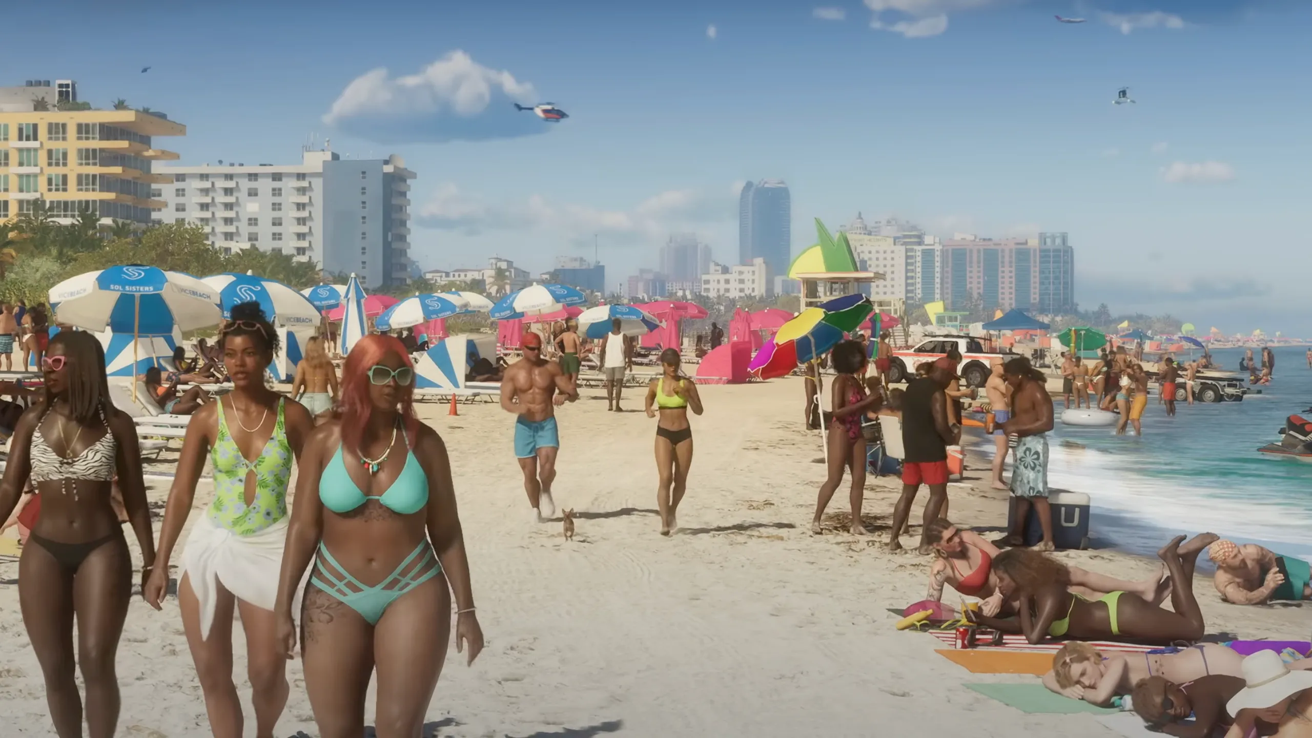
- Turquoise water and white sand along the coast and islands.
- Desaturated, rust-toned grays in grittier areas, which make Vice City’s glamour pop by contrast.
Region-by-Region Color Identity
Rockstar has confirmed six key locations in Leonida. Based on the trailers and official screenshots, each has its own visual temperature:
| Region | Real-world inspiration | Visual mood |
|---|---|---|
| Vice City | Miami & Miami Beach | Saturated, neon, pastel, glamorous |
| Leonida Keys | Florida Keys | Turquoise water, bright sun, laid-back but dangerous |
| Grassrivers | Everglades | Murky greens, humid haze, wild |
| Port Gellhorn | Florida’s gritty port towns | Desaturated, rust, decay |
| Ambrosia | Inland small-town Florida | Industrial, dusty, working-class |
| Mount Kalaga National Park | Florida’s forests and parks | Natural greens, open wilderness |
Shifting palettes between regions helps players read where they are at a glance and gives each zone its own emotional register: glamour, escape, wilderness, decay.
Atmosphere and Lighting
Heat shimmer, haze, lens flare and wet-season clouds sell Florida’s climate. Day-to-night cycles transform the same street from a sunny shopping strip into a neon-lit nightlife scene. The overall mood is seductive and slightly sweaty, as if the whole state is a little too hot to think straight.
What Inspired GTA 6’s Art Style?
GTA 6’s art direction draws from three main sources.
Miami’s Art Deco Architecture
Vice City is Rockstar’s take on Miami and Miami Beach. Art deco hotels, pastel facades, palm-lined boulevards, glass towers and causeways are reinterpreted rather than copied, giving the city a recognizable silhouette without a one-to-one recreation. Updated for the 2020s, the city layers its deco heritage with luxury high-rises and modern details like delivery drones.
Florida as a Cultural Myth
Beyond Miami, Leonida leans into Florida’s reputation for the strange and unpredictable: swamps full of wildlife, strip malls, beach parties, run-down port towns and endless highways. The “Leonida Man” headline in Trailer 1 riffs directly on the “Florida Man” meme, and several trailer moments closely echo real viral videos.
Social Media as a Camera Language
This is the most modern influence, and it changes how the world is framed, not just what’s in it. Much of Trailer 1 is presented as TikTok-style vertical clips with usernames, follow buttons and captions. Accounts like “PlanetLeonidaMan” curate local chaos the way real meme pages do.
Visually, this adds a second camera language next to Rockstar’s polished cinematography:
- Shaky, handheld phone footage
- Vertical 9:16 crops
- Low-light grain and compression artifacts
- Bodycam and dashcam-style shots
That mix of glossy cinema and messy phone video is the visual heart of GTA 6’s satire. It mirrors how we actually see places today: half through professional media, half through strangers’ feeds.
How Art Direction Shapes Gameplay Feel
Art direction isn’t decoration; it shapes how a game feels to play.
Readability Inside Realism
Neon signage, distinct district palettes and strong landmark silhouettes help players navigate a dense, realistic open world without relying only on the minimap.
Living-World Density
Crowds, traffic, wildlife and props create the feeling that anything can happen around the next corner, the core fantasy of a GTA game.
Mood as Pacing
Lighting technique and weather shift the emotional tone of the same location, turning a relaxed cruise into a tense nighttime chase route.
Tone Through Contrast
Pairing a grounded crime story about Jason and Lucia with an absurd world around them lets the game swing between drama and comedy without either feeling out of place.
How to Apply GTA-Style Art Direction to Your Game
You don’t need a Rockstar-sized budget to use the same principles. Whether you’re building a stylized indie game or a realistic action title, these lessons scale.
1. Define Your Lens Before Your Look
GTA 6’s visuals start from a point of view: satire of modern American culture. Decide what your world is saying before choosing shaders and palettes.
2. Separate Rendering Style From Tone
Realistic rendering can carry a comedic tone, and stylized rendering can carry a dark one. Choose each deliberately instead of letting one dictate the other.
3. Give Every Region a Color Script
Build a simple palette and lighting sheet for each zone. It helps navigation and emotional pacing, and keeps a large art team consistent.
4. Ground Your World in Real References
Gather photo references of real places, then exaggerate selectively. Reinterpretation beats direct copying, creatively and legally.
5. Use In-World Media as Storytelling
Phone videos, news chyrons, billboards and ads deliver worldbuilding and humor more efficiently than extra cutscenes.
6. Invest in Environment Art
In open-world games, environment art carries most of the storytelling. Props, signage and set dressing are where satire and personality live.
Need Help Defining Your Game’s Art Direction?
Turning an art direction idea into a consistent visual style is where many teams struggle. At Pixune game art studio, our artists create concept art, environment art, characters and visual development for games, helping studios lock in a look early and keep it consistent through production.
Key Takeaways
- GTA 6 combines photorealistic rendering with a stylized color palette and satirical content.
- Its satire works because the world looks believable; the exaggeration lives in casting, writing and framing.
- Each region of Leonida has a distinct color identity that supports navigation and mood.
- Miami, Florida culture and social media aesthetics are its three core inspirations.
- Any studio can borrow the method: define a lens, script your colors, ground in reference and invest in environment art.