Character color palette: a topic as technical as a physics textbook and as tender as a hand-drawn sketch!
In animation, color isn’t just a splash of paint or a digital hex code; it’s the meaning of a character, describing who they are before they speak.
From Cinderella’s soft blues to Spider-Man’s bold red and blue, a character’s color palette is a calculated mixture of science, raw human connection, and psychology in character creation.
Without further spoilers, let’s dive into this vibrant world and explore the how, why, and wow of color in character design.
Remember, this isn’t just about hues; it’s about identity, emotion, and the chemistry that makes us care.
Need Animation Services?
Visit our Animation Service page to see how we can help bring your ideas to life!
The Foundation: What Makes a Character Color Palette?
A character color palette is the designed set of colors that define an animated character. This mixture includes skin, hair, outfit, eyes, and even the shininess of a sword.
We can simply discuss that the color palette is their visual signature and the first impression they make in the language of light and shade.
But remember that choosing a character’s theme is no accident! Every tint, every shade, and every color gradient is a choice that blends art with logic in the character design process to create something eternally memorable.
1. Color Theory: The Scientific Aspect!
Color theory is the baseline for crafting a harmonized character color palette.
Animators and 3D character artists start with color theory, which is a system rooted in how light splits into the spectrum. You might be familiar with the color wheel, which gives us primaries (red, blue, yellow), secondaries (green, orange, purple), and tertiaries while hue, saturation, and value fine-tuning the mix.
Color theory is a universal grammar for character palette design across various mediums and artists.
2. Contrast and Harmony: The Visual Rhythm!
Our eyes love a good trick show!
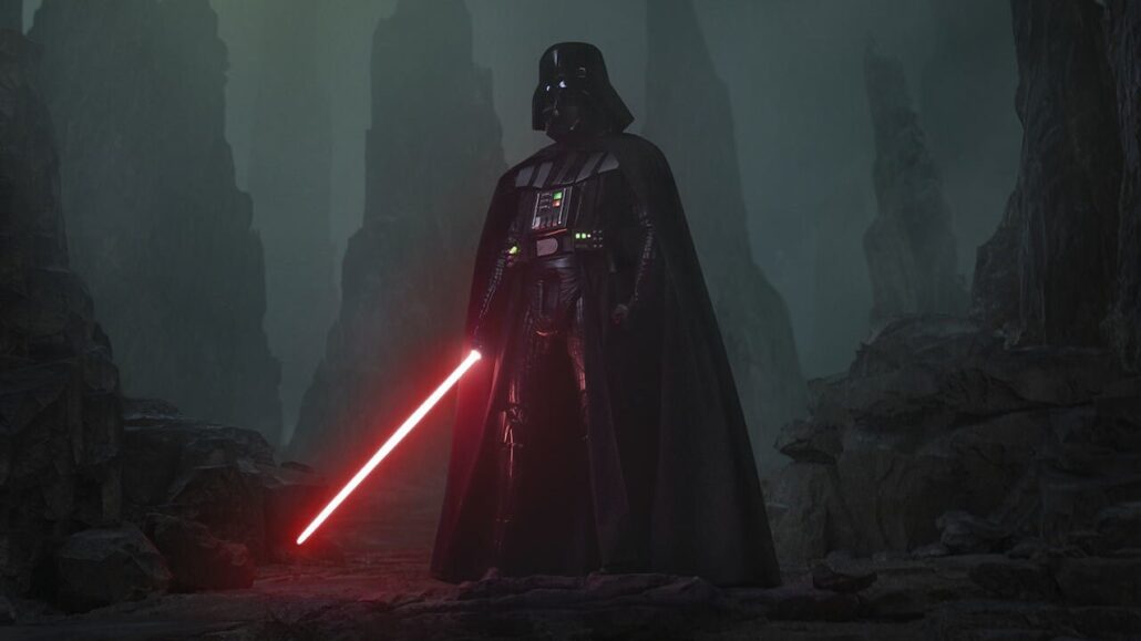
For example, the contrast of Darth Vader’s black armor against his red saber grabs our attention, thanks to how our retina’s ganglion cells fire at sharp edges!
Harmony, like Belle’s yellow gown, which complemented her warm brown hair, kept the vision pleasing, aligning with the brain’s love for coherence.
The character color palette smoothes this path to ensure that every character stands out without clashing.
3. Practical Limits: Less Is More?!
Various studies suggest that we best process three to five distinct colors before overload kicks in, which means that targeted simplicity is sometimes our best option for character design.
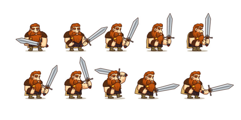
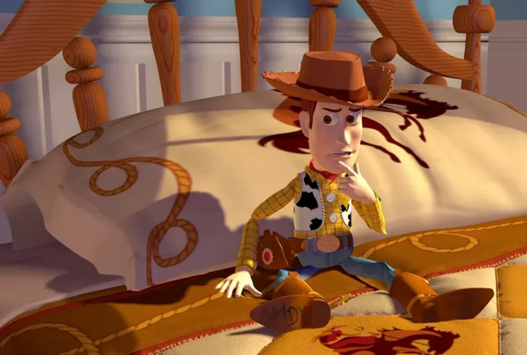
So, as we see in many cases, a character’s color palette rarely exceeds this rule. For example, think of Toy Story and Woody’s yellow plaid, brown hat, and blue jeans. The design is actually restrained with purpose, a lesson from both hand-painted cells and 3D renders!
The Science: How Can Color Wire Our Brains?
In character design services, a character color palette isn’t just about looking pretty; it’s a neurological trick for our senses, tapping into how we see and feel the world!
Light and Perception: The Physics of Color
The journey of seeing color starts with light, electromagnetic waves that bounce off surfaces and hit our eyes’ color-sensitive receptors.
A character color palette exploits the ability of our eyes and brain to picture a harmonized and pleasant scene, playing a vital role in creating a unique character art style.
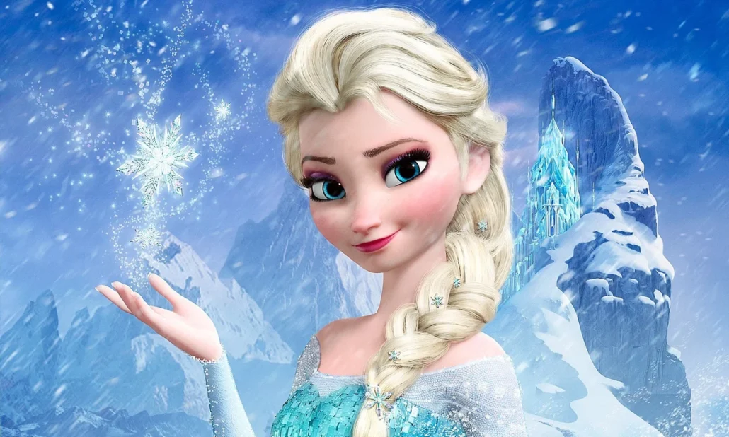
For example, Elsa’s pale blue cape (RGB: 135, 206, 235) reflects more blue light, cooling down our perception. Whereas, Scar’s dark green (RGB: 34, 139, 34) absorbs it in a brooding and heavy way. Animators use this physical approach to colors to guide our gaze. They deploy brighter colors to draw focus first, a trick as old as film.
Psychology: Colors That Speak to Our Soul!
It’s only evident that colors trigger human emotions. They play a crucial role in the psychology of animation, displaying a scene’s mood, portraying a character’s vibe, or warning about an impending doom!
For example, Anger’s fiery glow in Inside Out with red spikes demonstrates a sign of blood or danger. Blue slows us down (Sadness’s muted tones), similar to the calm feeling of looking at the sky. Green promises life (Shrek’s swampy skin), whereas yellow radiates joy (Minions!).
Various psychological and neurological research confirms that these links are near-universal, proving that the character color palette is a shortcut to our minds.
Cultural Nuances: Looking Through A Global Lens!
The basic biology of our body sets the stage, but our culture directs the play.
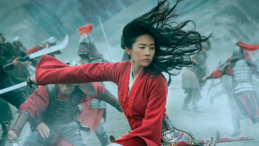
For example, white’s purity in the West (Snow White’s dress) is translated as mourning in Japan! Or, red’s symbol of luck in China (Mulan’s robe) is in contrast with danger here in the U.S!
The artist designing the character color palette must know their audience to successfully overcome the character design process.
The Design Process: How to Build a Character Color Palette
Now, let’s explore how we can start designing a stunning yet memorable character color palette that follows the physical color theory and complements each character’s personality.
Step 1: Defining Identity!
Who are you trying to portray?
For instance, a hero’s color complexion might consist of glowing shades—Superman’s red cape screams courage.
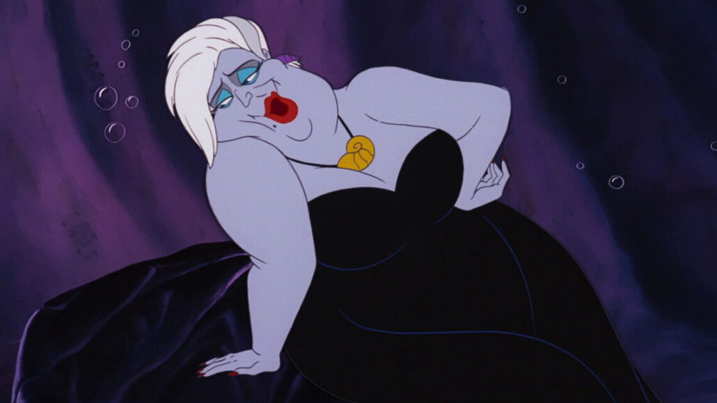
However, a villain’s costume might appear sneaky—Ursula’s purple and black appearance oozes menace.
So, a character’s color palette starts with the story you’re writing for them. Animators usually sketch mood boards and pull hues and colors from personality! Puss in Boots’ orange tabby fur reflects his fiery charm and quirky traits, which are all rooted in his engaging tale.
Step 2: Integrate the Environmental Factors
Characters live somewhere specific, and their palette must be compatible.
In Coco, Miguel’s warm reds and oranges display Mexico’s Day of the Dead vibrancy, while his skeleton pals’ whites and grays are in vibrant opposition to the living world!
Scientifically speaking, this is figure-ground segregation, which allows our visual cortex to need characters distinct yet relevant to their environment.
One important aspect of character color palette design is nailing this balance.
Step 3: Testing and Refining
Nothing is ever perfect on draft one!
Traditional artists used to paint swatches, whereas digital artists adjust sliders (e.g., HSL values).
Like other animation fields, it’s only natural that character color palette design evolves through feedback. Animation team members, such as animation directors, lighting teams, and even test audiences, weigh in to add a human touch to a scientific base.
Step 4: Consistency Across Media
A character’s colors must not shift on different platforms.
Simba’s gold is always gold, whether in film, toys, or games! One essential approach to maintaining consistency in transmedia storytelling is using digital tools to lock hex codes (e.g., #FFC107); it’s worth mentioning that traditional artists matched ink batches to maintain this consistency.
Emotional Power: How Does Color Stick?
A character color palette isn’t just about design; it’s why and how we remember a character’s vibe of love or fear:
- Instant Recall: Visual Shorthand!
Think of a red hat and yellow shoes; you imagined Mickey Mouse, right?
Studies have shown that colors boost memory, and we retain colored visuals 70% better than grayscale.
- Emotional Hooks: Feeling Through Hue!
Colors pull strings and create emotional responses.
Nemo’s orange fins scream “small but mighty,” passionately grabbing our attention. Maleficent’s green skin chills us and creates an alert sensation in our brains.
The character’s color palette uses our experienced wiring to display emotional bonds or spark tension.
- Symbolism: Layers of Meaning!
It’s not always supposed to be obvious. The character color palette can subtly hint our minds to look more closely and then be surprised as the layers unfold.
For example, Rapunzel’s purple hints at royalty before her crown; Hulk’s green isn’t just anger—it’s rebirth!
Challenges: The Colorful Obstacles!
With every great work comes great challenges, and a joyful character color palette design is no exception!
- Overload vs. Underwhelm!
Too many colors confuse the audience, and too few will bore them into leaving!
The character color palette needs a Goldilocks balance. Based on cognitive load research, we suggest three to five punchy yet simple hues.
- Accessibility: Seeing for All!
Colorblindness affects 1 in 12 men and 1 in 200 women. A good character’s color palette must be adaptable to various audiences.
To achieve such compatibility, we suggest using high contrast (e.g., Batman’s black-gray) or distinct shapes, creating a humane design that ensures everyone sees the magic.
- Consistency: The Long Game!
To create long-lasting memories, you should know that colors can’t drift. Ariel’s tail has always been #00CED1 across decades, whether locked by digital painters or slaved over paint by traditional ones.
Your character’s color palette is a commitment you make to your fans, and we must all keep our promises (remember Sonic’s blue hue debates?).
- Aging Gracefully: Timeless vs. Trendy!
Although keeping up with the current vibes is essential in any field, we must know that trends fade; for example, neon ‘80s palettes are all outmoded now.
A proper character color palette must endure throughout time and carry a heartwarming nostalgia; for example, Cinderella’s classic blues versus fleeting fads, a balance of now and forever.
The Future: What Will Be The Color Palette’s Next Frontier?
- VR and Dynamic Color:
In VR, palettes shift rigorously. We can observe how a hero’s cape darkens in shadow thanks to real-time shaders. The character color palette will flex in color theory in game art and shine in VR, blending science with immersion.
- Representation with Real-World Hues:
Today’s palettes reflect diversity and cultural differences. The character color palette is a mirror based on real skin and stories.
- AI and Beyond:
AI tools can suggest color palettes based on emotions or trends with harmonized themes. Still, it’s the humans who pick Joy’s yellow over a bot’s beige, proving that the character color palette stays human, even as tech accelerates.
Final Words
To provide a quick recap of our journey, the character color palette is a marvelous mixture of science in every photon and soul in every shade. It’s why Woody’s plaid feels like home, why Jafar’s black-red chills us.
Colors are physics, psychology, and a dash of magic that can turn lines into legends. It must be amazing how a carefully designed set of a few colors can make us laugh, cry, or believe. But that’s the power of a decent character color palette: a prism of art and a mirror to humanity, lighting up our screens and hearts.